Crafted by Design By Temple, Tropical Additions’ packaging system hones in on classic 60s design cues. Because the brand is 100% plant-based, the focus on “flower-power-esque” design fits perfectly with the brand’s ethos. By keeping the color palette for each SKU to just two hues, the psychedelic-inspired typography has the chance to shine. The design is quite simple, but through the use of animated fonts and energetic colors, the packaging effortlessly pops. Plus, who doesn’t want to feel inspired by the whimsy of the 60s as they’re consuming their super foods?
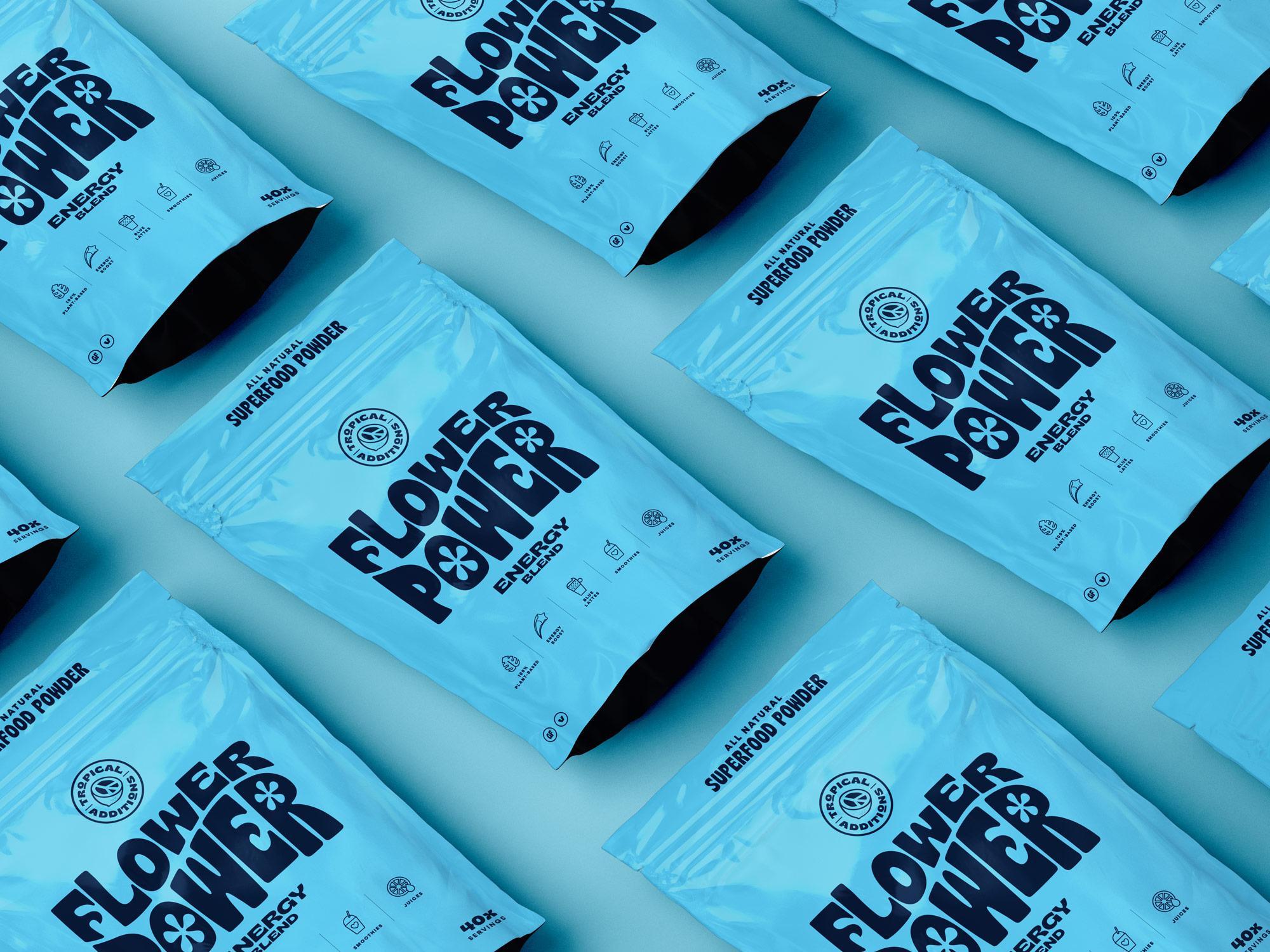
Tropical additions seek to improve wellness through the power of plants. When added to drinks and recipes, their plant-based superfood blends improve nutritional health and overall wellbeing whilst adding a splash of colour at meal times. Tropical Additions engaged with Temple to create a vibrant new brand and packaging which would help them stand out in a crowded well being space.