The Typeface on These Wines Cleverly Illustrates their Meaning
By
Published
Filed under
By
Published
Filed under
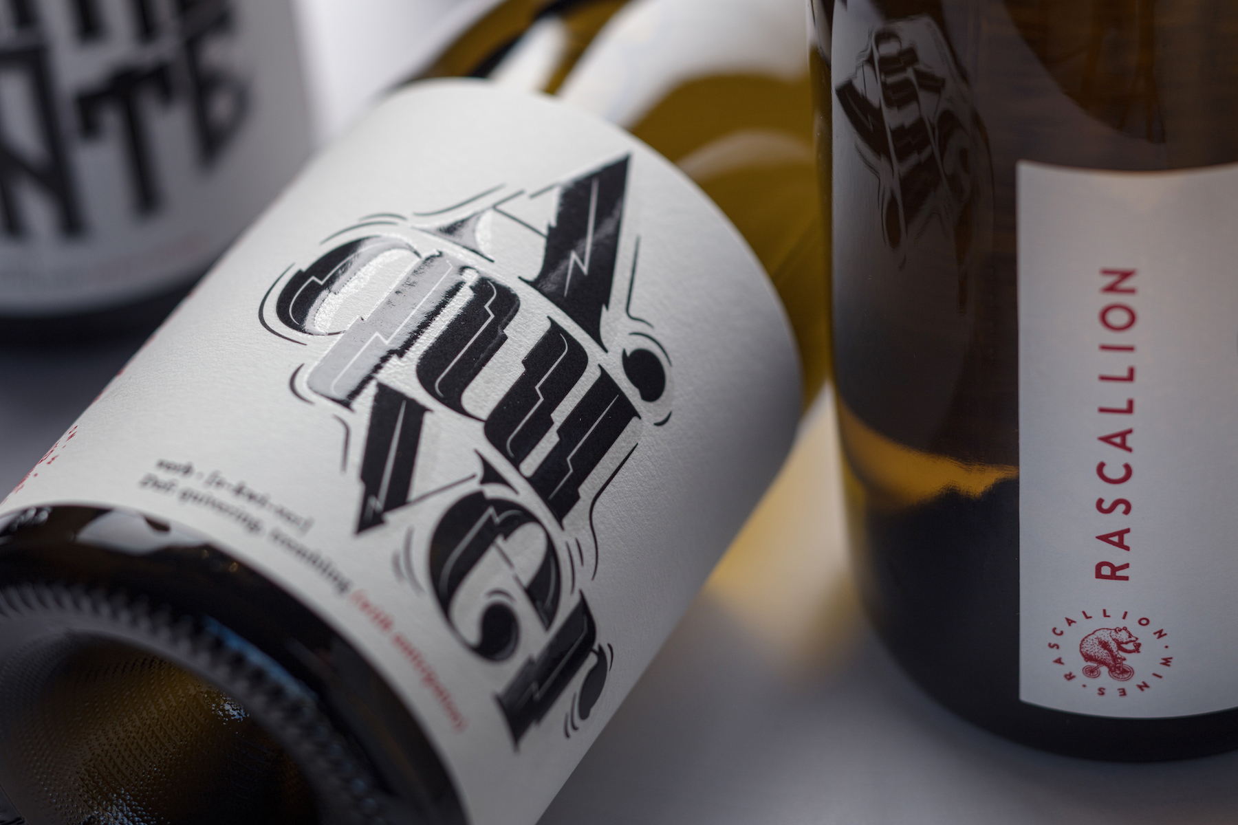
Typeface lovers, this one’s for you. G2Design is behind these font-focused wine that is playful and sophisticated.
“Rascallion wants to change the conversation with consumers so that they don’t talk about the wine only, they talk about what the brand says to them via its packaging and sensorial interplay. And Rascallion wants its consumers to have fun whilst engaging with the brand. This was the task that Rascallion set the G2 agency.”
“The wines of the Word Collection provide an introduction to a world where words portray emotions and actions that stimulate the senses. They add to the experience of drinking wine as they embrace an uncomplicated world where the emotional connection between the word and the wine is direct and immediate. It’s not of tomorrow, it’s now; it’s fun, and it invites others to become involved in the experience.”
Get unlimited access to latest industry news, 27,000+ articles and case studies.
Have an account? Sign in