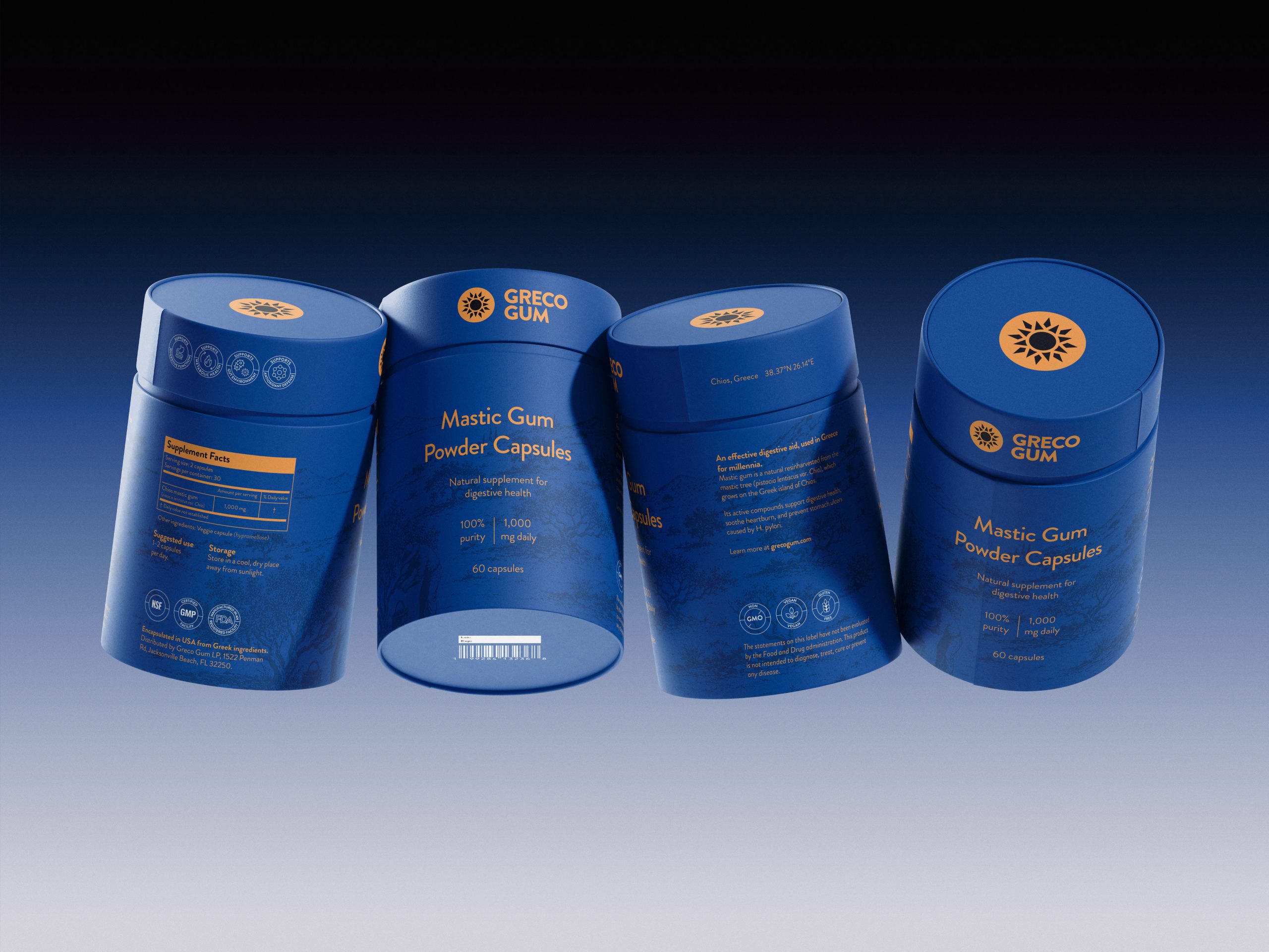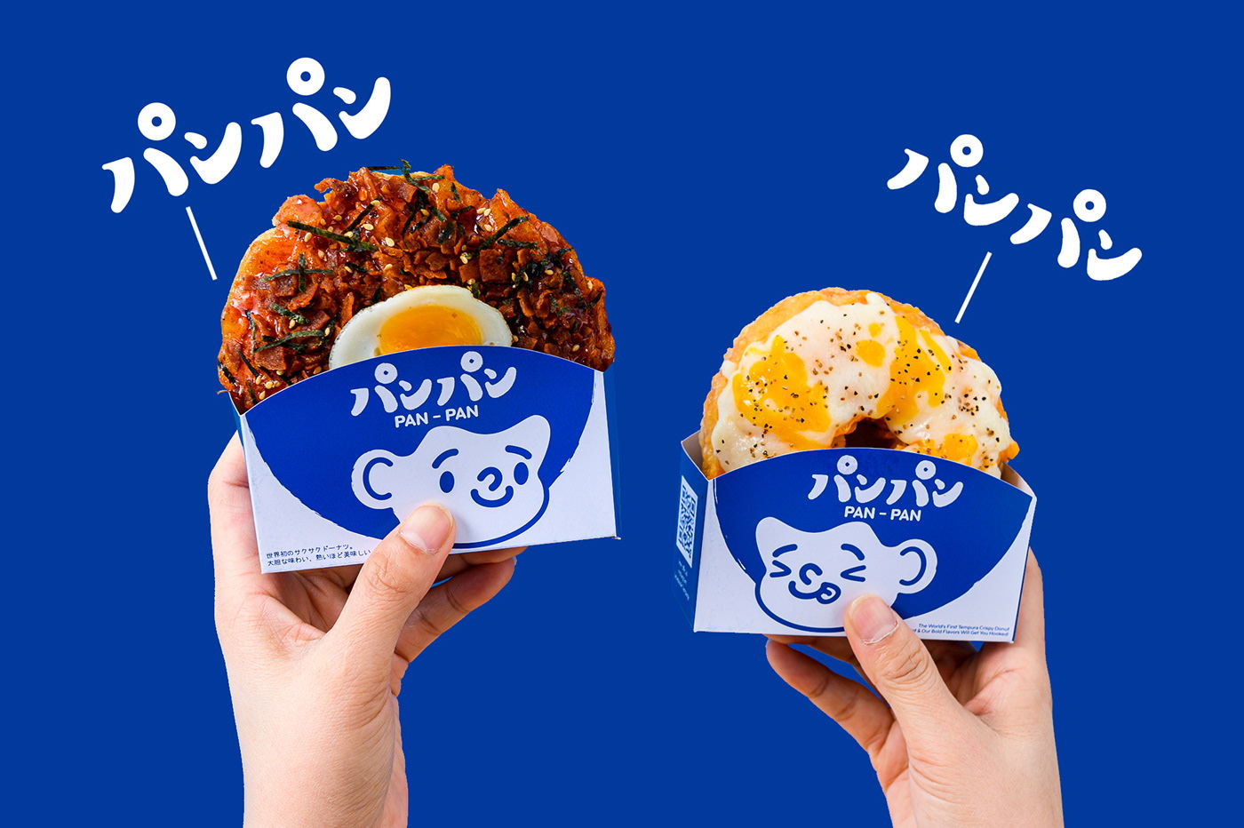
Cobalt blue is a color that makes packaging pop. It’s bold, not overly used, and complementary to any style illustration. Designer Sorawit Opapongphun cleverly utilized cobalt in the cheeky design for fried donut brand Pan-Pan. Because the brand’s products are unique, creating unique packaging to follow suit was clever and brave. The product’s shape accentuates the packaging and allows the tasty treats to speak for themselves.
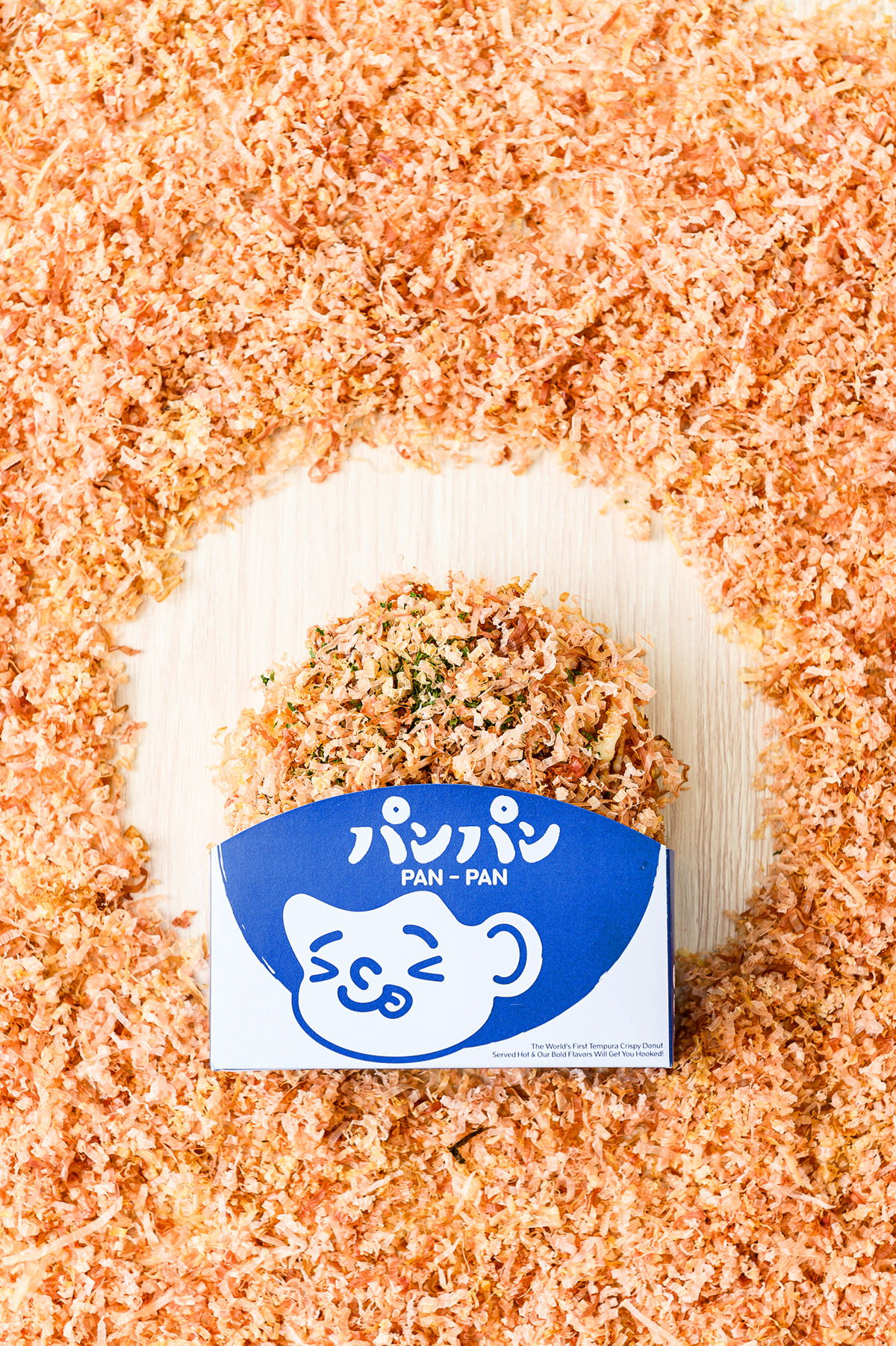
“Pan-Pan” is the Fried Donut brand , Unique with different type of topping such as Takoyaki, Hokkaido milk, Mala.