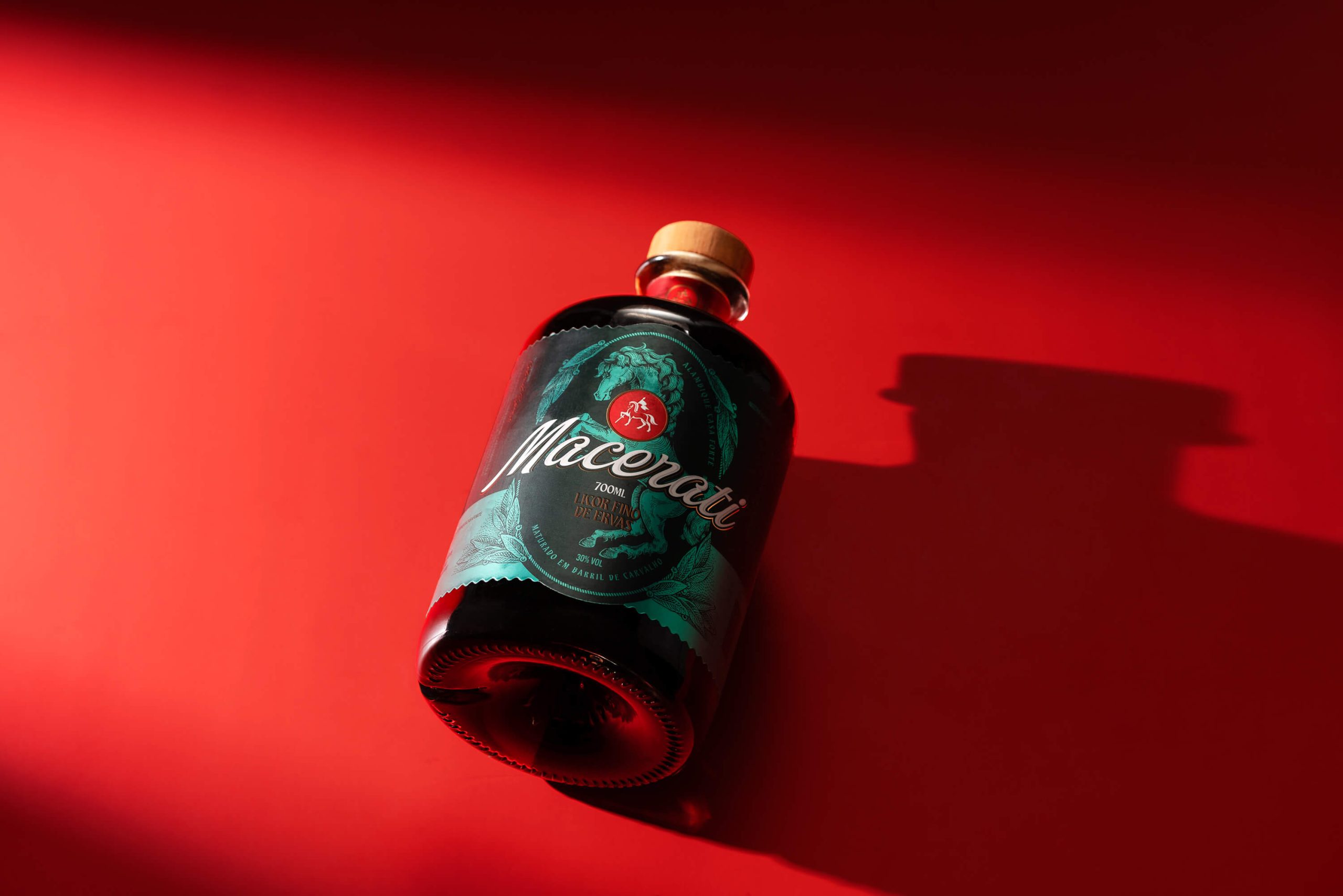
Macerati, designed by Pictom Design for Casa Forte, brings herbal liqueur packaging into the conversation. The label is centered around a dramatic engraving-style illustration of a rearing horse, a reinterpretation of Casa Forte’s existing horse symbol that has been elevated into something far more baroque and sculptural. Plus, it’s surrounded by botanical herbs and feather motifs that imply the 50-plus herbs and spices inside.
The Macerati wordmark is set in a warm, handcrafted white script, while LICOR FINO DE ERVAS below is set in a smaller gold serif that grounds it. In a herbal liqueur space where European brands like Fernet and Jägermeister have long dominated the visual conversation, Macerati brings a distinct perspective.