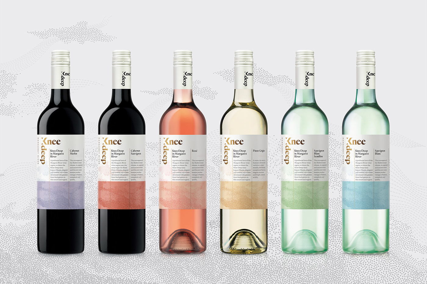
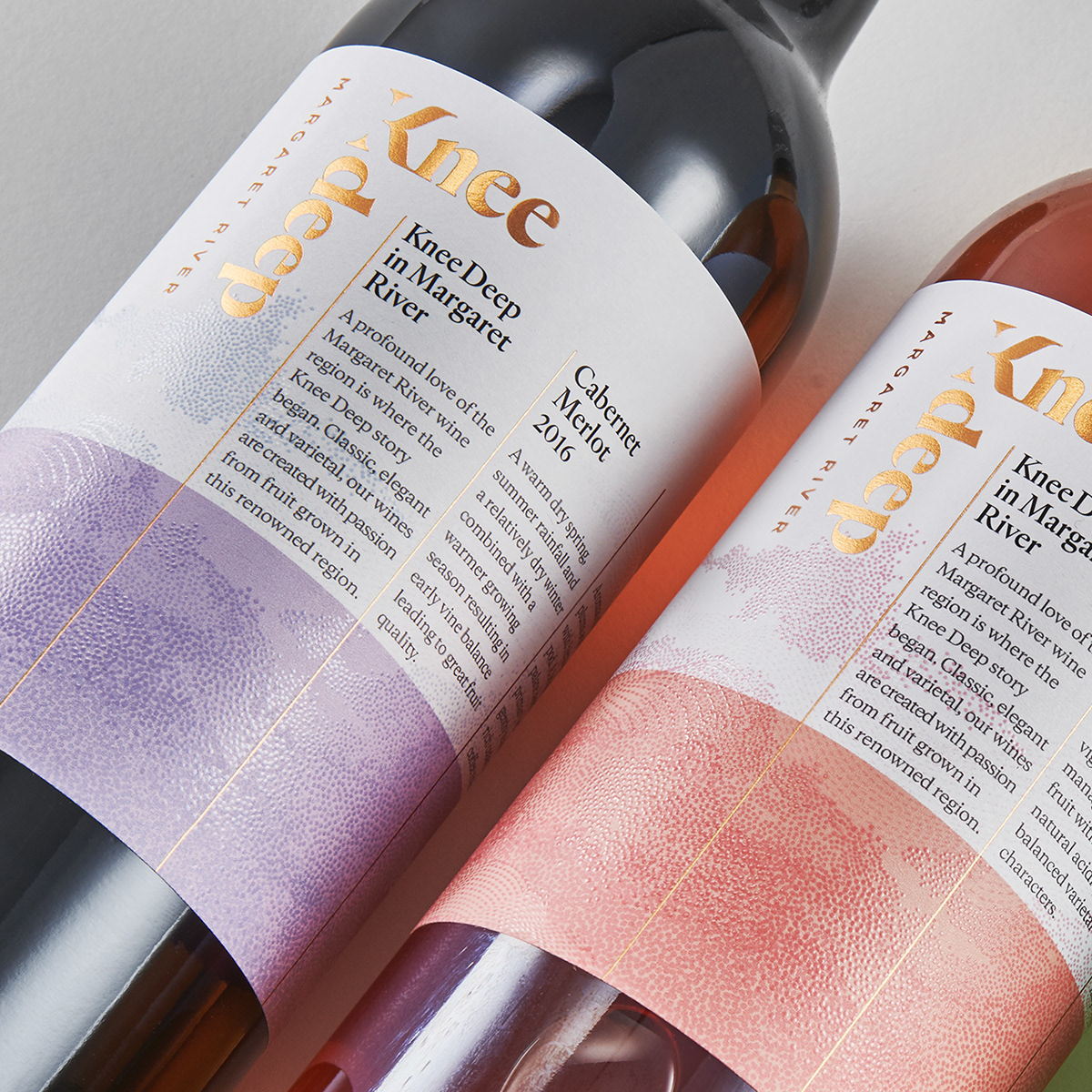
Harcus Design created the dynamic packaging design for Knee Deep, which excites a fresh and breezy aesthetic. The logo on the bottle is a visual device that’ll leave your head spinning, literally. The creative orientation of the logo is both a visual metaphor and a beautiful framing device. Moreover, the colors and textures used on each wine label create a set of heavenly bottles that are gorgeous on their own and even more impressive as a collection.
The founders, the Child’s family, broke ground back in 2000 establishing what was to become an iconic Margaret River winery. The brand name of ‘Knee Deep in Margaret River’ was a tongue-in-cheek acknowledgement of jumping in ‘boots and all’ during a testing time in the wine industry with the grape glut of the late nineties. Times have changed and so too have the reins.