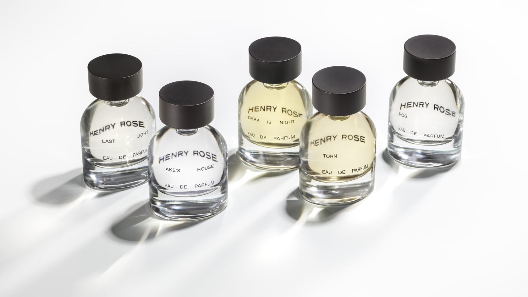
Looks like we’re going to have to remember Michelle Pfeiffer for something other than her iconic roles such as Cat Woman. The packaging for Henry Rose fragrances is a stunning exercise in minimalism that utilizes two fonts that work in harmony with the bottle’s unique tops to give it luxurious and transparent feel. The placement of the brand’s name on the back of the bottle, so it can peek through the front, is a further nod to the brand’s commitment to transparency in their ingredients.
Henry Rose is the first fine fragrance line with 100% ingredient transparency. Created by Michelle Pfeiffer, the gender-neutral line comprised of five distinct scents, is the result of Michelle’s nearly decade-long pursuit to develop a luxury, clean fragrance brand. Historically, perfume has been the least transparent beauty and personal care category. The majority of perfume bottles list “fragrance” as the sole ingredient, but realistically “fragrance” can consist of 3,000 different additives. Throughout the development of Henry Rose, Michelle would often refer to this standard industry practice as a “black box” wherein consumers had no idea what was going into a product they apply intimately to their skin. Our design direction was to “hide nothing”, creating an interplay between transparency and sensuality. We worked with Michelle and her small team to balance familiarity with desire throughout the design system, including the bottle design itself as well as the shipper packaging.