The specialty coffee world loves elaborate ornamental design and hand-drawn botanical illustrations, so when a roastery shows up with packaging that looks like the antithesis of that, it resets your expectations of what this category can do.
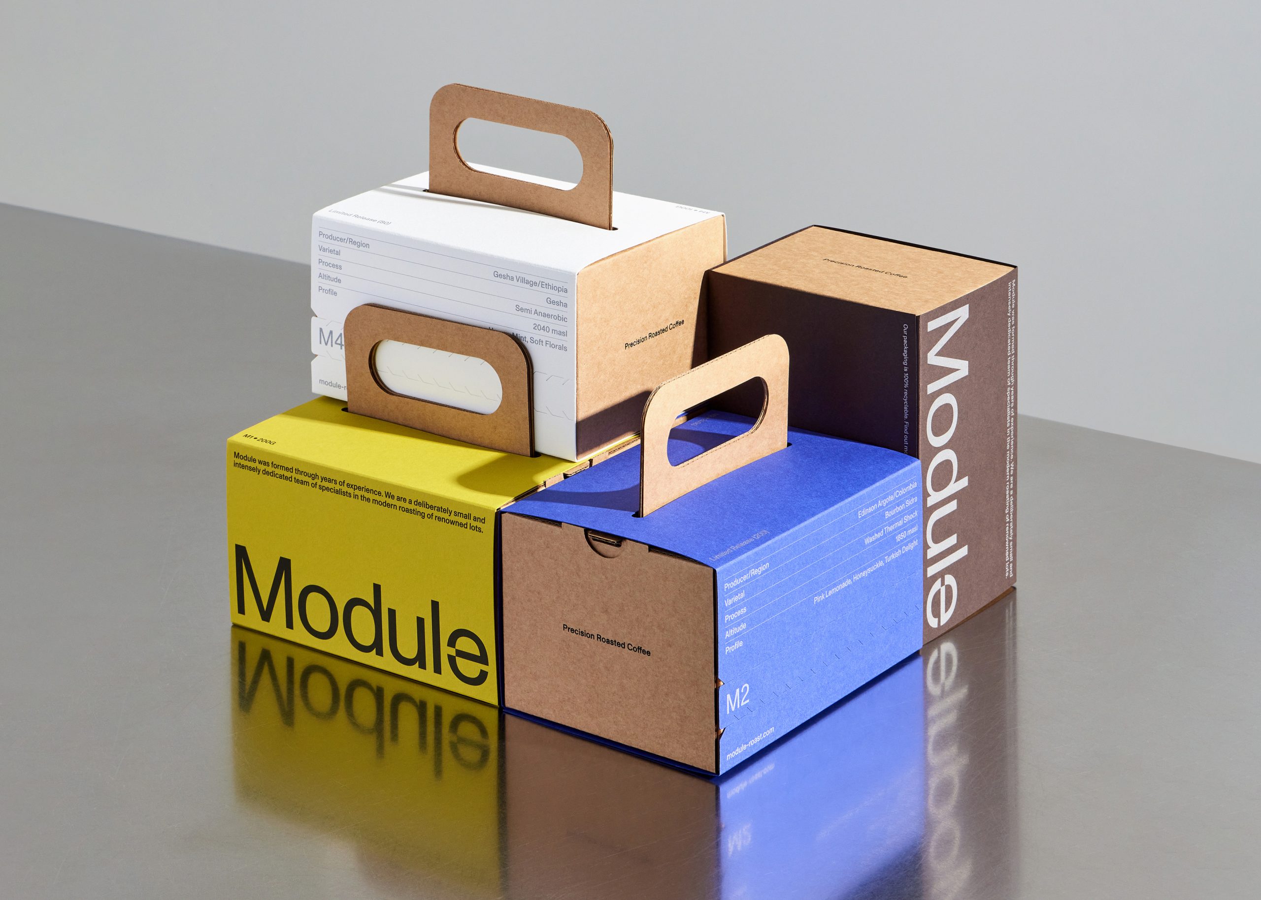
Module is a limited-release Edinburgh roastery with packaging designed by Standard Format, which builds its entire system around the visual language of utility objects, referencing toolboxes and luggage through a rigid kraft board box. For the first series, the sleeves were printed on discontinued paper stocks sourced from G.F. Smith, a design decision as conceptually rich as anything happening in contemporary art publishing right now. The frosted three-layer inner bags mirror the same die-cut handhold as the outer box, creating a relationship between every component in the system.
Every single detail was designed with intention, and it certainly shows.

Module is an intentionally small-batch coffee roastery based just outside of Edinburgh, Scotland. Each coffee is released once, produced in limited quantities, and never repeated. When a release sells out, it makes space for the next. The packaging was designed to reflect this cycle, treating every box as a distinct moment within a continuous system.
The brand identity establishes Module’s core values of precision, restraint, and process-led thinking. These principles carry directly into the physical packaging, which prioritises tactility, function, and clarity over decoration. The primary structure is a rigid box with an integrated handhold, referencing objects of utility such as toolboxes and luggage. These are containers designed to be carried, handled, and relied upon.


The outer boxes are engineered from e-flute kraft board and screen printed to emphasise material honesty and functional character. Each box is sealed with a wraparound paper sleeve printed with the coffee’s specifications and finished with a tear strip. The sleeve acts as the primary point of variation, allowing the system to remain consistent while each release feels distinct.
For the first series of releases, we partnered with G.F Smith to print the sleeves using discontinued paper stocks. This decision reinforced the idea of non-repetition while working within a repeatable framework. The papers are no longer available, and neither are the coffees.

Inside, the coffee bags continue the same visual language. They are die-cut with the same handhold as the outer box, creating a clear relationship between both components. The bags are made from a frosted three-layer material to ensure optimal freshness while maintaining the brand’s subdued, industrial aesthetic.
Across the system, the packaging is grounded in utility and material honesty, designed to be continuously repeated while remaining open to change. Consistency comes from structure and process, while evolution is introduced through detail, allowing each release to feel both familiar and unique.