Eme Skincare Is Centered On Simplicity And Balance
By
Published
Filed under
By
Published
Filed under
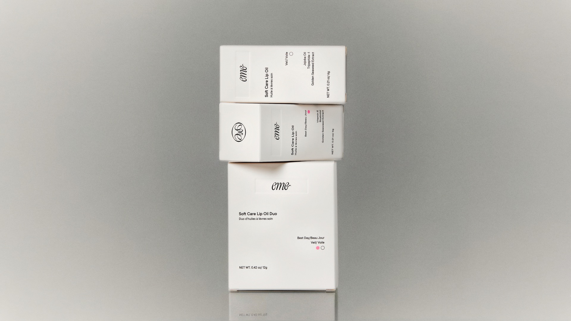
Eme Skincare, designed by HsuanYun Huang, is all about balance, and the packaging visualizes it through frosted glass tubes and blush-pink and grey-tinted tops that feel closer to a perfume than a lip oil. The swirly script wordmark goes down each tube in white, referencing the kind of lettering you’d find on vintage apothecary bottles.
But I’m mostly stuck on the soft square cap; it’s a small, smart shape choice that adds geometric contrast to a space that’s typically so rounded. The white outer box keeps everything grounded with clean sans-serif typography, bilingual copy in English and French, and generous negative space. Eme lands in a quieter space where craftsmanship and softness lead. It feels gentle and approachable, and, if you squint hard enough, reminiscent of the Y2K aesthetic that many brands are currently chasing.
Get unlimited access to latest industry news, 27,000+ articles and case studies.
Have an account? Sign in