Centinela Cocktails’ Packaging Features A Vintage Layout Representing The Heritage Of The Brand
By
Published
Filed under

Published
Filed under

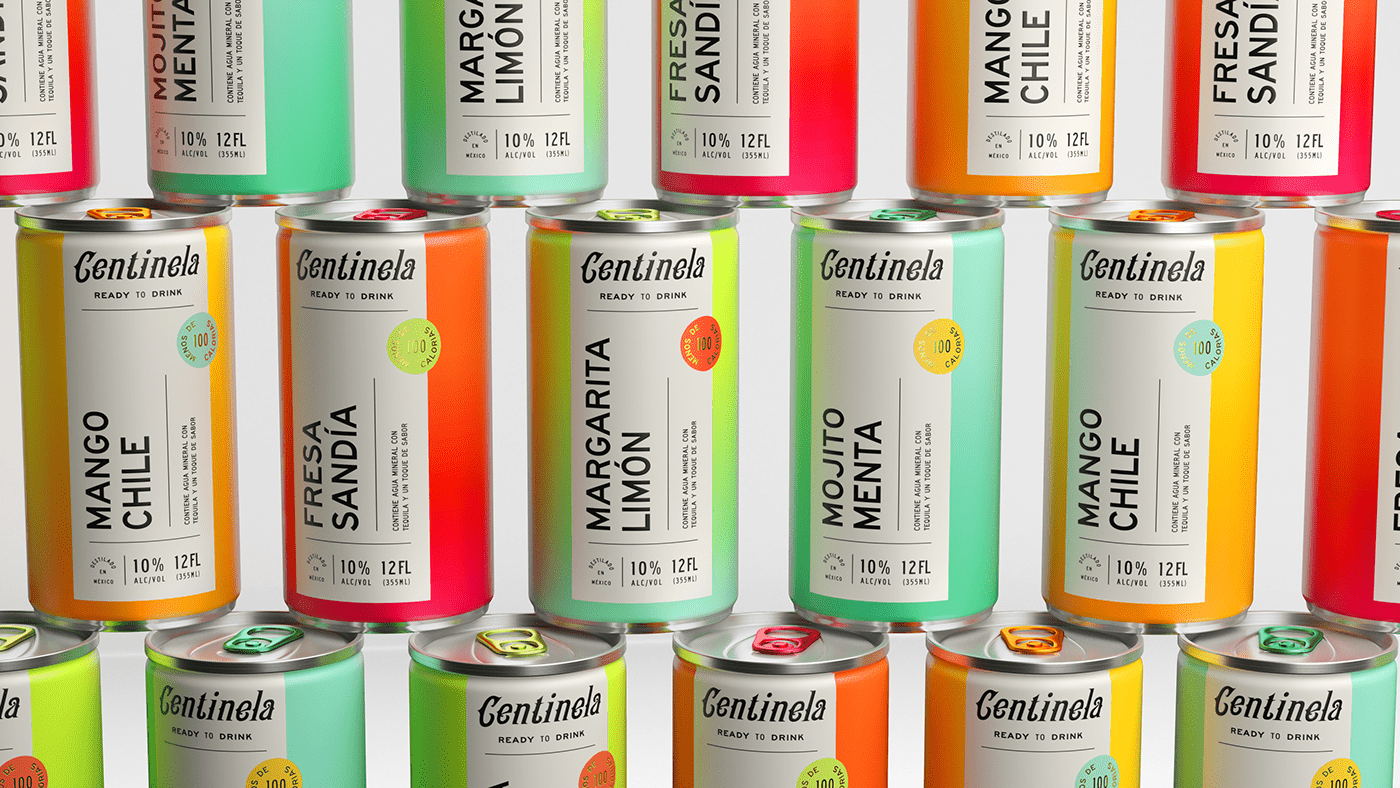
Gradients have taken over the packaging world by storm, and Casa Centinela RTD Cocktails are not shying away from the alternative design detailing. Human is the design agency behind the vibrant work, and we are simply mesmerized. Between the almost-neon color hues to the gilded details to the folklore-inspired typography, the packaging feels like a treat within itself. Additionally, the vibrantly colored pop-tops further showcase how Human didn’t leave any element unturned, the agency’s eye for design is unmatched, and these cans are proof. Now, pass me a Mango Chile can, please.

Brand development for Casa Centinela RTD cocktails.

Add project credits with Dieline PRO | Log in
Get unlimited access to latest industry news, 27,000+ articles and case studies.
Have an account? Sign in
To provide the best experiences, we and our partners use technologies like cookies to store and/or access device information. Consenting to these technologies will allow us and our partners to process personal data such as browsing behavior or unique IDs on this site and show (non-) personalized ads. Not consenting or withdrawing consent, may adversely affect certain features and functions.
Click below to consent to the above or make granular choices. Your choices will be applied to this site only. You can change your settings at any time, including withdrawing your consent, by using the toggles on the Cookie Policy, or by clicking on the manage consent button at the bottom of the screen.