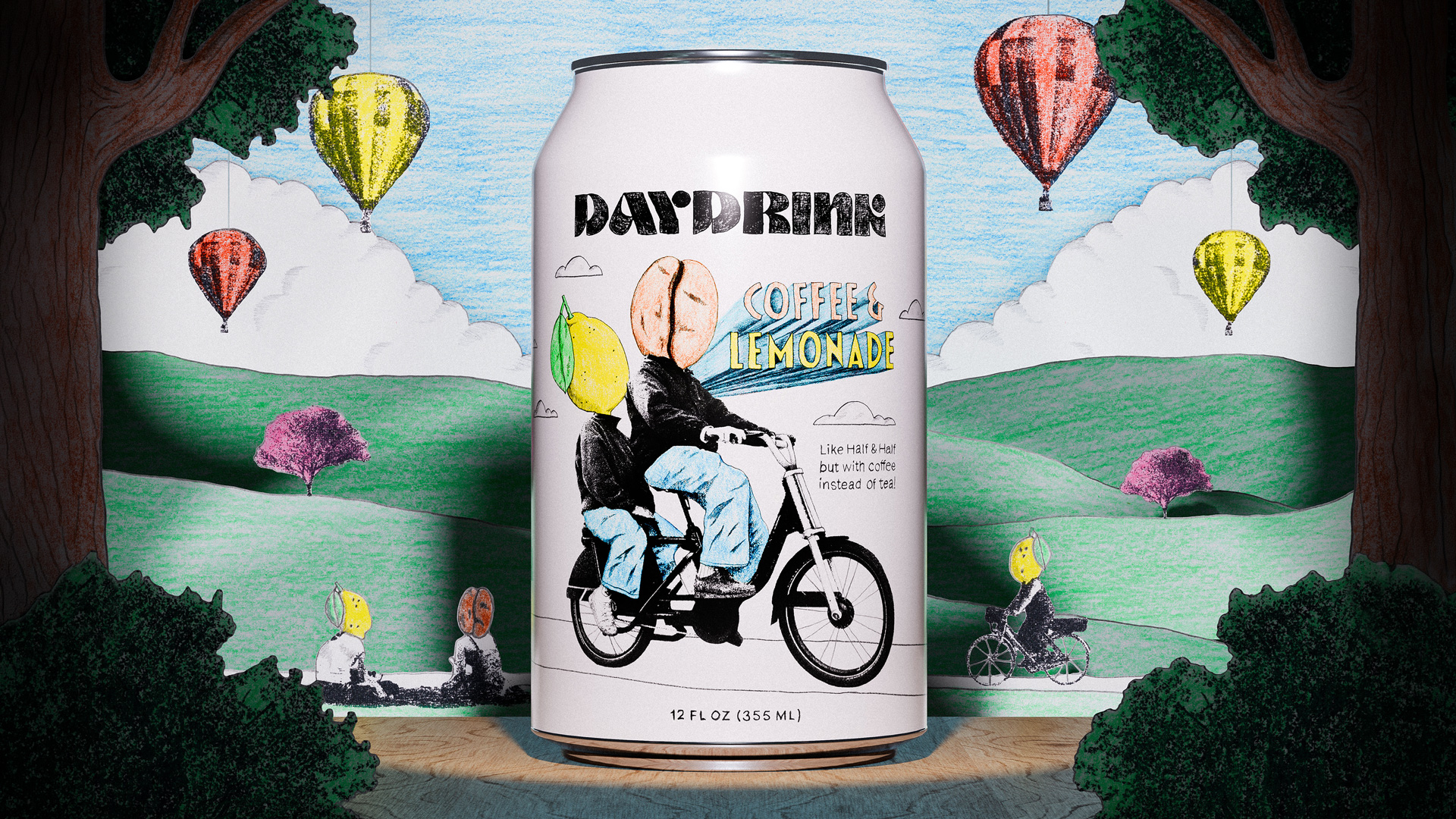
Inspired by the techniques and patterns of printing techniques, nu studio designed Alive’s packaging with grit, texture, and mystery. The coffee beverage company values new experiences, and the packaging reflects this. The 60s inspired psychadellic typography and lack of color work together to create a beautifully myserious system that begs consumers to learn more. It’s a simple design, but the textures and patterns add a sense of depth that create interest and allow this modern brand to feel charming.

I’M ALIVEEEEEE!, the first true sign of a new day starting. This is not the moment when we open our eyes, no… this is only achieved when our first cup of coffee truly kicks in. It is this particular high, when dreams finally fade, where the name Alive! comes from.