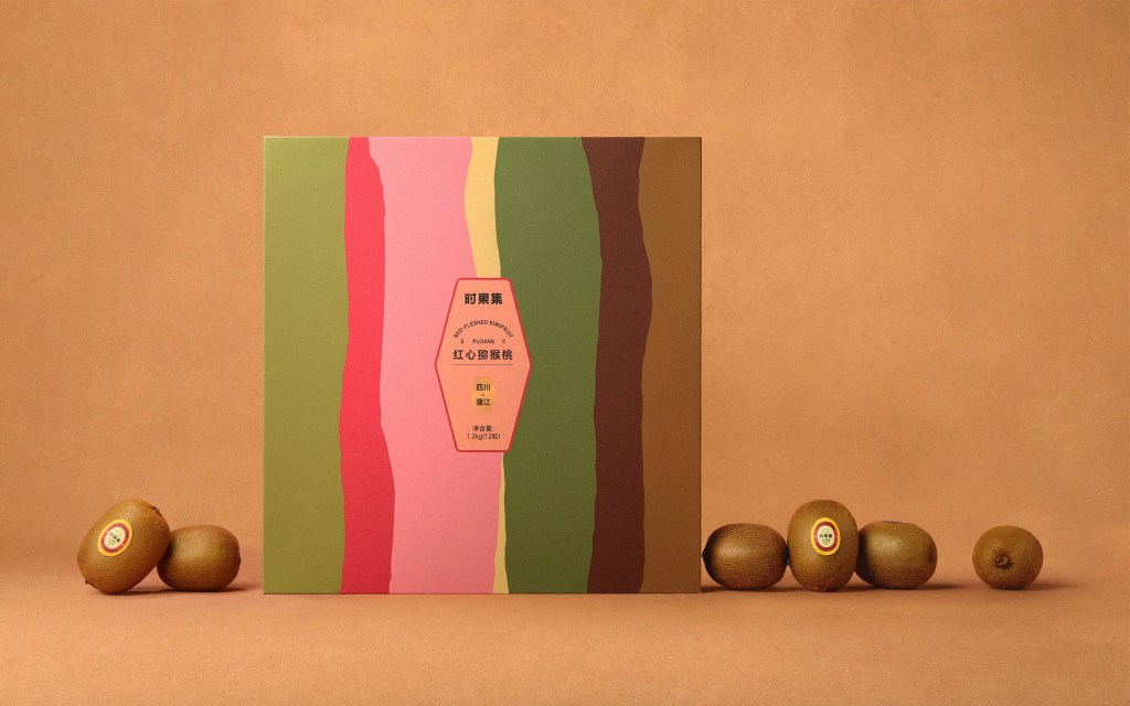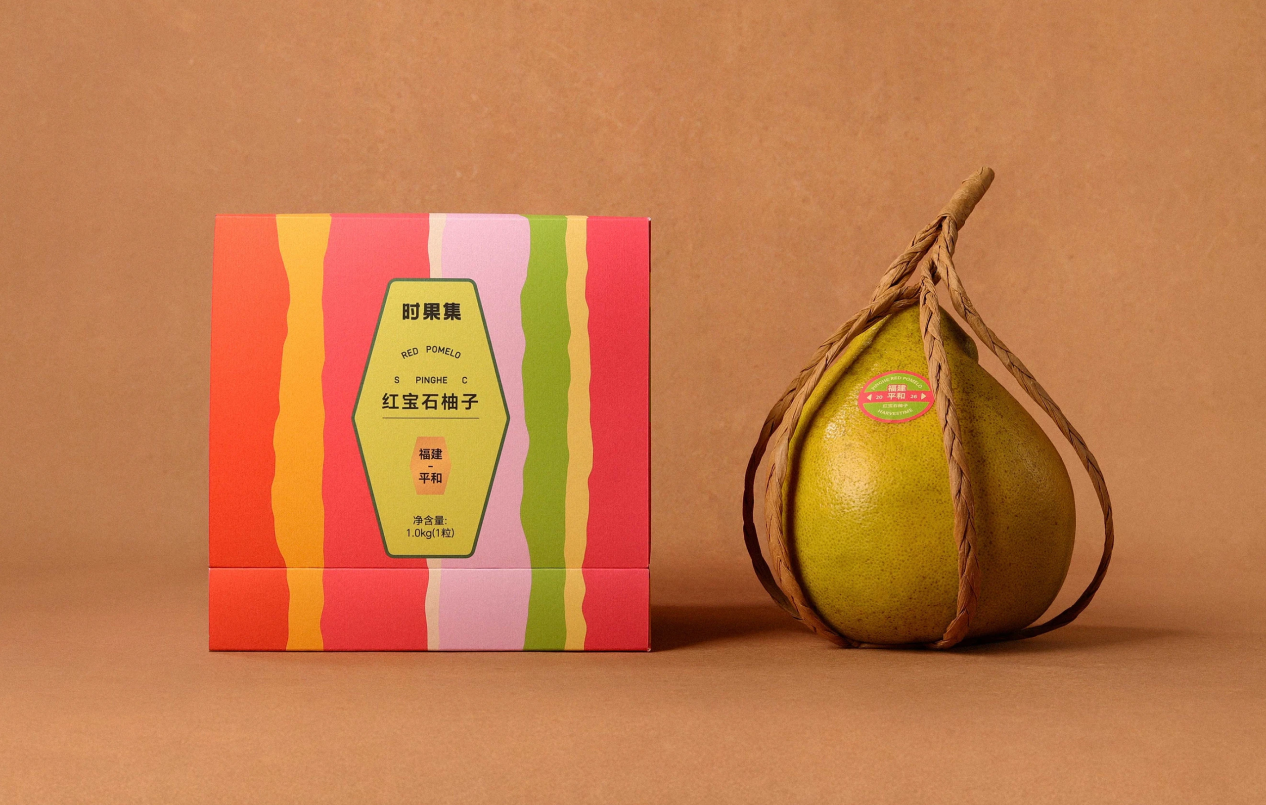
Premium fruit gifting typically stays in a more refined world, but embracing earthy palettes and expressive abstraction is a different take, and Fungo Design’s Harvestime turns the packaging into a colorful portrait of seasonality. Wavy vertical bands borrow from soil, regional landscapes, and sliced fruit, moving through moss green, kiwi pink, citrus yellow, clay red, and deep brown to connect ripeness with the land it comes from. The irregular shapes have a cut-paper simplicity with a touch of midcentury graphic design, giving traditional ideas about seasonal eating a surprisingly contemporary place in CPG. Clean, straightforward typography keeps all that organic movement grounded. Where premium fruit packaging can lean ornate or overly polished, Harvestime makes nature itself the decoration, turning soil, sunlight, and the changing seasons into something you would want to unwrap.