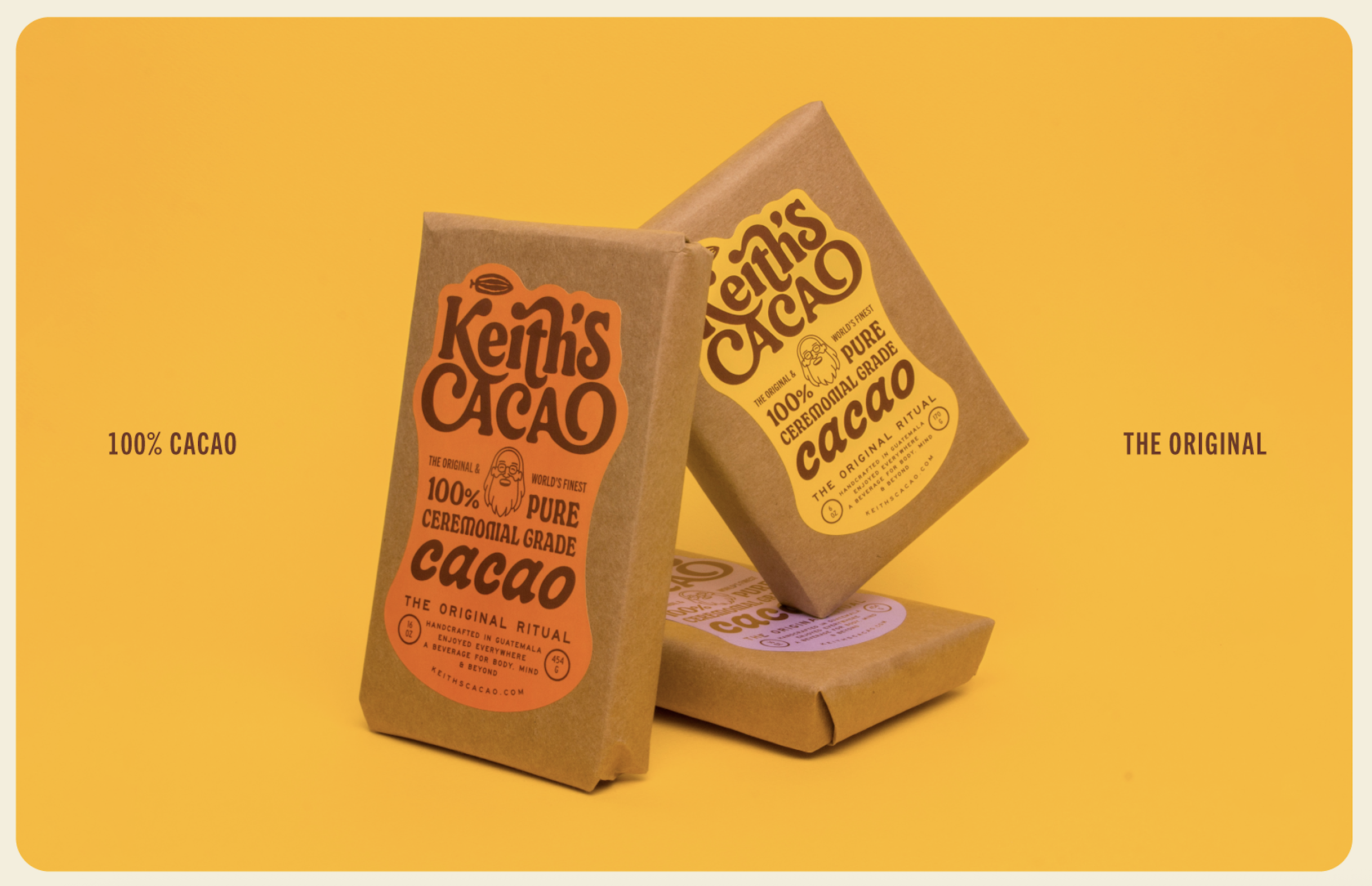
Keith’s Cacao shows how much rich personality can live inside something handcrafted.
Kinoto Studio keeps the kraft paper used for hand packing in Guatemala and gives it a boost of playful energy, adding a more spiritual note to the palette. The curving Art Nouveau-inspired lettering has a loose quality, with swirling forms drawn from the motion of stirring cacao. While Keith’s illustrated portrait connects the pack back to the person, place, and community behind it, the branding lands squarely in the shift toward expressive typography and founder-led storytelling. The earthy materials and playful label shapes, however, keep it far from the overly polished wellness aesthetic that has stripped the shelves of quirky, human-driven personality.
Luciano Geoffroy, co-founder of Kinoto Studio, gets into the design thinking below.