Featured image for Meralan Takes Inspiration From Women Who've Changed The World

Meralan Takes Inspiration From Women Who've Changed The World

by Chloe Gordon on 03/11/2022 | 3 Minute Read

Editorial photograph

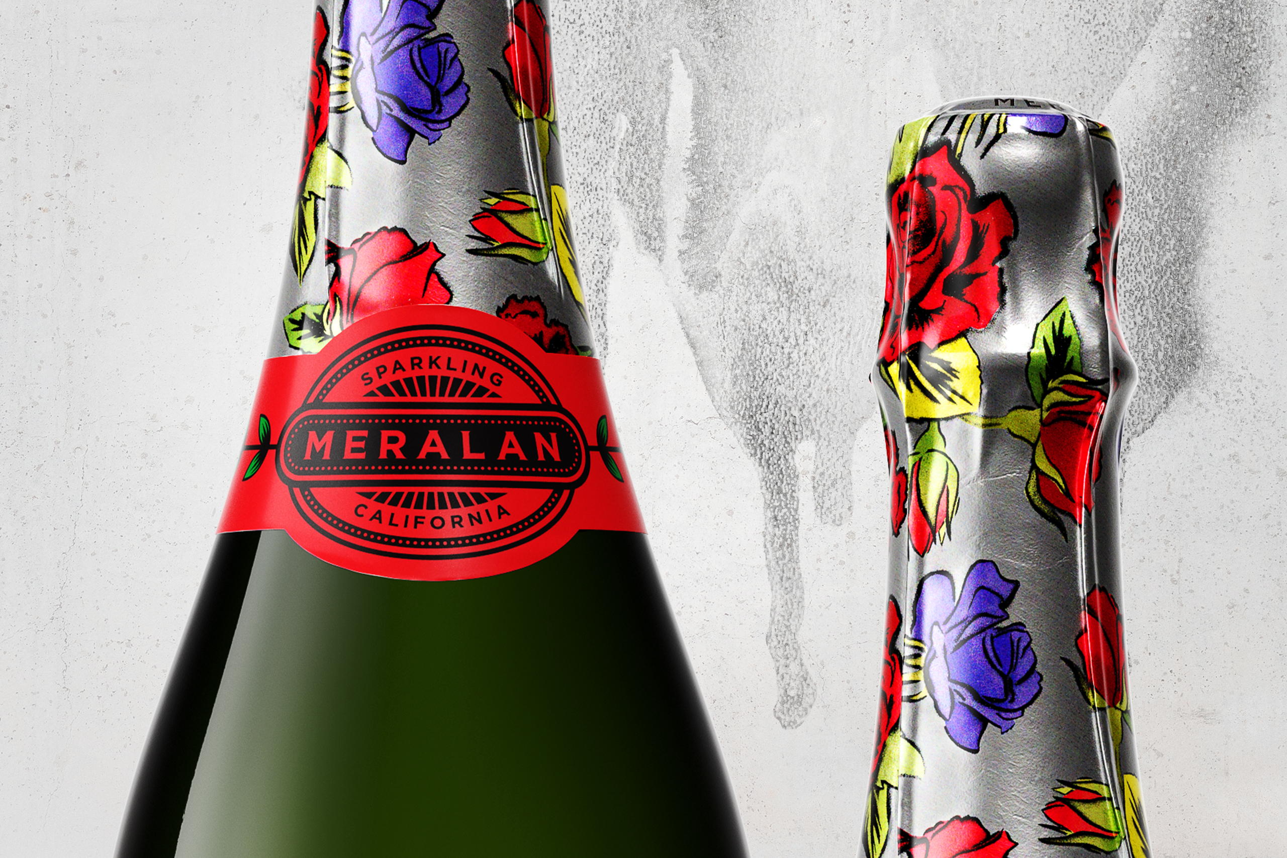
Client’s Brief: Develop a breakthrough brand and packaging solution for a lifestyle sparkling wine that represents the modern, vibrant, free-thinking millennial woman. Priced $16 but looks like $30. 

Creative inspiration behind the packaging: Consumers today are drinking more sparkling wine than ever before. The growth of affordable, quality wines presented an opportunity to create a new-to-world brand for a consumer that looks for authentic experiences and expects depth from the brands they invest in. 

Editorial photograph

Flower crowns were the original statement piece, worn when women gathered for fertility rites and spring festivals, they are a symbol of the female community, a safe time and place for women to flourish, be themselves, and feel appreciated. 

Over time, the flower crown has become a symbol for a different kind of power - more gentle and inclusive - a true rebellion in a hard world. This inspired our design idea: The Elegant Rebel. 

Our heroine Meralan (MERA – admirable, wonderful, prosperous in Hebrew, ÉLAN – energy, style & enthusiasm in French) is the distilled essence of The Elegant Rebel. 

Editorial photograph

Inspired by women who changed the world through soft power like Mona Lisa & Frida Kahlo, her calm yet resolute face radiates strength and gentleness. Her neutral features can be applied to multiple ethnicities, which makes her an icon of inclusivity. Her eyes look directly at you, provoking a response calling you to action. 

The timeless, impactful themes of artist Obey (AKA Shepard Fairey)’s work resonated with us when building the brand's foundations, so we partnered with Fairey’s design agency Studio Number One to illustrate the portrait of Meralan in his signature style. 

The pack design strikes a balance of classic and contemporary by using a mixture of mediums. The main label is printed on brushed metal stock and is built in an art deco style with details elevated through embossing. 

Accents of red are used as an overall brand color. Associated with power, desire, and love, the red rose has the noble title of the Queen of Flowers. 

The branding and packaging inspiration for Meralan was inspired by the flower crown. 

The types of flowers captured on the hoods were carefully chosen for what they represent (Purple roses: Elegance and sophistication, Red roses: Feminine strength and passion, Red carnations: Admiration). 

These were expressed in stencil art following inspiration from our collaborator OBEY (Studio No.1), to bring a rebellious expression to the packaging and help to build an off-pack brand behavior. 

The use of a silver color palette brought an ownable colorway and set Meralan apart from the competition while adding freshness and energy against the accent of red. 

Editorial photograph