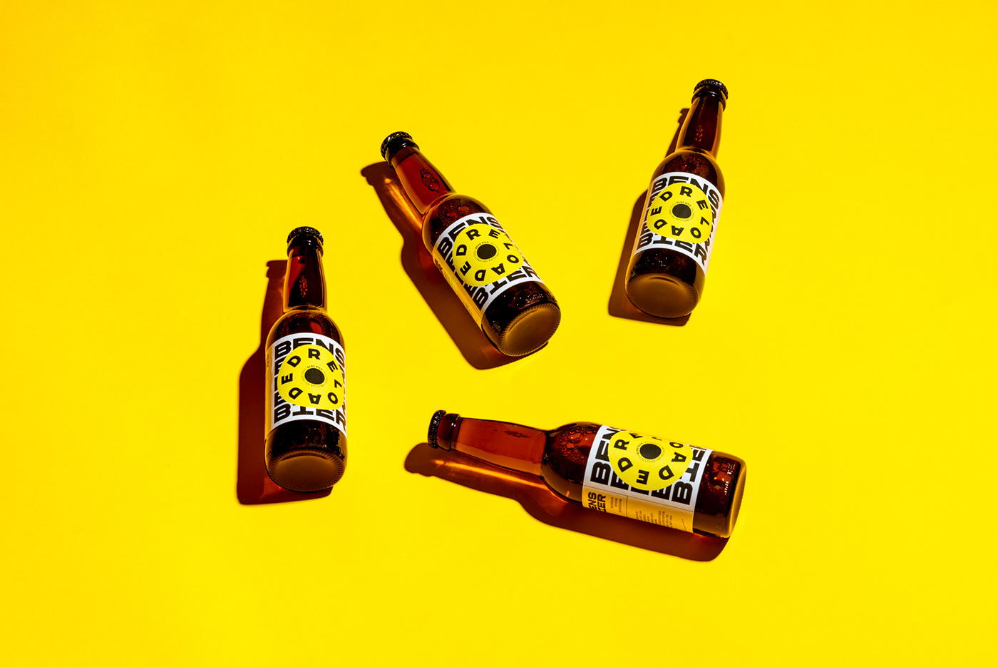
Yellow is often considered a color of happiness, and when you take a glance at Bens Bier’s packaging of Reloaded, you’ll see why. With typography that can only be described as bold, this is a beer that you won’t possibly be able to shy away from. Designed by Lukas Diemling, the reloaded beer is inspired by a revolver wheel, but instead of bullets in the rotation, letters are spelling out “Reloaded.” This is clearly a beer loaded with attention to the details, making for a striking design.

Bens Bier Reloaded is the second release of the local start-up brewery Bens Bier. Based on the impactful design of the first edition the new label design of the reloaded beer is inspired by a revolver wheel. The bullets in the wheel are replaced by letters which results in an eye catching and fully loaded visual for the second edition. The striking visual language is applied onto further promotional materials like posters and merchandise.