- Keurig Dr Pepper (KDP) has announced a new formula and brand identity for 7UP in North America.
- The new packaging was designed by Deutsch, led by KDP’s design team, and is the brand’s first major update in over 15 years.
In the shadow of the Cola Wars is the fight for lemon-lime soda supremacy. While Pepsi and Coca-Cola duke it out, the lemon-lime space has been more interesting and more competitive, with a multitude of brands battling for the top spot in the category, and some leaving for good, at least in the US, like Teem. In contrast, others have relaunched after disappearing, like Slice, but have repositioned themselves as a “healthy” soda. Unlike colas, there are three constantly competing at the top in America: Coca-Cola’s Sprite, PepsiCo’s Starry, and Keurig Dr. Pepper’s (KDP) 7UP.
Following PepsiCo’s launch of Starry in 2023 and the recent refresh of Coca-Cola’s Sprite, KDP has announced a revamp of “uncola” OG 7UP for North America (in the rest of the world, 7UP is marketed by PepsiCo).

The latest update to the lemon-lime contender, and its first in 15 years, tweaks the flavor to be more lime than lemon to differentiate itself from Sprite and Starry.
“This is a bold reinvention of one of America’s most iconic soda brands for a new generation of consumers, starting with the flavor itself,” said Drew Panayiotou, chief marketing and innovation officer at Keurig Dr Pepper (KDP), via press release. “7UP has an incredible legacy, but by giving lime the spotlight, we’re rewriting the rules of the lemon lime category. We are transforming a beloved heritage brand into a modern disruptor, delivering a sharper visual identity, a more refreshing taste experience, and a distinct position that attracts new users and deepens brand loyalty.”

According to a KDP spokesperson, the packaging design was done by Deutsch with oversight from James Sommerville, KDP’s chief design officer.
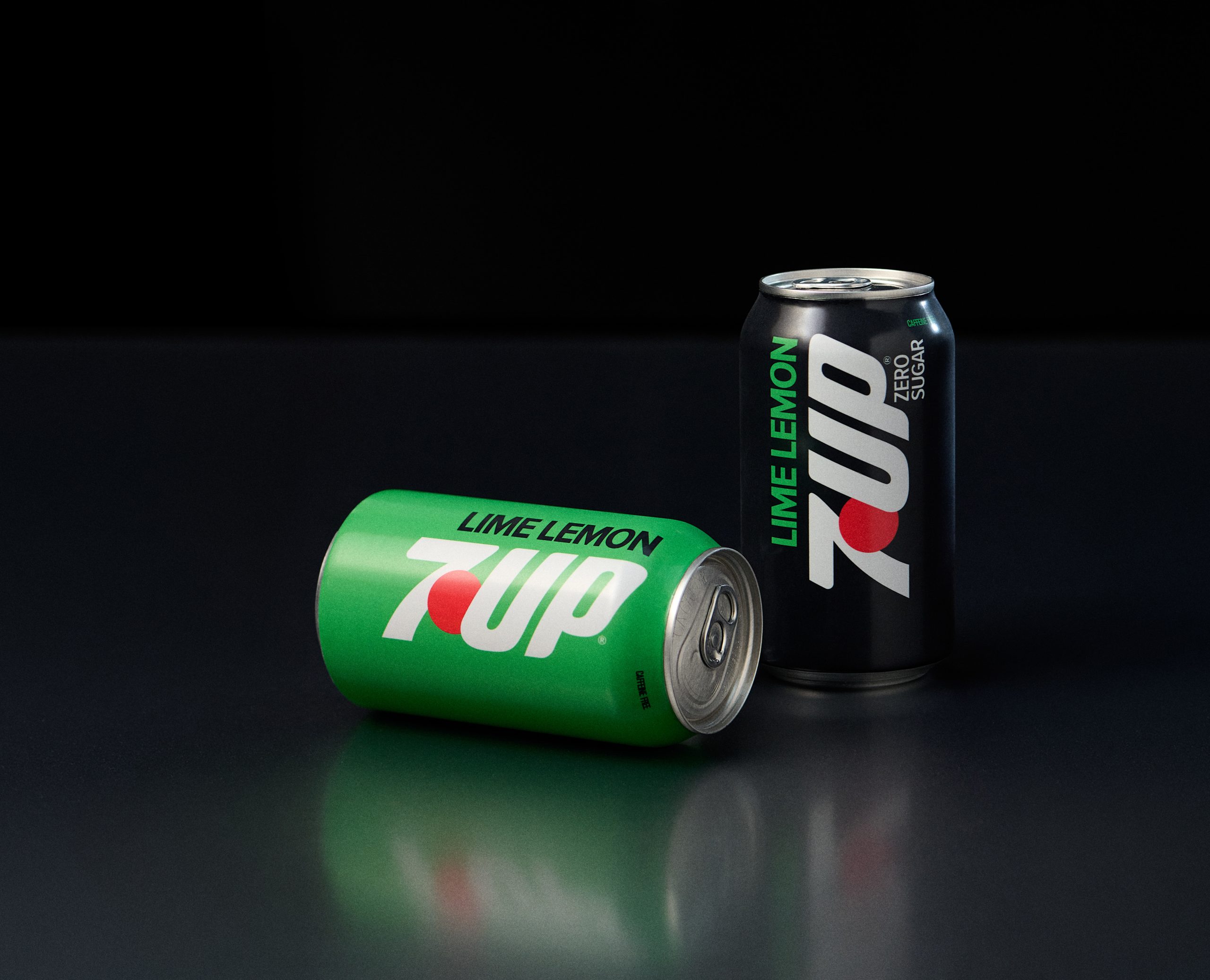
The new 7UP logo is sleeker, losing the letterforms’ waviness but retaining the signature red dot. On the revised packaging, the logo is placed vertically, and the backgrounds are now solid colors devoid of bubbly graphics and citrus wedges. Flavors are communicated above the logo, such as Cherry and Lime Lemon, the latter a deliberate way to signal the new formula’s lime-forward change. Zero sugar is placed below and at the end of the logo. With a sense of speed and aerodynamics in the new look, there’s almost a hint of automotive design in the new refresh, especially against the new solid backgrounds.
KDP is introducing the new 7UP with a campaign called “Flip the Sip,” developed by creative agency BBH. According to KDP, the new Lime Lemon 7UP will start rolling out this month at stores where the soda is sold.
It remains to be seen whether KDP’s new brand identity and lime-forward formulation will unseat segment leader Sprite. Still, it gives 7UP a distinctive edge amongst its lemon-lime brethren, with something familiar yet different enough for consumers to reach for when they’re thirsting for a zesty, citrusy alternative to cola.