A Minimalist Design and Complicated Printing for Woodker Vodka
By
Published
Filed under
By
Published
Filed under
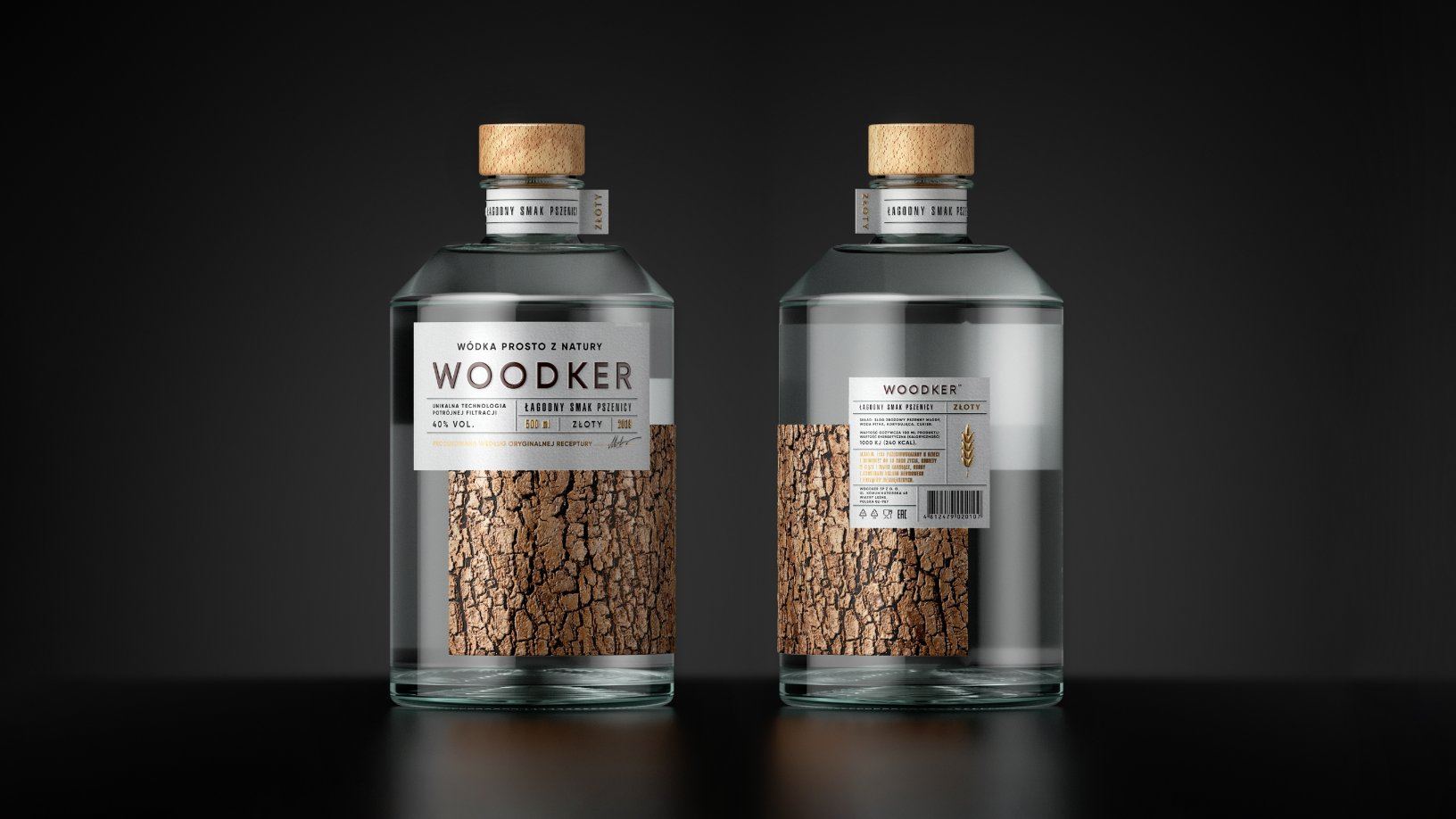
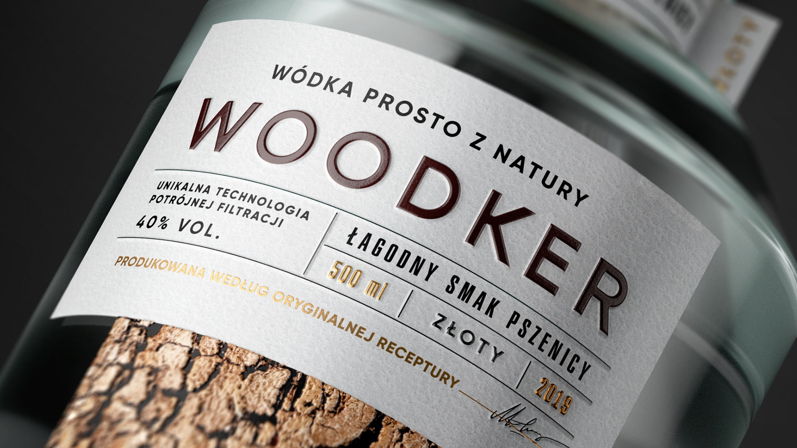
There are some vodkas in this world you would hop on a plane to try. And there are some you want to gaze at in awe.
Woodker, with its complex and tactile printing process, manages to look like PG Branding slapped a piece of bark on every bottle. And yet, even with this element of nature seemingly affixed to every label, they managed to make the packaging feel utterly minimalist:
Get unlimited access to latest industry news, 27,000+ articles and case studies.
Have an account? Sign in