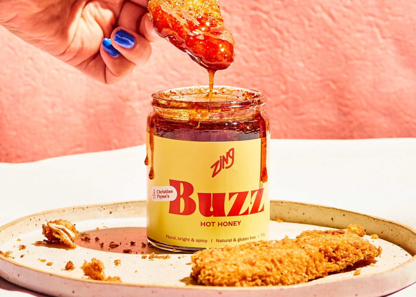
Designer Marissa Korda worked with Zing to help the brand redesign its packaging system. The new design leans into the punchy, vibrant flavors within, showcasing bright colors, playful typography, and enough personality to set this brand apart from crowded shelves instantly. Each product’s typography system leans into its individual qualities, but the line feels cohesive, with the same format for each.
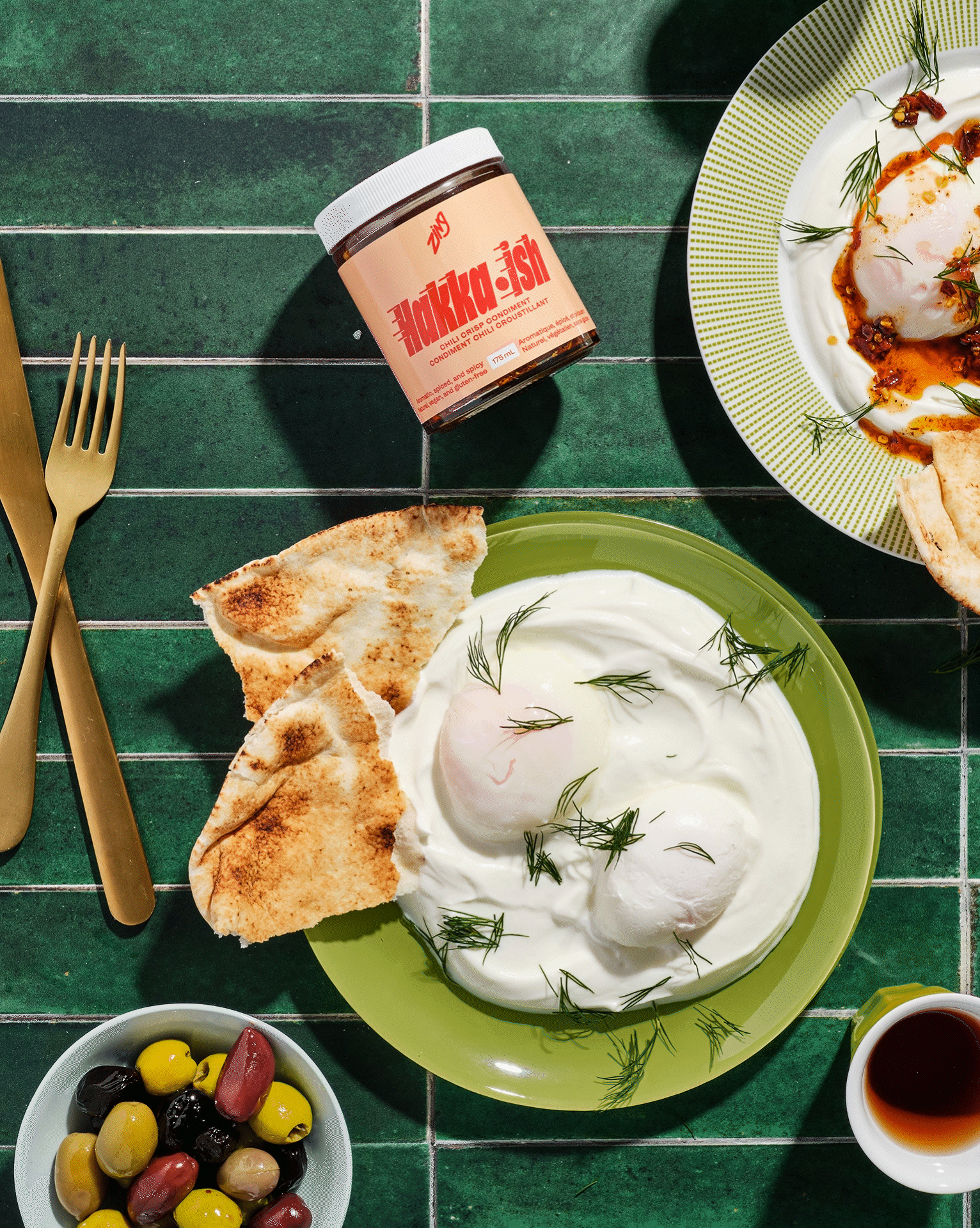
Zing wants to make everyday cooking more fun. Their one-of-a-kind sauces and seasonings are designed to be pantry shortcuts – they add a punch of flavour to any meal and help cooks of all skill levels get excited about cooking at home. This punchy and vibrant redesign by Marissa Korda is full of flavour, using bright colors and custom typography to express the uniqueness of each product in the Zing lineup.