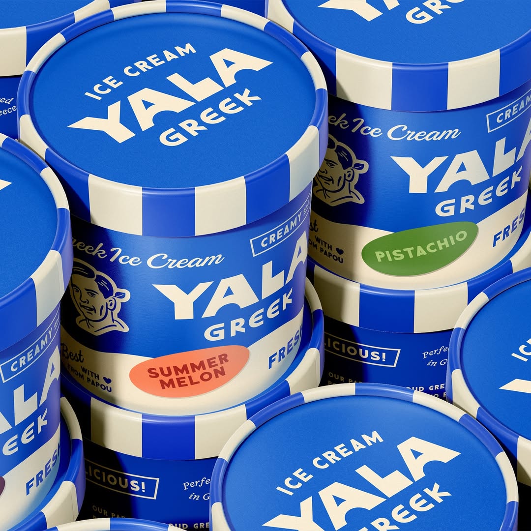
We recently saw a massive spike in Italian-inspired packaging design, but if I had to bet on the country we’d be pulling inspiration from next, based on one design alone, it’d be Greece, thanks to Herefor’s packaging design work for Yala.
But if there’s one thing difficult about the ice cream category, it’s that almost always you have a wall of frosted glass separating your product from the consumer. This ice cream brand’s packaging is built to work hard in the freezer aisle while still leaving room for storytelling.


“Greek heritage is central to Yala, but we were very intentional about what kind of Greek story we told,” shares Ryan Hammond, creative director of Herefor. “Rather than relying on more traditional and ‘expected’ visual cues like columns, waves, patterns, or heavy iconography, we focused on bringing to life values that are rooted in Greek culture: generosity, pride, and warmth.”
Across cartons, pints, and variety packs, the design relies on clarity to initiate recognition at scale, creating a system that reads boldly from a distance, key for the freezer aisle, and rewards closer inspection with thoughtful details.

The most immediate impact is color. A saturated blue paired with a warm cream dominates every format, separating Yala from the visual noise of most ice cream packaging. This palette does double duty. It successfully references Greek design accents without ornamental shortcuts, but flavor differentiation is handled through secondary accent colors; melon orange and pistachio green, for example, are applied sparingly in oval-shaped labels.
Typography also does much of the heavy lifting. The Yala wordmark is oversized and bold, occupying prime real estate on both boxes and pints. Its geometric weight ensures legibility even when stacked or partially obscured.
“We landed on a wordmark that referenced the hand-painted signage of early 20th-century Greek American soda shops and ice cream parlors mixed with a subtle ornamentation that cues historical Greek architecture,” shares Hammond. The hierarchy is clear and consistent, allowing shoppers to understand the product in seconds.
Striping plays a key structural role, particularly on the pint containers. Vertical blue-and-cream bands wrap the tubs, creating a rhythm and reinforcing brand recognition even when the lids are the only visible surfaces. The lids themselves mirror this approach, using solid blue fields with centered white type to maintain consistency when viewed from above.

Illustration is used selectively but purposefully. A simplified portrait of Papou, the founder’s grandfather, appears on select panels, rendered in a single-line style that integrates seamlessly with the rest of the graphics. “The story of Papou became our anchor,” Hammond notes. “His approach to life and his warm, welcoming persona guided every design decision. We translated that into a visual language that strived to be unfussy, honest, confident, and human.“
Across every touchpoint, the packaging prioritizes confidence, readability, and discipline—proof that a tightly edited system can still carry a deeply personal story without saying too much.

“Our job was distilling all of that into a clear system without diluting the story or overwhelming the design,” shares Hammond. “We wanted the full narrative to come through, but we recognized that we had to be selective, ensuring that the most important ideas were expressed in an intentional way that allowed the brand to feel confident, clear, and, ultimately, worthy of Papou’s legacy.”

















