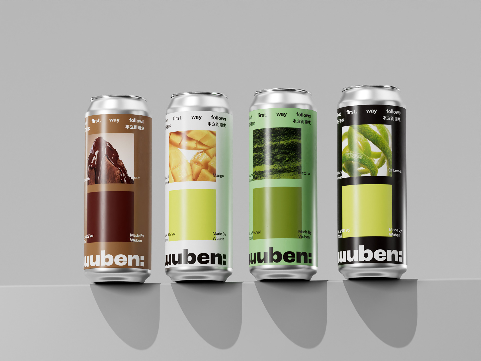
Wuben, by Pigeon Studio, is one of the most interesting examples of where craft beer packaging is landing right now. The core identity is built around a clean white ground with the “wuben” wordmark at the base of each can in a wide, heavy grotesque. It’s rich and editorial in the way of a cookbook or a magazine spread, while a flat color swatch in the corresponding flavor tone fills the bottom half, creating a system that’s distinctive. In a craft beer category still largely dominated by Western illustration traditions,
Wuben is creating a design system rooted in Confucian philosophy and Chinese typographic distinctiveness, making it one of the freshest things on a craft beer shelf.