WHEN’s Packaging Demystifies Fertility Testing With Approachable Design
By
Published
Filed under

Published
Filed under

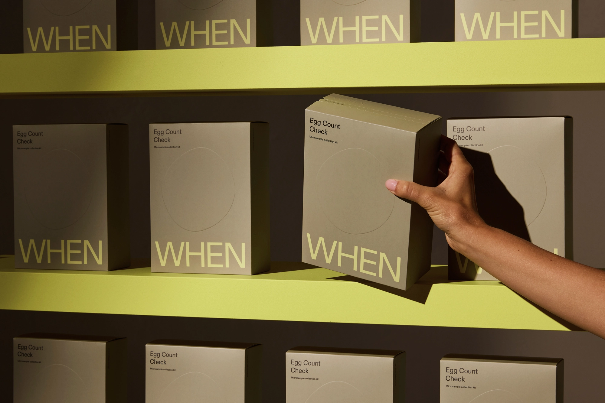
Universal Favourite‘s packaging for WHEN strips away excess, leaving a design that’s deliberate and introspective. The muted olive exterior, punctuated by soft neon typography, creates a striking contrast that’s grounded yet forward-looking.
Embossed details, like the subtle circular motif, allude to cycles, time, and fertility without being overt. The typography is minimal but firm, reinforcing trust and clarity. Every detail, from the perforated reveal to the soft matte finish, invites interaction with a sense of quiet confidence.
Joy Li, the designer at Universal Favourite, shares more about the thought process behind the intentional packaging design below.
Add project credits with Dieline PRO | Log in
Get unlimited access to latest industry news, 27,000+ articles and case studies.
Have an account? Sign in
To provide the best experiences, we and our partners use technologies like cookies to store and/or access device information. Consenting to these technologies will allow us and our partners to process personal data such as browsing behavior or unique IDs on this site and show (non-) personalized ads. Not consenting or withdrawing consent, may adversely affect certain features and functions.
Click below to consent to the above or make granular choices. Your choices will be applied to this site only. You can change your settings at any time, including withdrawing your consent, by using the toggles on the Cookie Policy, or by clicking on the manage consent button at the bottom of the screen.