What Does Packaging For A Mood Boost In A Can Look Like?
By
Published
Filed under

By
Published
Filed under
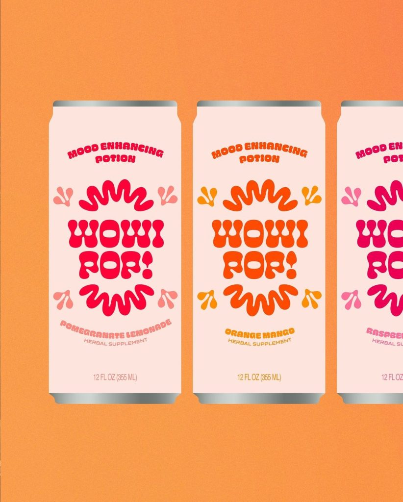
Wonderkind‘s packaging design for Wowi Pop leans into the brand’s retro, mood-enhancing vibe through playful typography and a vibrant color palette. The bold, funky lettering and warm, poppy colors are meant to reflect the energy of kava, the mood-altering ingredient, while simultaneously supporting a clean, simple look. This balance between playfulness and sophistication gives Wowi Pop an elevated yet approachable aesthetic, a balance that’s often hard to come by in the supplement market.
Get unlimited access to latest industry news, 27,000+ articles and case studies.
Have an account? Sign in