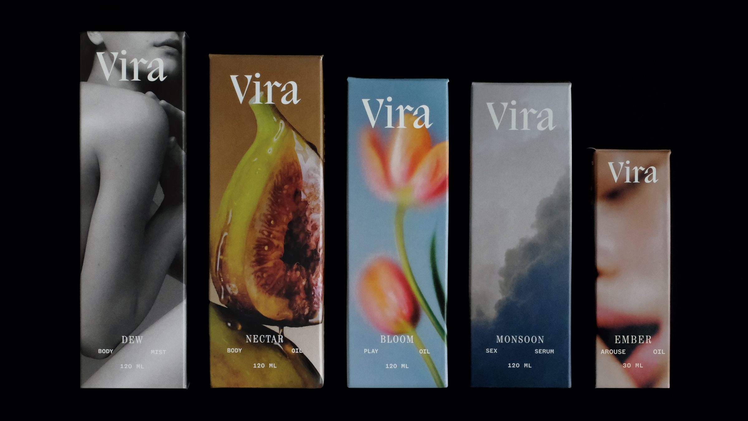
- Vira replaces typical cheeky or clinical sexual wellness branding with a calm, mature, care-focused aesthetic.
- Soft typography, muted colors, and subtle imagery emphasize mood and sensation over explicitness.
The sexual wellness aisle has developed a very specific visual language over the past decade.
Products tend to land in one of two camps. They’re either aggressively cheeky brands that treat intimacy like it’s a punchline, or hyper-clinical ones that feel more like over-the-counter medication than something connected to intimacy. In both cases, the design tells you what it is rather than showing it.