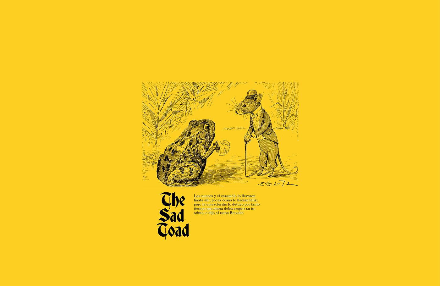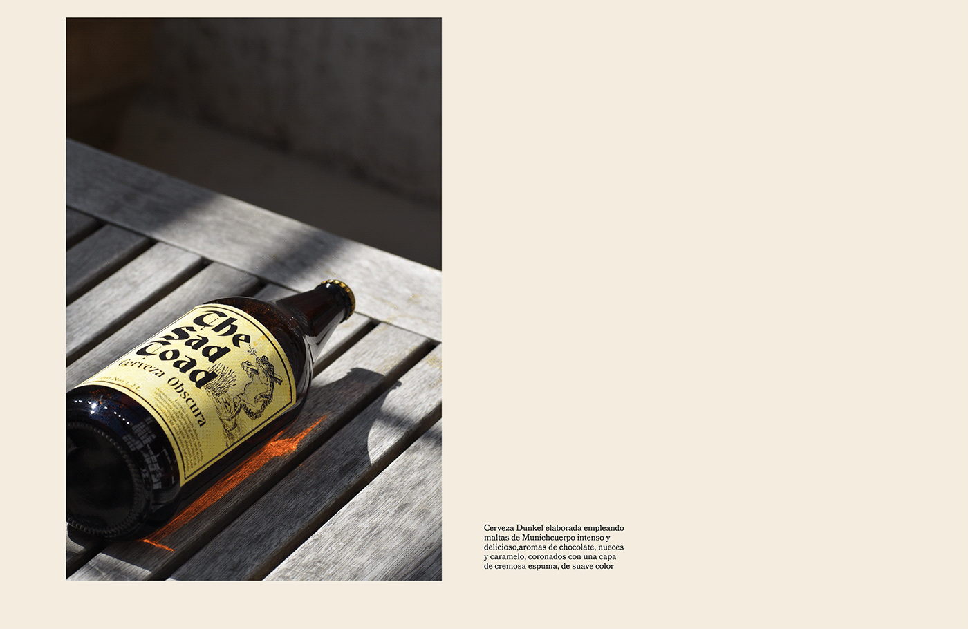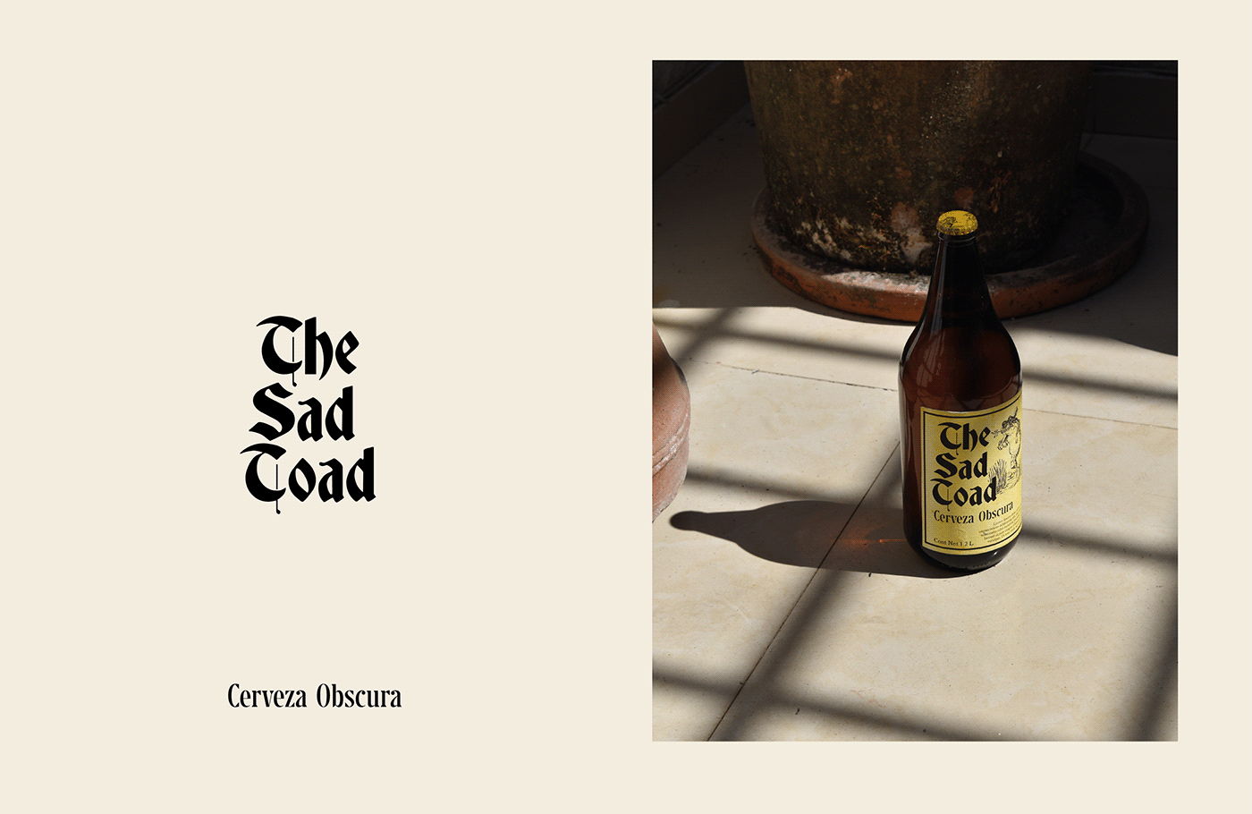
There’s something inherently ominous about naming a beer “The Sad Toad.” However, when paired with an intricately illustrated label and bright yellow hues, the ominousness transforms into a childlike state of glee. Designed by Lou Perez Sandi, it’s evident that these nuances were intentional and purpose-driven. As humans, we’re constantly battling the neverending questioning of self the endless juxtapositions of humanity, and The Sad Toad’s packaging is a representation of the struggle, beautifully represented.