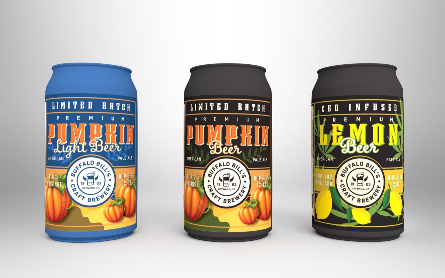
Creating a line of beers that look cohesive yet represent the vastly different flavors from type to type is a daunting feat. Gurvinder Kaur was tasked to redesign the packaging for an already existing beer brand, and she ultimately chose a beer brand known for its intricate flavors. The result is a line of packaging that instantly allows the flavors of each beer to shine through from the illustrations and color palettes that she aptly chose. While each can and bottle is unique on its own, when placed next to one another, it’s clear that they are all from the same brewery. Now, hand me a Pumpkin Beer, please!
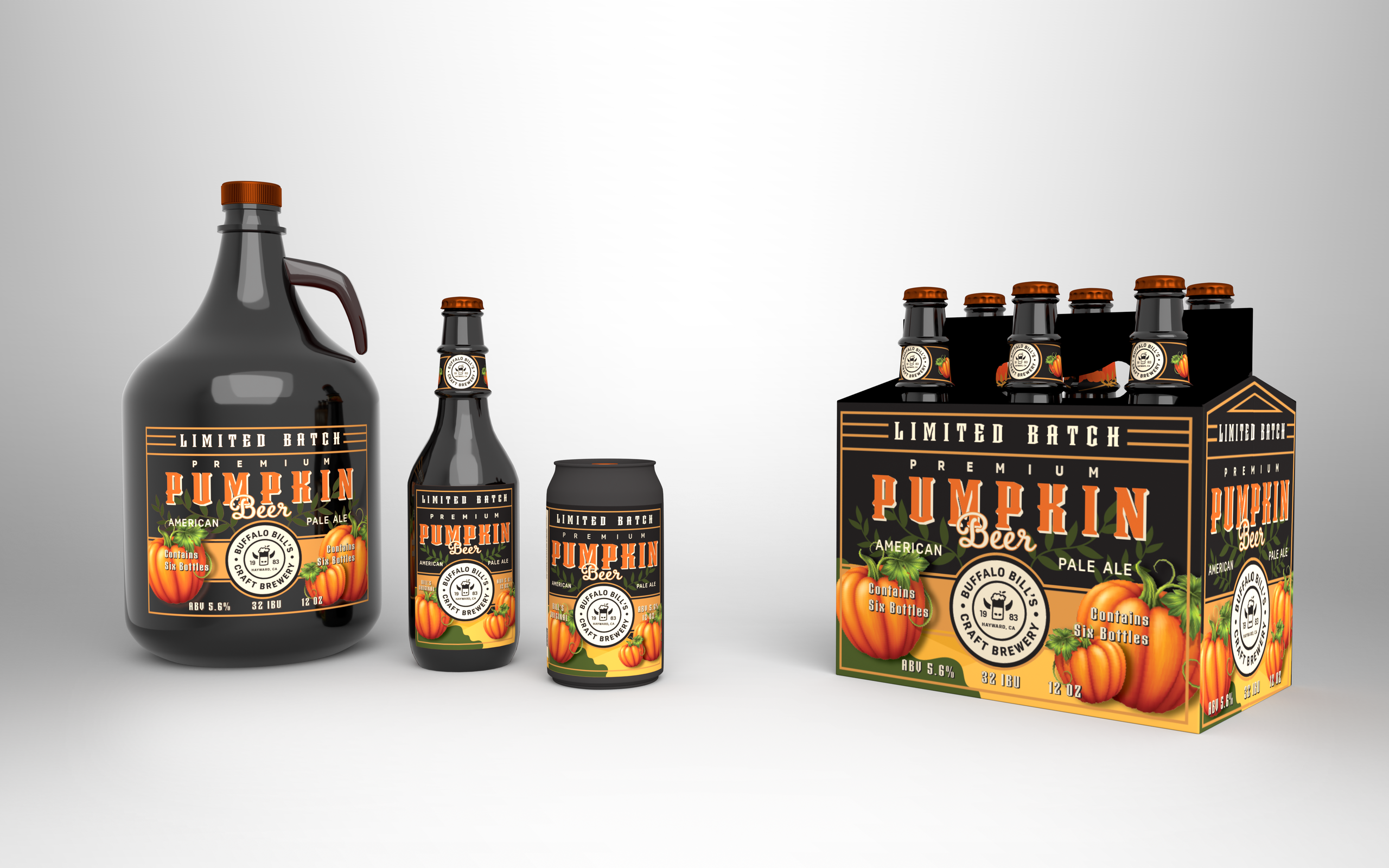
The objective was to redesign packaging for an existing beer brand. To understand the market of beer packaging & other beverages. Researching the chosen brand and their current packaging. Learning about different materials and techniques used in packaging design. To create a packaging that resonates with the brand itself.
















