
Inspired by the distillery’s location in Bethel, New York, close to where the original Woodstock music festival took place in 1969, Peace Vodka’s packaging visualizes the movement. Designed by Pulp & Pixel, the packaging system is entirely driven by late 60s and early 70s visual signals, with glowing, multicolored artwork and strong yet simple typography.
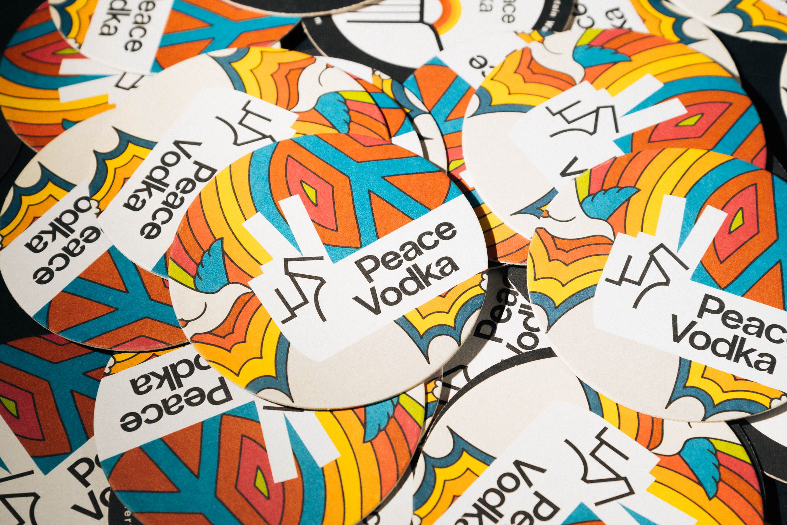
Our design for Peace Vodka is in fact a re-design — the spirit had been in production for over 10 years under previous ownership. The name Peace Vodka is a nod to the distillery’s location in Bethel, New York, a stone’s throw from where the original Woodstock music festival took place in 1969.

















