Rocky’s Matcha Sticks Looks Like They Belongs in Your Back Pocket
By
Published
Filed under
By
Published
Filed under
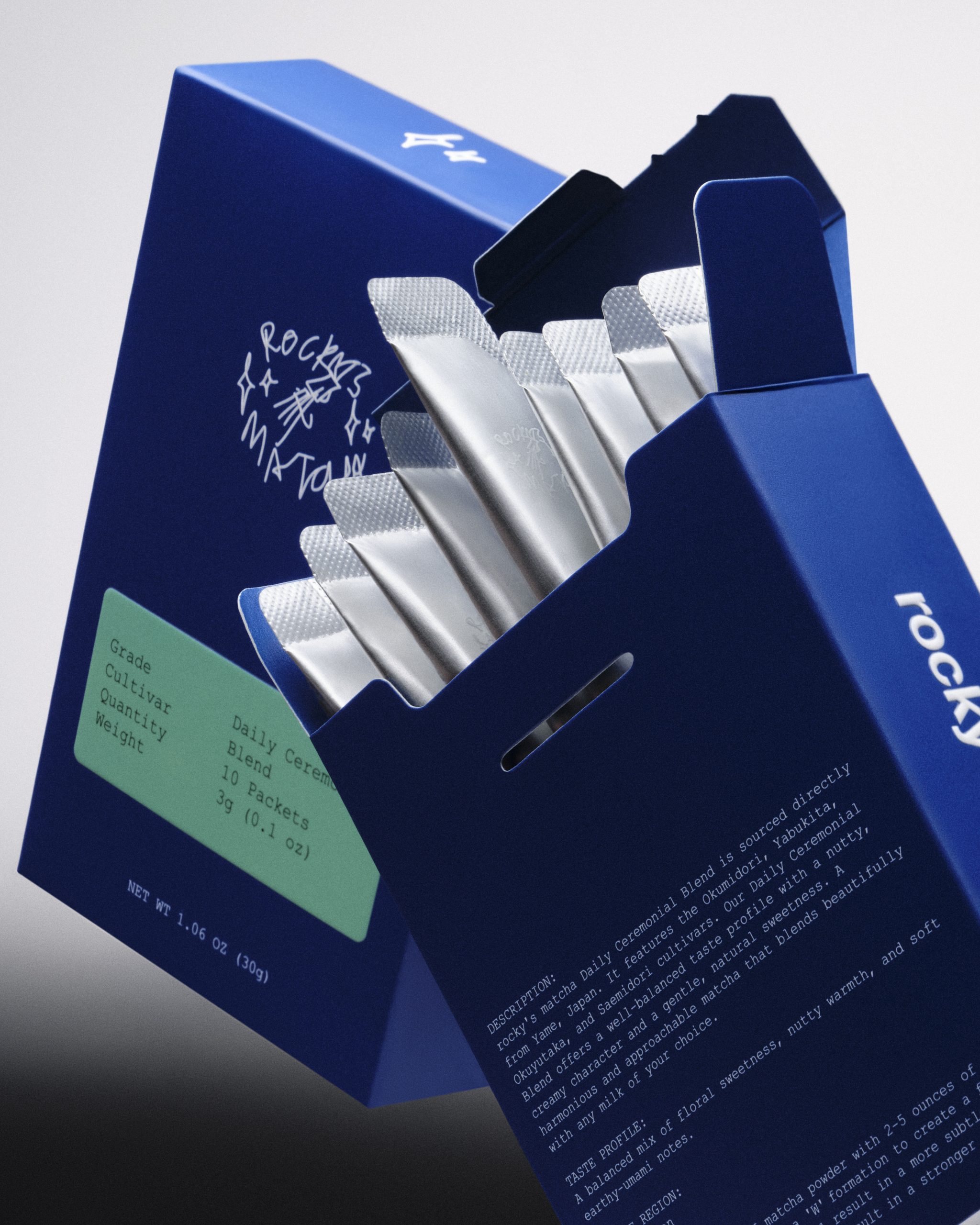
Matcha packaging often either leans into precious Japanese minimalism or overly wellness-coded aesthetics. But Rocky’s matcha is bringing a subtle edge to the space with individual stick packets that are matte silver mylar printed with a loose, scrawled handwritten logo that feels like a sketchbook note. Designed in-house, the outer box goes deep cobalt blue, a color that feels more like streetwear than a beverage.
The cigarette-style flip-top box structure keeps ten silver stick packets fanned out like a pack of smokes, which is both a functional choice and an aesthetic one. In a matcha space racing to keep up with TikTok’s on-the-go preparation obsession, Rocky’s is meeting the consumer where they are.
Get unlimited access to latest industry news, 27,000+ articles and case studies.
Have an account? Sign in