- Design agency Sister Mary redesigned Labatt’s US packaging to celebrate the brand’s shared Canadian heritage and US presence.
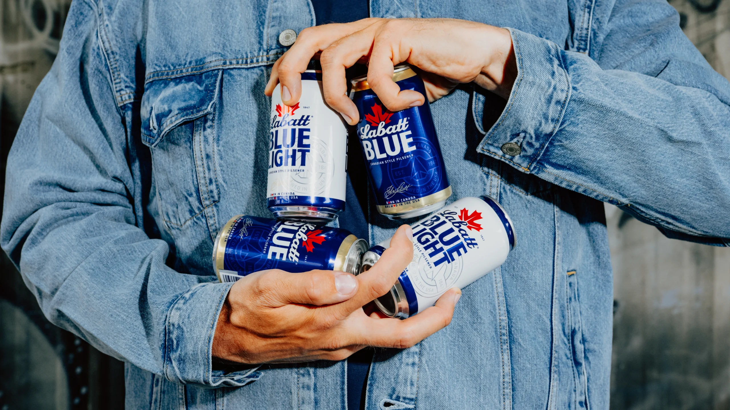
- The visual overhaul introduces an enlarged logo and maple leaf, a diagonal slash to symbolize cross-border connection, and contrasting gold detailing to stand out in the crowded domestic beer aisle.
Labatt might not be Canada’s oldest brewery—that would be Molson—but it’s certainly its largest. Founded in 1847, the Ontario brewery was almost confined to the history books because of Canadian Prohibition, but it managed to survive by selling beer to its Southern neighbor, the US. Though both countries’ temperance laws overlapped from 1920 to 1927, it ultimately helped keep the brewery afloat while garnering a legion of fans in the States.
Labatt is also very much sold and brewed here in the US (Rochester, to be specific) and is part of FIFCO USA’s stable of brands.
Recently, the beermaker sought the help of agency Sister Mary to refresh its packaging system and brand identity here in the states, something that not only spoke to its 179-year history but also improved its standing in the immensely crowded US domestic market.

The problem, as they saw it, was that there was far too much blue (cough, Bud Light, cough). To shake things up, the brand wanted to talk up its Canadian provenance while injecting it with a little more vitality. However, instead of just talking about its Maple Leaf-bearing roots, they wanted to dive into the brand’s cross-cultural codes, the “natural back-and-forth” amongst friendly neighborhood rivalries and drinking buddies.

“Friendly rivalry became the unlock for the entire brand,” said Emily Cristoforis, Head of Strategy at Sister Mary, in a press release. “As a kind of dual citizen, the brand has permission to champion the epic relationship between the U.S. and Canada, while fuelling the friendly rivalries that bring people together across all walks of life. That created a broader cultural role for Labatt rooted in playful banter, competition, and connection.”
Now, the Labatt name takes on more significance and has been enlarged, along with the brand’s other greatest asset, the maple leaf. To introduce a greater sense of heritage, they have also added the signature of Labatt’s founder, John Labatt, and an even clearer established mark. You’ll also find refined typography and some additional gold detailing, which, while seemingly minor, does help take the brand—and specifically Labatt Blue—out of the “blue beer” cooler wasteland. While gold typically signals premium, I’d say it just adds some much-needed contrast.
Additionally, they have added a new diagonal graphic device that draws heavily on the logo’s italic angle. According to the agency, it’s a “subtle expression of borders, contrast, and connection,” adding to the Canada-US relationship. What’s more, on pack, the brand splits “Labatt” and “Blue” into a kind of barrier that mirrors the one between the US and Canada, but it also becomes a tool the brand can use to highlight what brings the two nations together and their differences, and it’s not just that Canadians love writing in cursive and script fonts.

“We elevated the prominence of the Labatt name across packaging and the wider identity system, while embracing the brand’s position as a dual citizen,” said Leigh Chandler, founder and executive creative director at Sister Mary, added in the same press release. “That came to life through graphic devices inspired by borders, contrast, and connection, alongside a more playful and provocative tone of voice that reflected the dynamic between Canada and the U.S.A., but is also alive at the bar, the tailgate, around the grill, or anywhere people gather to compete, tease, and roast each other. ”
“Labatt didn’t need to become something else,” Chandler adds. “It needed to make sense of the things that were already there. Its Canadian roots, its US presence, its blue equity, its sports culture, and its sense of humor. The refresh gives the brand a clearer story and a more confident way to show up.”


Personally, I take some umbrage with the “brewed in the USA” copy, as the brand is brewed in both the US and Canada, which could be misconstrued as meaning the beer is only made in the US. Perhaps this is a minor quibble. It was also part of the brand’s previous look, but the “Born in Canada” copy makes for a wise and necessary addition, and what’s not to love about replacing an “O” and “E” with a Maple leaf and a star? Obviously, this will do nothing to ease strained Canada-US relations, but, hey, there’s nothing stopping us from enjoying some of our northern neighbor’s finest suds.
Regardless, at least for drinkers here in the US, the new packaging adds a more prominent celebration of Labatt’s origins and even a sense of class and refinement that wasn’t there previously. I’d even wager that all of those gold touches might prompt a certain US president to forget about all of those silly tariffs he imposed, but that might just be wishful thinking.