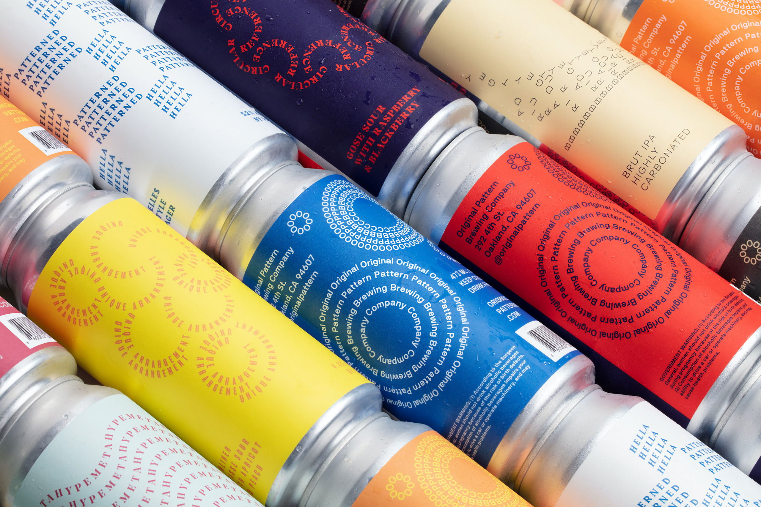
Upon being contracted by Original Pattern Brewing Company to design their cans’ labels, Play Studio took the opportunity to defy norms and ran with it. Using their client’s curious name as inspiration, they designed a shapely and curved design, playing around with what could have otherwise been a traditionally linear typeface format.
With fourteen different color combinations, it seems the possibilities are endless. Play Studio also toyed with different font sizes, choosing to include all or part of the OPBC acronym on each respective glass or can. Creating shapes and a variety of angles using strictly words and letters was the perfect way to stand out on a shelf.