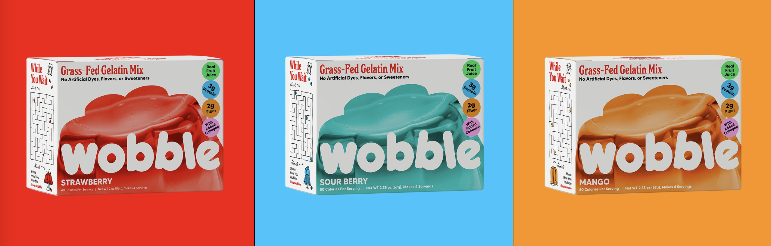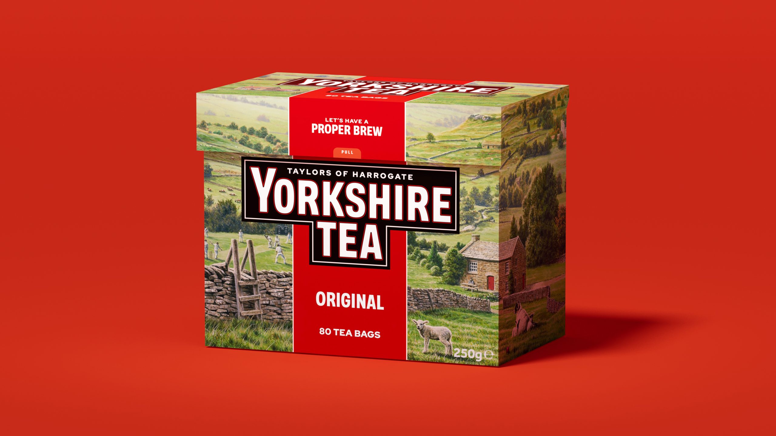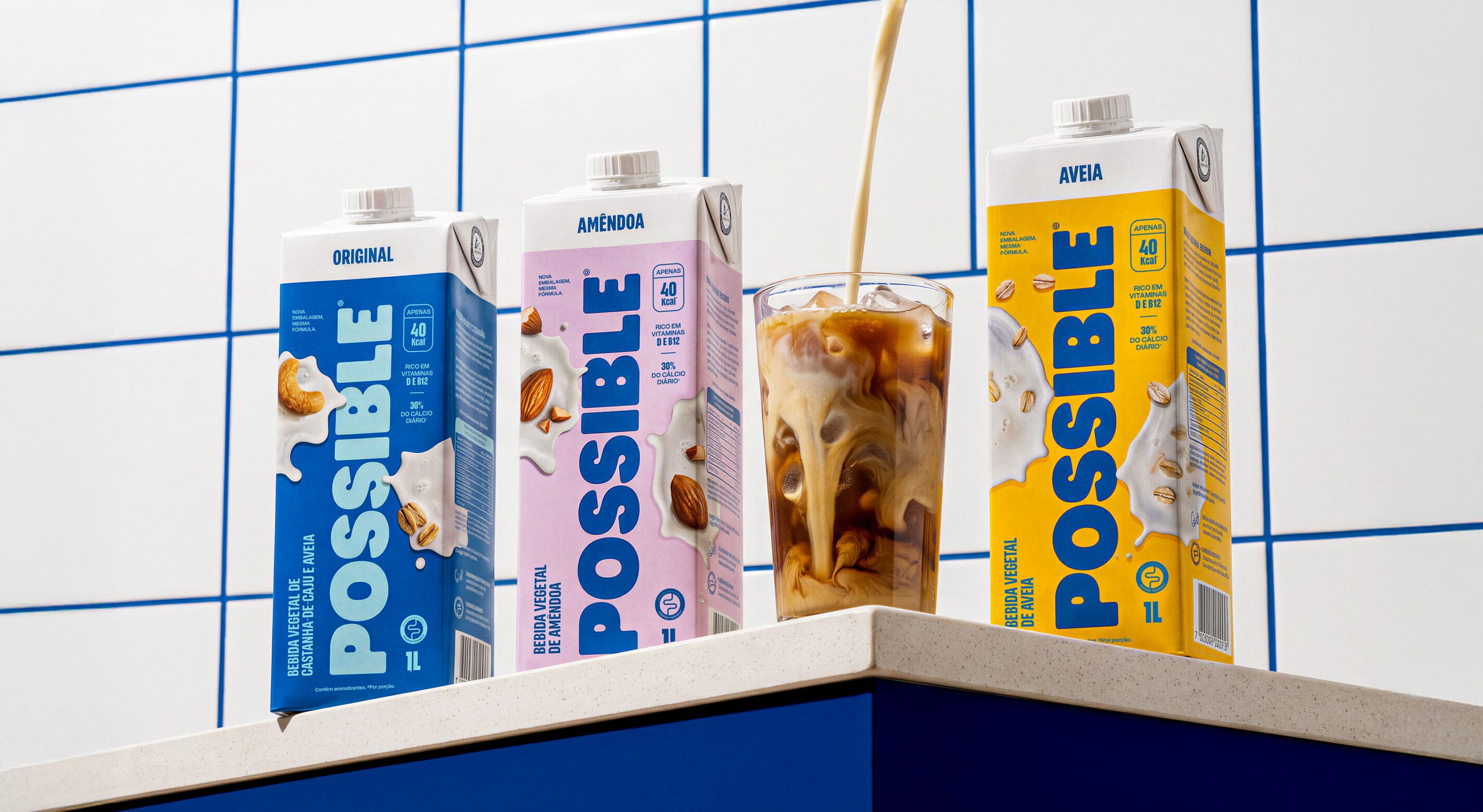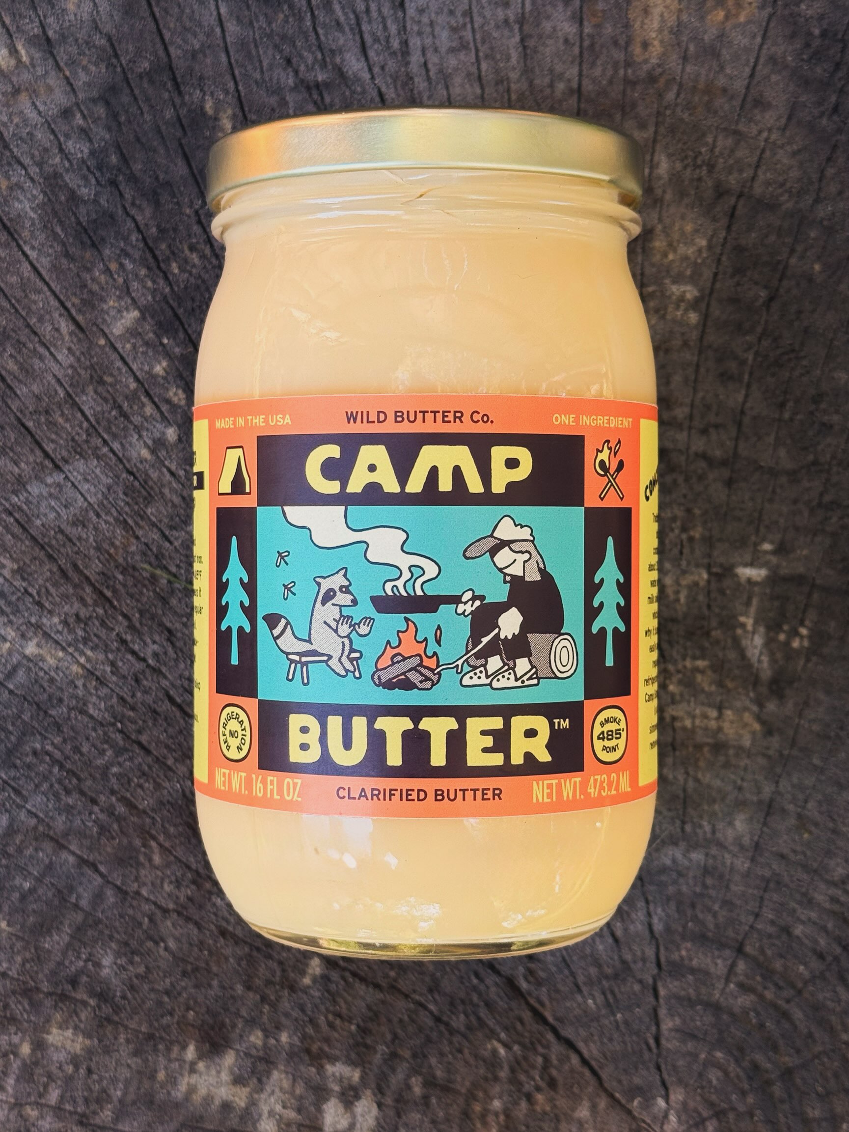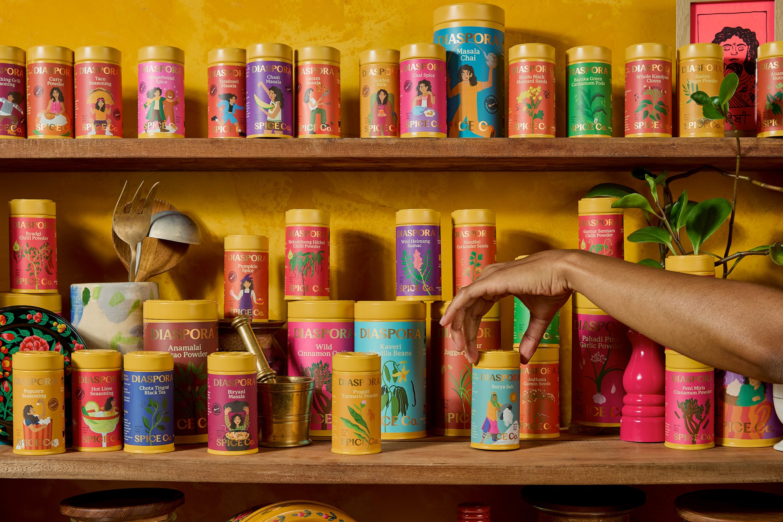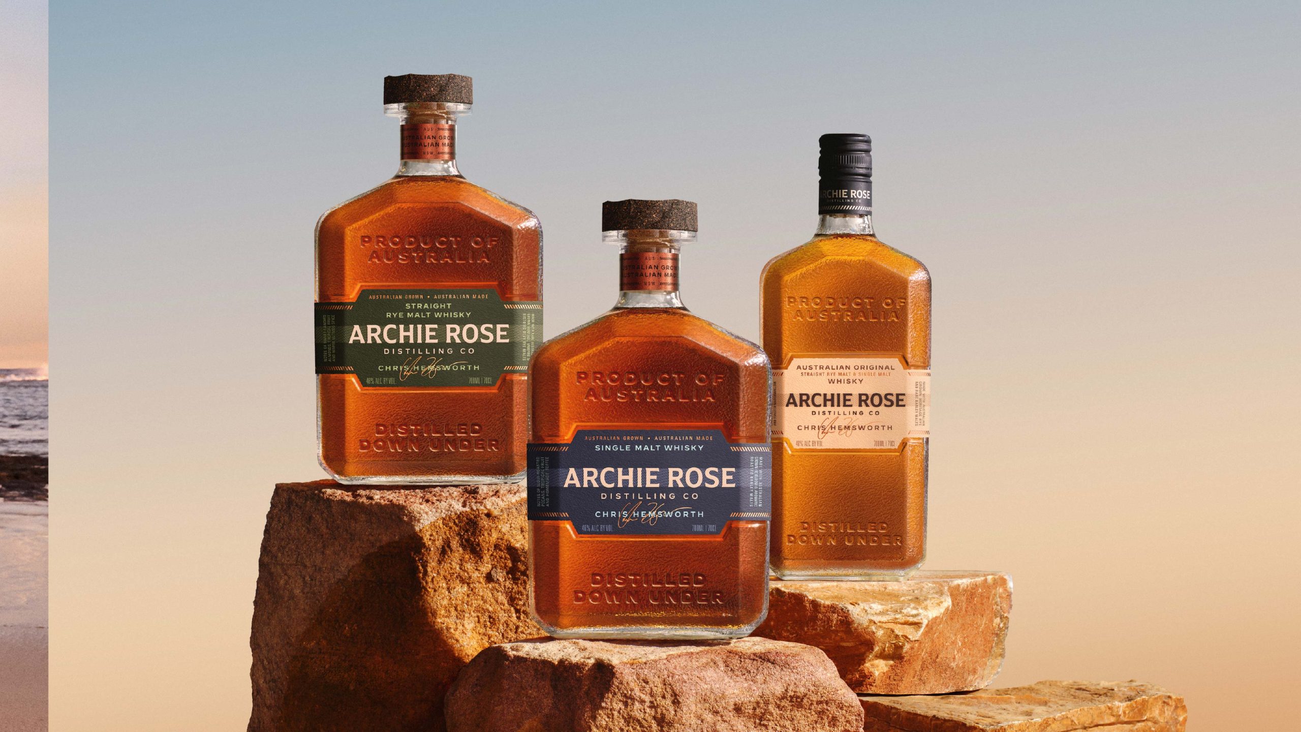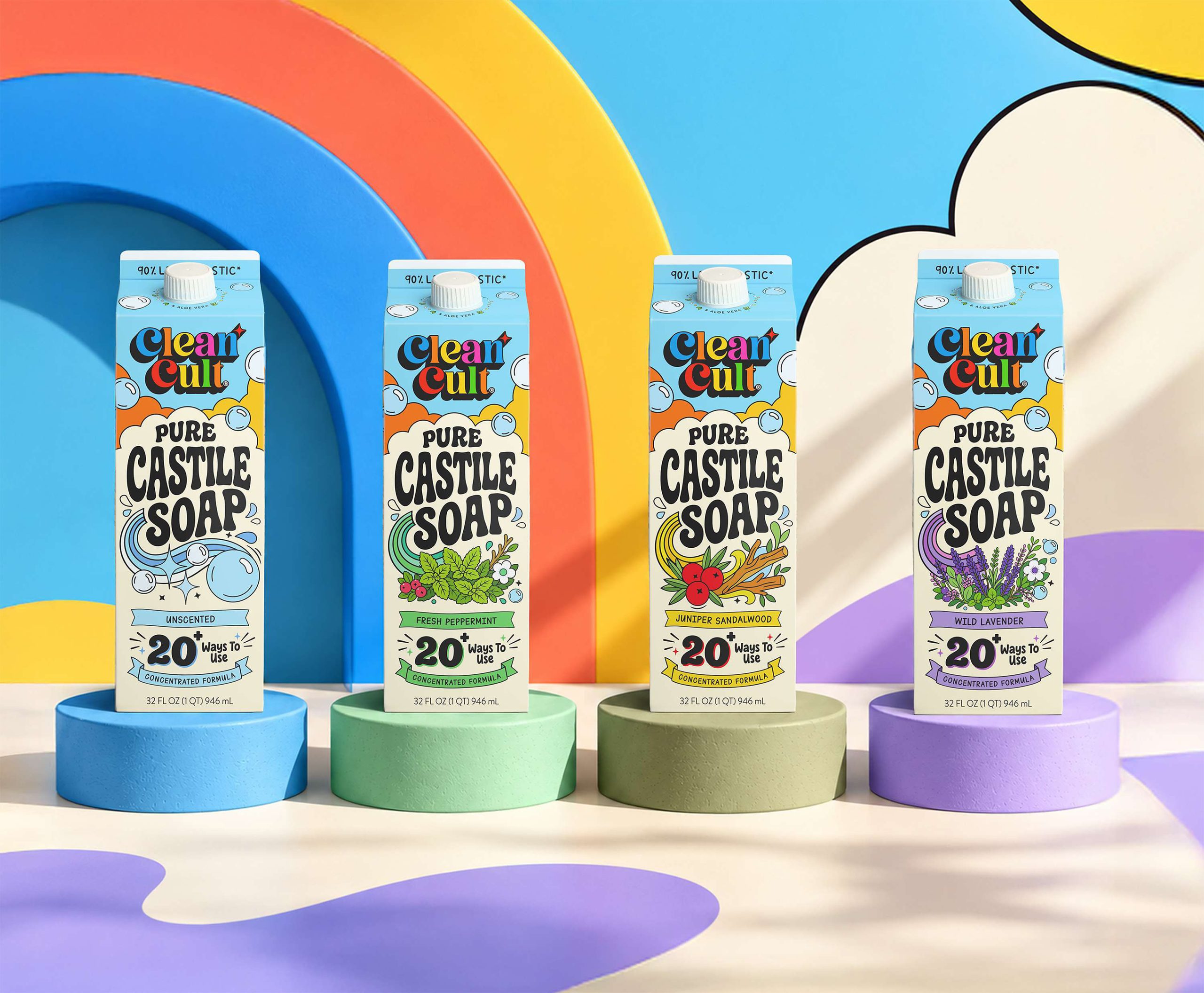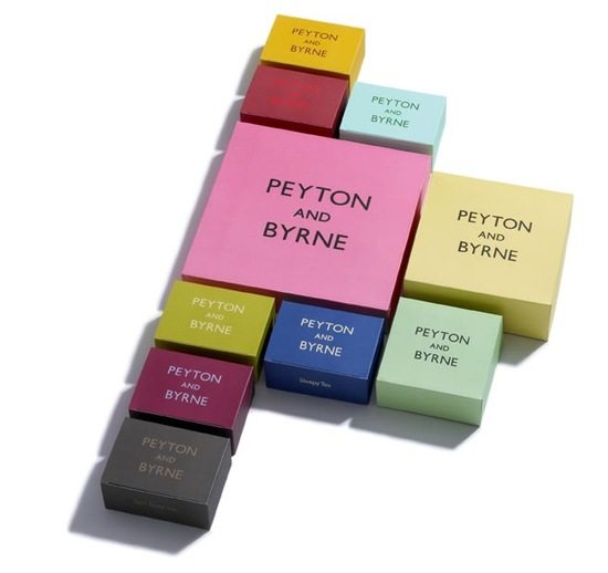
London bakery, Peyton and Byrne, package their products like tea, coffee and biscuits in bold, spare, colorful packaging. The feel is very British, although I can’t put my finger on exactly why. I suspect it has to do with the name itself and the very straightforward typographic treatment. Thoughts?
Design by Farrow.