Mio Levels Up with a Colorful, Charismatic Redesign from BrandOpus
By
Published
Filed under
By
Published
Filed under
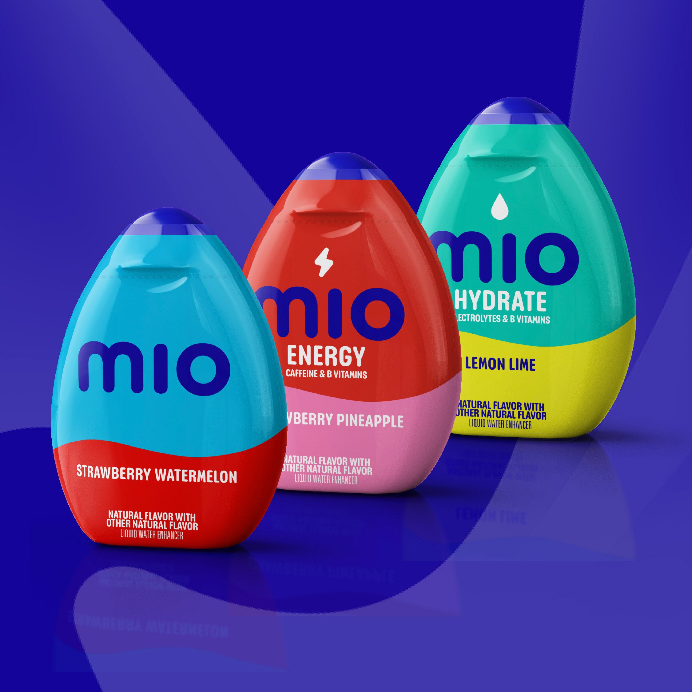
The popular water enhancer Mio recently got a serious upgrade from the experts at BrandOpus. While the black containers are fairly iconic at this point, they were neither attention-grabbing nor interesting, and this welcome redesign adds a whole bunch of extra flavor to the mix.
Each fruity option gets a color palette fitting its nature, and BrandOpus modernized the wordmark with a bubbly yet sophisticated sans serif. They also added a cool accent by dotting the i’s with icons that communicate any extra talents the flavor in question might have, like lightning bolts for energy and water droplets for hydrating formulas.

Get unlimited access to latest industry news, 27,000+ articles and case studies.
Have an account? Sign in