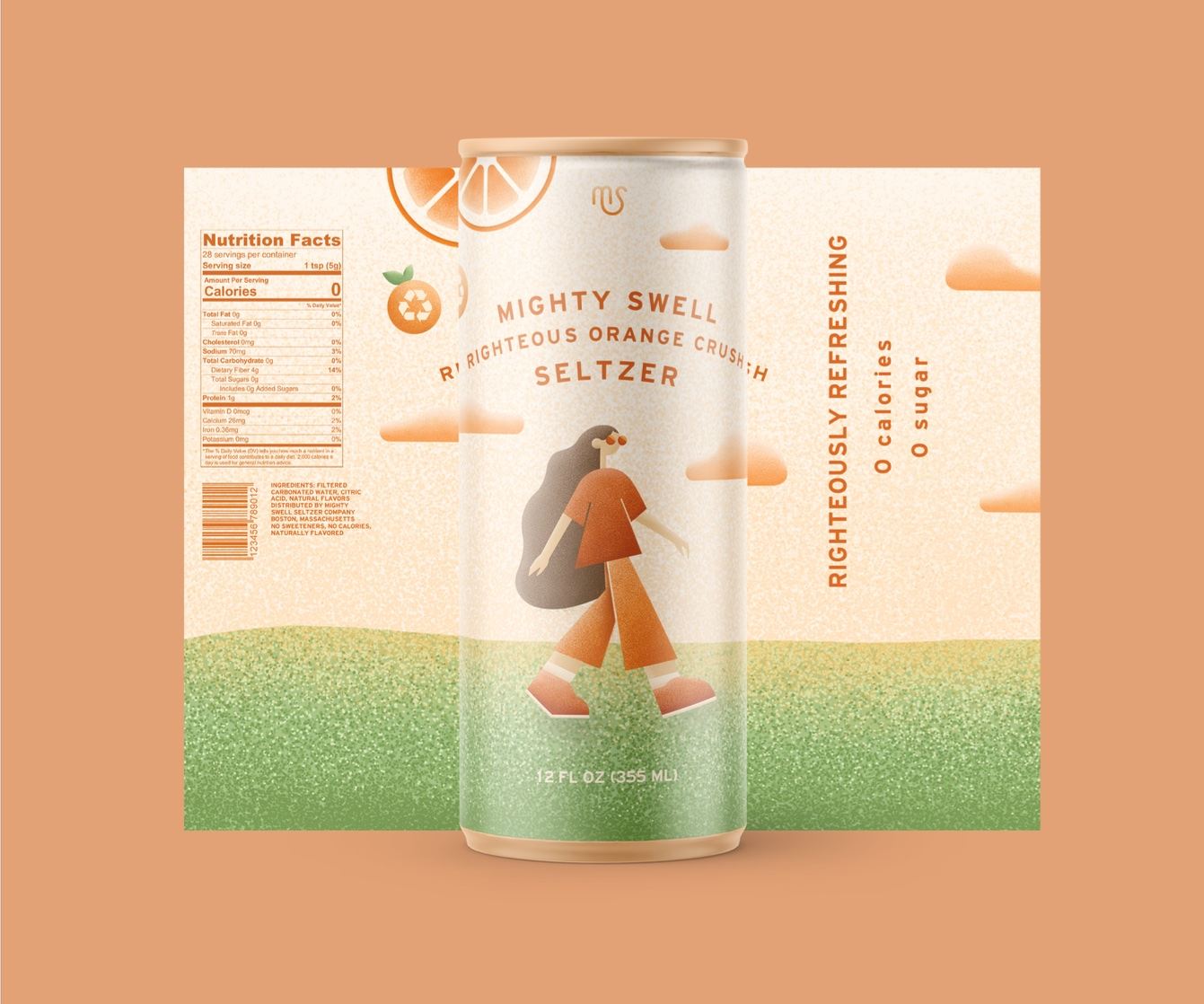
Jayme Underhill’s conceptual packaging design for Mighty Swell Seltzer, completed during a packaging design course at Susquehanna University, showcases adept attention to detail. Underhill effortlessly integrated the brand’s relaxed and carefree aesthetic into the packaging by introducing a charming character on the label, highlighting the essence of the brand’s name. The creative use of textured design elements, reminiscent of sparkling water’s effervescence, depicts the fizzy nature of seltzers, enhancing the product’s appeal. Furthermore, the bold choice of primarily orange hues in line with the descriptive words on the label reinforces the brand’s flavorful profile.

Mighty Swell Seltzer was a packaging project I completed last fall for my package design course at Susquehanna University. Students were given the name of the company and the title of the beverage and designed packaging for the company from there. We had to create a label for a slim can, print it out, and place the label on four cans and ensure it didn’t fall or peel off. This project inspired me to take a risk and try out a new illustration style.


