ZUDI Brings a Jolt of Caffeinated Energy Before You Even Sip
By
Published
Filed under
By
Published
Filed under
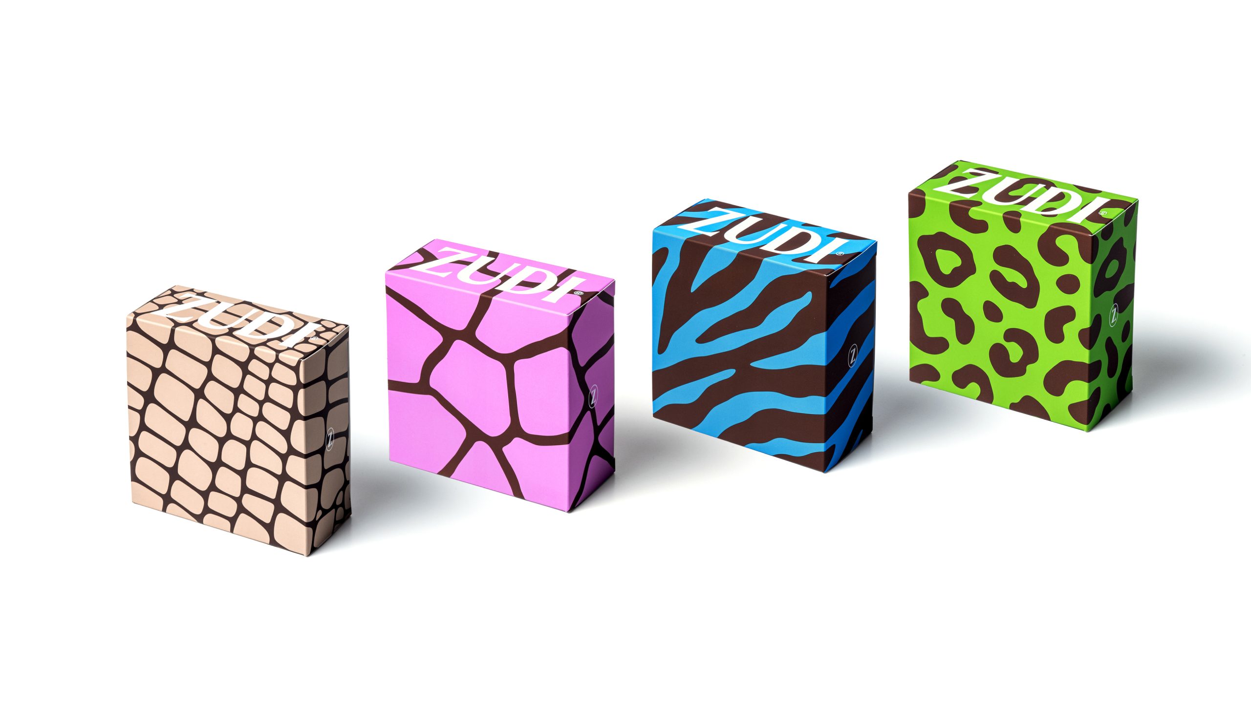
I love it when packaging becomes a visual onomatopoeia of sorts. For ZUDI Coffee Co., Vorá Design Studio builds a system that looks like a jolt of energy. The typography is set large, with the ZUDI name stretched vertically across cans and boxes.
But color becomes the real storyteller here, with rich browns paired against saturated blues, greens, and purples, echoing both the depth of coffee and the unexpected notes found in specialty roasting. The patterns resemble abstract animal prints or organic textures, hinting at the brand’s wild, untamed identity rooted in its name. What makes this stand out is how it embraces tension between order and spontaneity, turning coffee into something that feels energetic.
Get unlimited access to latest industry news, 27,000+ articles and case studies.
Have an account? Sign in