Pasta is such a comfort food, it makes sense that Northern Pasta Co. leaned right into it with its packaging.
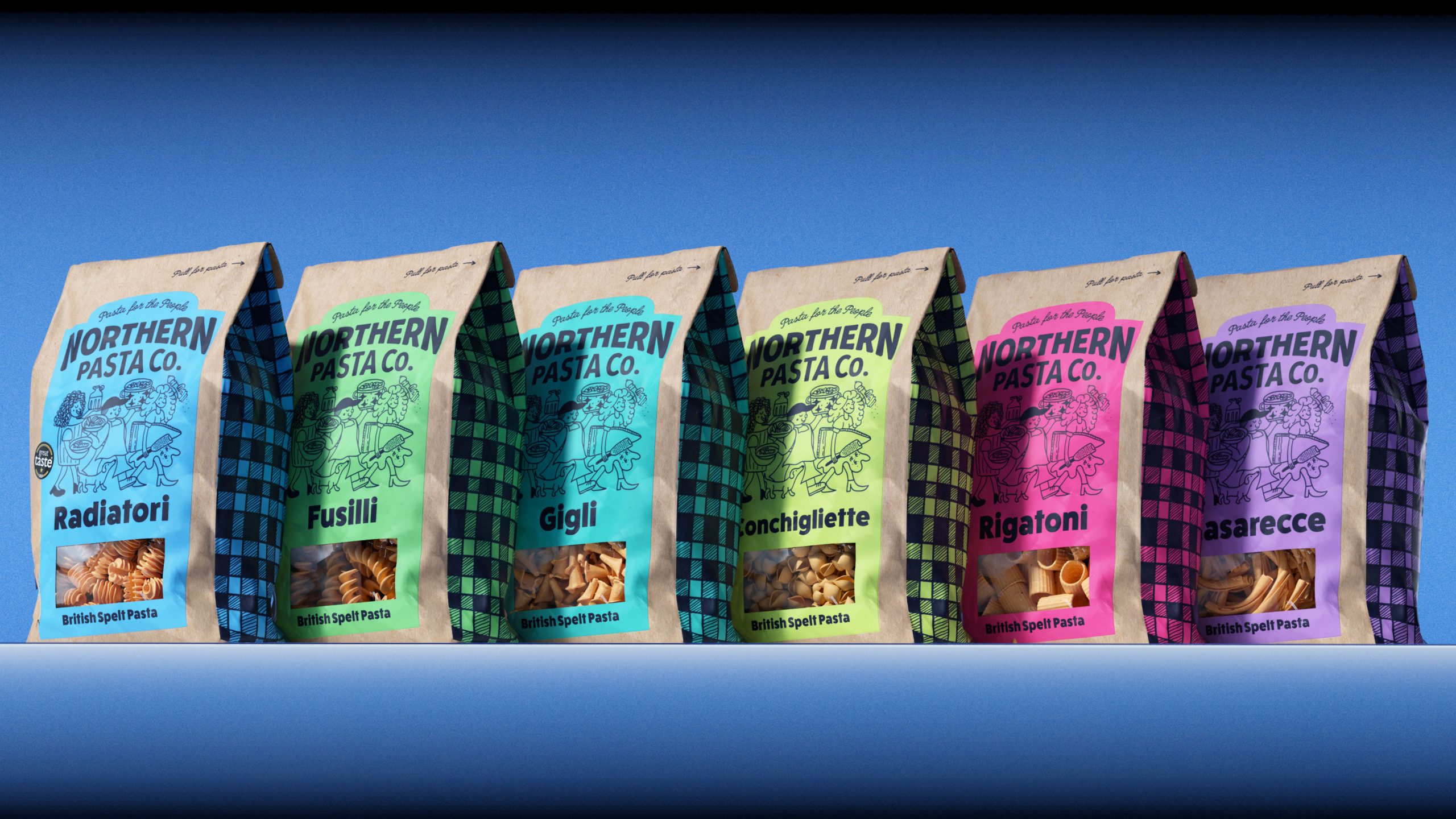
Design agency Roleplay kept that comfort food in mind, but the design also leans into a restaurant-inspired approach, pulling cues from deli boards and neighborhood eateries to create something that feels full of character. Color becomes a major factor as well, with bright, punchy blocks that shift across flavors while sitting against natural kraft paper, creating a balance between craft and energy. What makes this stand out the most, though, is how it rejects the quiet aesthetic of better-for-you food and instead brings the joy of a busy neighborhood restaurant straight into the grocery aisle.

Northern Pasta Co. is an award-winning British brand founded by Matt and Imogen Royall in the Lake District. They produce small-batch, ‘flavour-hugging’ pasta (Radiatori, Gigli, Casarecce) using traditional Italian methods but with a uniquely British twist: regeneratively grown spelt.
The big unlock for Northern Pasta Co. was the insight that sustainable, healthier-for-you pasta doesn’t need to look like sustainable, healthier-for-you pasta.

While the product is rooted in the serious business of regenerative British farming and gut-friendly spelt, the design heart beats with the vibrant, soulful energy of your local neighbourhood restaurant. We moved away from the apologetic, beige visual language of the health-food aisle and replaced it with ‘Strategic Maximalism’ our branding and design philosophy that uses single-minded strategy to create maximalist design. In this case bringing the joy, craft, and character of a bustling neighbourhood deli to the supermarket shelf.
Despite a superior product, their original packaging was holding them back from a wider audience. We borrowed the visual language of the restaurant world. The custom wordmark, inspired by traditional restaurant sign-painting, creates an instant sense of heritage and ‘chef-approved’ quality.

To solve the functional frustration of opening pasta bags, we introduced a unique drawstring system. This ‘unboxing’ moment adds an element of play and tactile delight, making the act of cooking feel like an event before the water even boils.
We maintained the sustainable feel of a paper bag but innovated with a recyclable plastic window. This allows the consumer to see the unique textures of the spelt pasta, proving that transparency and premium design can coexist.
We commissioned custom illustrations and used gingham patterns – inspired by classic trattoria tablecloths – to wrap around the gutter of the bag. This maximalist approach ensures the brand grabs your attention on the shelf, using colour and craft to disrupt a fairly uninspiring category.
Since the re-launch, Northern Pasta Co. has seen a 275% increase in D2C sales and secured listings in Booths and Ocado, with Waitrose on the horizon. By treating the packaging as advertising, we helped a small Cumbria kitchen become a national contender.