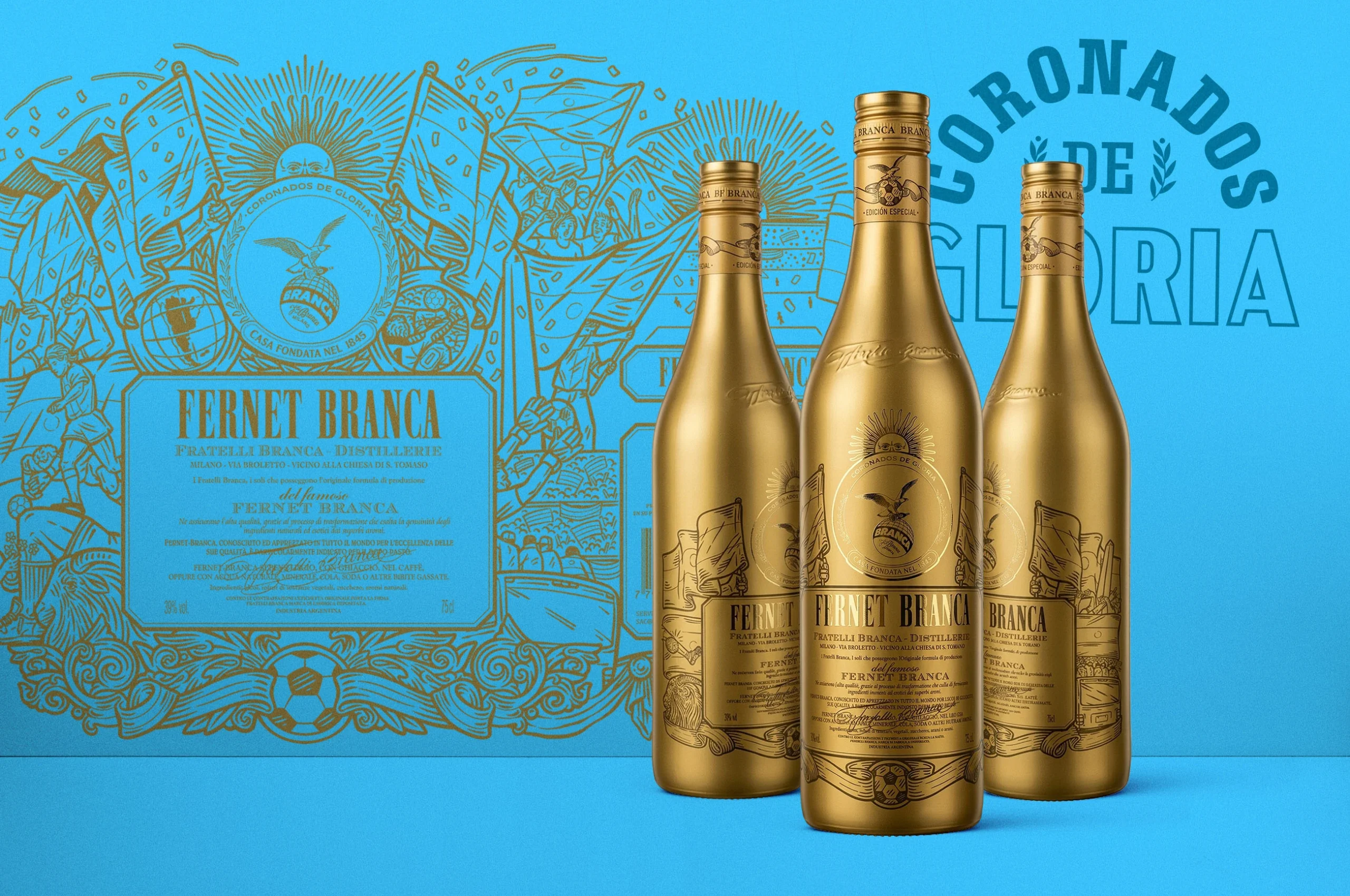
30 Knots Captures Movement and the Australian Coast in their Range of Canned Cocktails
By
Published
Filed under

By
Published
Filed under
How do you capture the spirit of a locale in a can without leaning on obvious iconography?
This was the challenge posed to packaging designer Seb Sciacca for 30 Knots Spirits. The Western Australia distillery wanted some bold branding for their ready-to-drink pre-mixed cans, and Sciacca delivered, tapping into the movement and colors of Geraldton without being too on-the-nose (i.e., not a kangaroo in sight!).
Get unlimited access to latest industry news, 27,000+ articles and case studies.
Have an account? Sign in