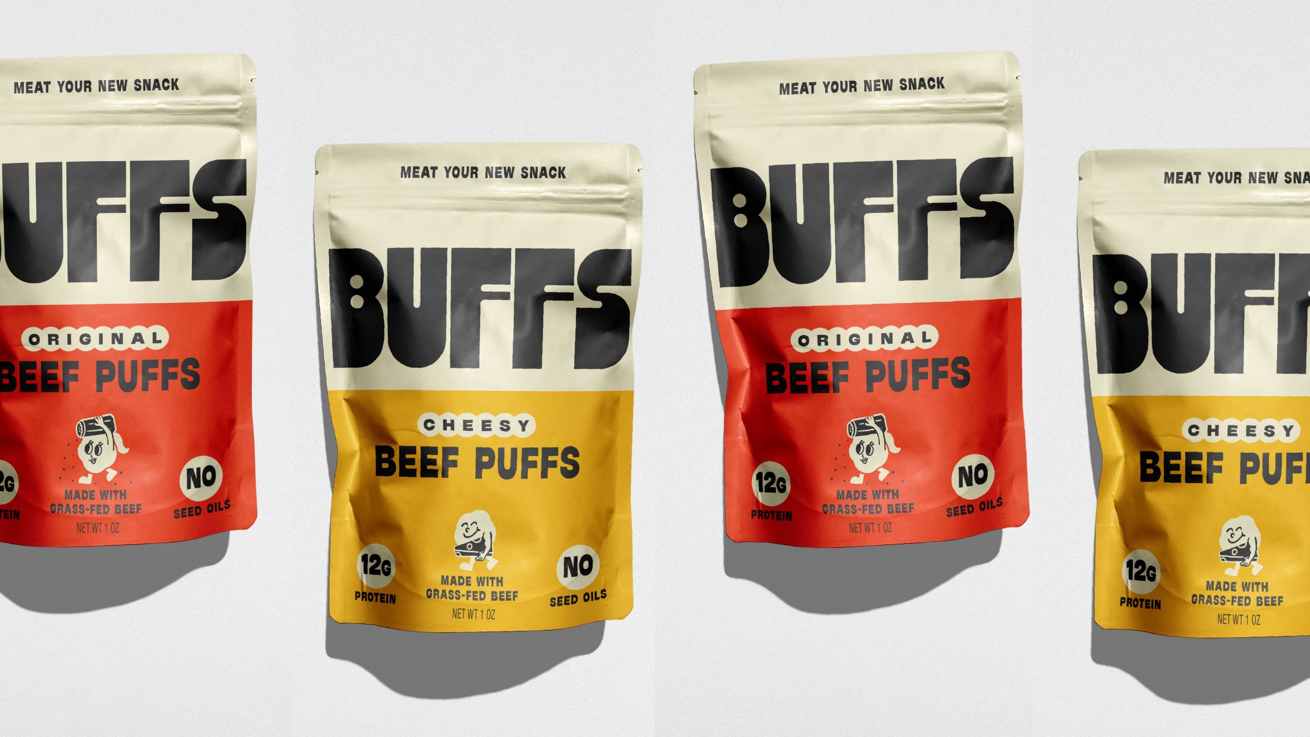
- Herefor Studio creates a modern identity for Buffs using clean color blocking and oversized typography.
- The design moves away from traditional jerky cues, offering a more approachable and craveable snack brand.
I wish more snack brands would try to say less, at least visually speaking.
Color blocking leads the experience here, with creamy neutrals paired against yellows and reds that separate flavors while keeping the system cohesive. The layout is clean and scannable, leaning into how people actually shop. The small graphic icons, like the cheerful character and simple badges, bring in just enough personality without overwhelming the design.
Herefor Studio grounded everything with an oversized BUFFS wordmark that stretches across the pouch. The typography is slightly playful, softening what could have been a tough-leaning protein snack. It is a smart shift away from macho jerky cues and sterile wellness design, landing in a space that is genuinely fun to pick up.

Herefor developed the brand identity and packaging system for Buffs, a modern protein snack made from real, grass-fed beef.
In a category dominated by either hyper-masculine jerky cues or sterile “better-for-you” tropes, we built a bold, confident brand that makes Buffs craveable, fresh, and relevant.

The oversized BUFFS wordmark anchors the system, delivering immediate shelf impact with unapologetic simplicity. A high-contrast color-block structure differentiates flavors while maintaining strong range recognition.
Playful, retro-inspired mascots and punchy claims like “Meat Your New Snack” inject personality without sacrificing credibility. Clean ingredient callouts and macro badges are seamlessly integrated into the design architecture for clarity and trust.
The result is a scalable, ownable packaging system that transforms grass-fed beef into an iconic snack brand—raising the steaks on modern snacking.