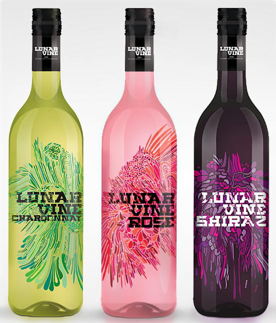
Death By Colour’s design
for Lunar Vine caught my attention with its stained glass ornaments and strong colour palett, which certainly lives up
to the name of the studio. After some trouble identifying the vinery, I learned
that the wine packaging was not a real product at all. It’s what kept Micheal Lonergan
busy when the projects at work weren’t piling up on his desk. If you happen to
have some time to burn, with the economy the way it is, consider following Michael’s example. Design something
extraordinary, to keep yourself occupied, inspired and to keep your portfolio fresh. Here’s Michael’s description
of the project: