KIYO MATCHA Puts a Playful Spin on Traditional Matcha Packaging
By
Published
Filed under
By
Published
Filed under
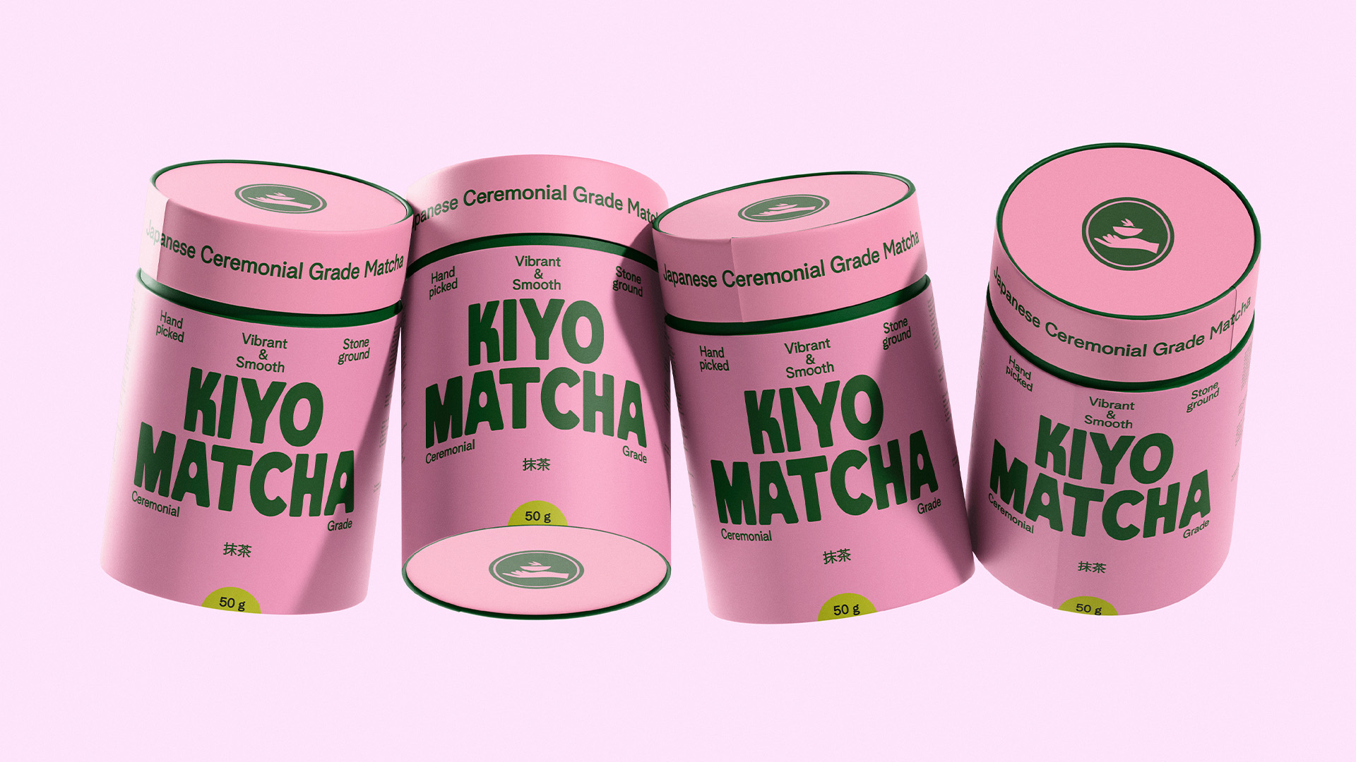
KIYO MATCHA’s packaging, designed by Ezgi Sarıca, leans into a playful tension between soft and strong. The bold, chunky typography sits front and center, taking up major real estate against blocks of deep green and bubblegum pink.
The color story feels deliberately unexpected for a matcha brand, but still signals freshness and energy. With no clutter, the focus stays on the name itself. It’s a smart balance of approachability and impact, giving the product a confident, clean shelf presence.
Get unlimited access to latest industry news, 27,000+ articles and case studies.
Have an account? Sign in