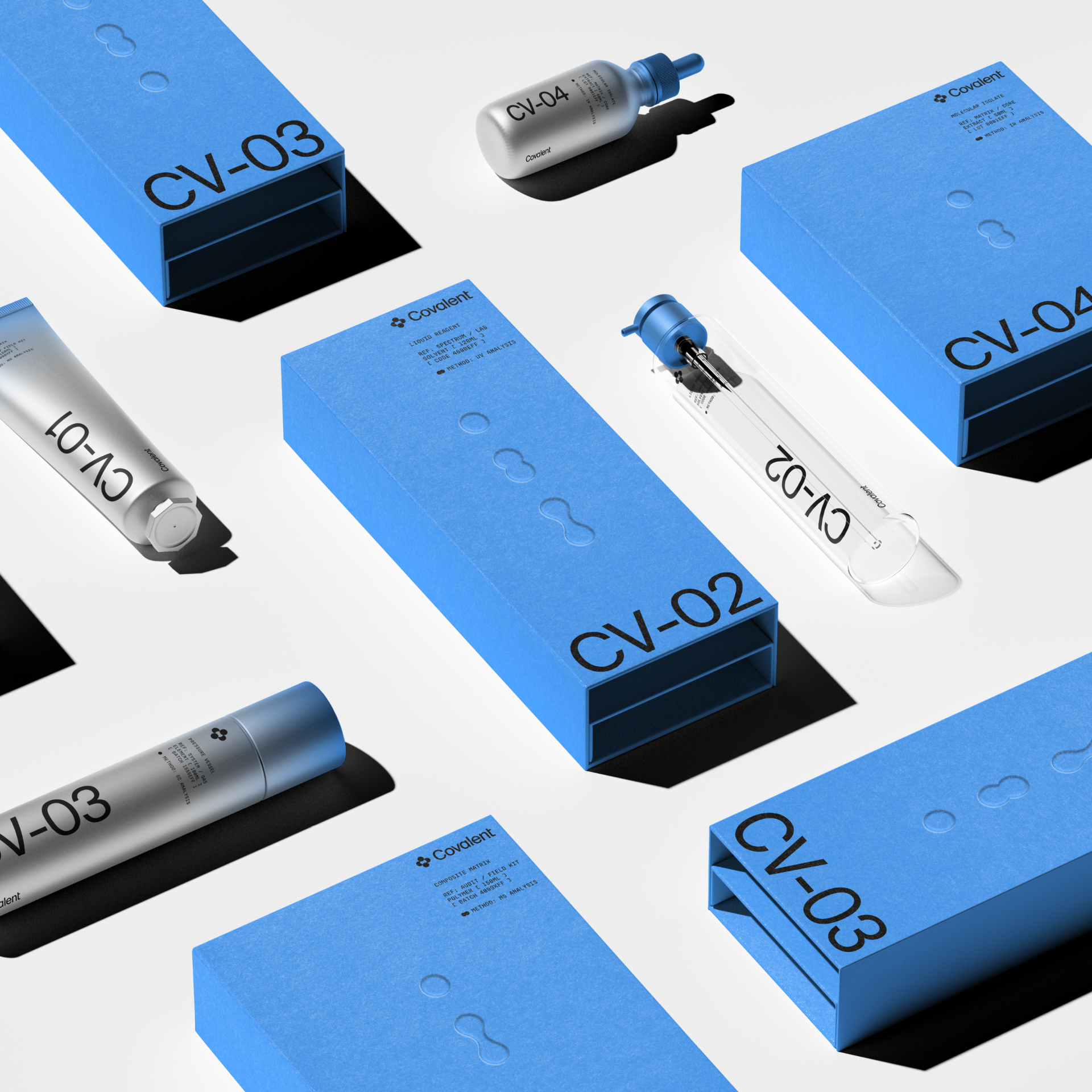
We’ve seen skincare packaging range from millennial pink to museum-worthy, sculptural, bright colors to edgy aesthetics. But I think we’re going to start reverting to a sense of underlying lab-coat influences. It’s concept work, but Obrazur Brands skipped product names entirely and coded the lineup as specimens: CV-01 through CV-04, set in oversized type running down brushed-silver tubes and vials that could pass for actual lab equipment.
Each piece nests in a matte box chosen to signal data, connectivity, and discovery, with embossed droplet motifs that reference cell division mid-split. Where most clinical brands stop at white minimalism, Covalent commits to the full laboratory fantasy, and in a market obsessed with proof over promises, an audit lab aesthetic might be the most persuasive shelf language there is. It feels trustworthy, immediately.

















