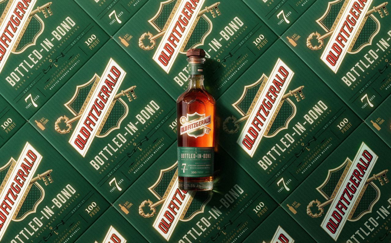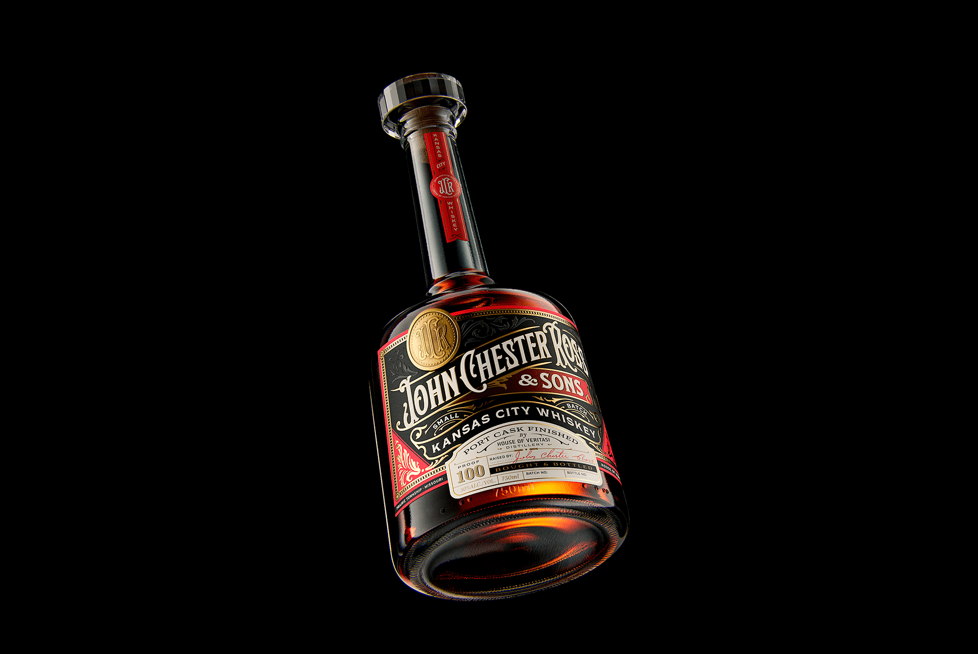
Maximalist design meets traditional whiskey packaging in Holy Studio’s packaging design for John Chester Ross. The stunning type design paired with the rich hues and incredible bottle shape makes for a remarkably interesting design. It’s complex but it’s not intimidating, opening doors for new customers and leaving space for strong brand loyalty.

John Chester Ross & Sons. A classic and newborn Kansas City Whiskey, finished in port barrel produced and bottled in Kansas City, USA. A project that evokes the golden age of Victorian style in a living tribute to Shane Veritasi’s grandfather, in his own words “the nicest guy in the world”. Ornaments and typography that refer to the language of advertisements, packaging and facades of the 1890s. Colors, finishings, ornaments and maximalism that seek to bring the complexity and maturity of the product that inaugurates House Veritasi’s own premium product line. A reminder of the prohibition era that is born to be a classic among the great American whiskeys.