Honest Junk’s Packaging Injects Fun Into Better-For-You Snacking
By
Published
Filed under
By
Published
Filed under
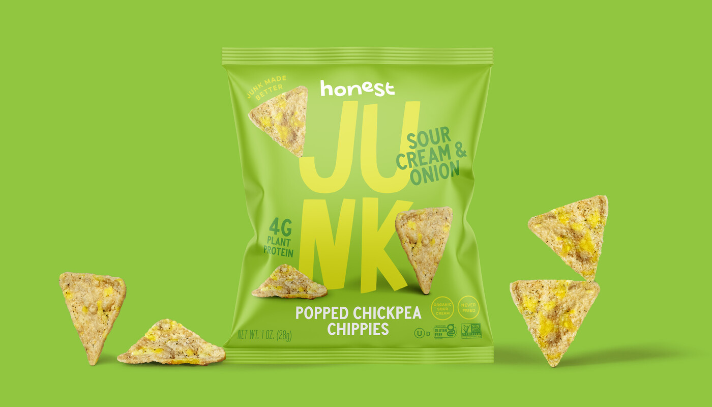
Crafted by Design Womb, Honest Junk’s packaging takes a bold and playful approach that embraces the fun side of snacking. The oversized typography takes over the bag, with “JUNK” acting as a playful canvas for floating chips and flavor callouts.
The color palette stays true to classic snack flavors, orange for nacho cheese and green for sour cream and onion, using bold backgrounds to immediately signal taste while maintaining a fresh and inviting feel. The hand-drawn lettering and fun chip placement add an element of humor, making the design feel lighthearted and unapologetically playful while still reinforcing the idea of a better-for-you snack.
Get unlimited access to latest industry news, 27,000+ articles and case studies.
Have an account? Sign in