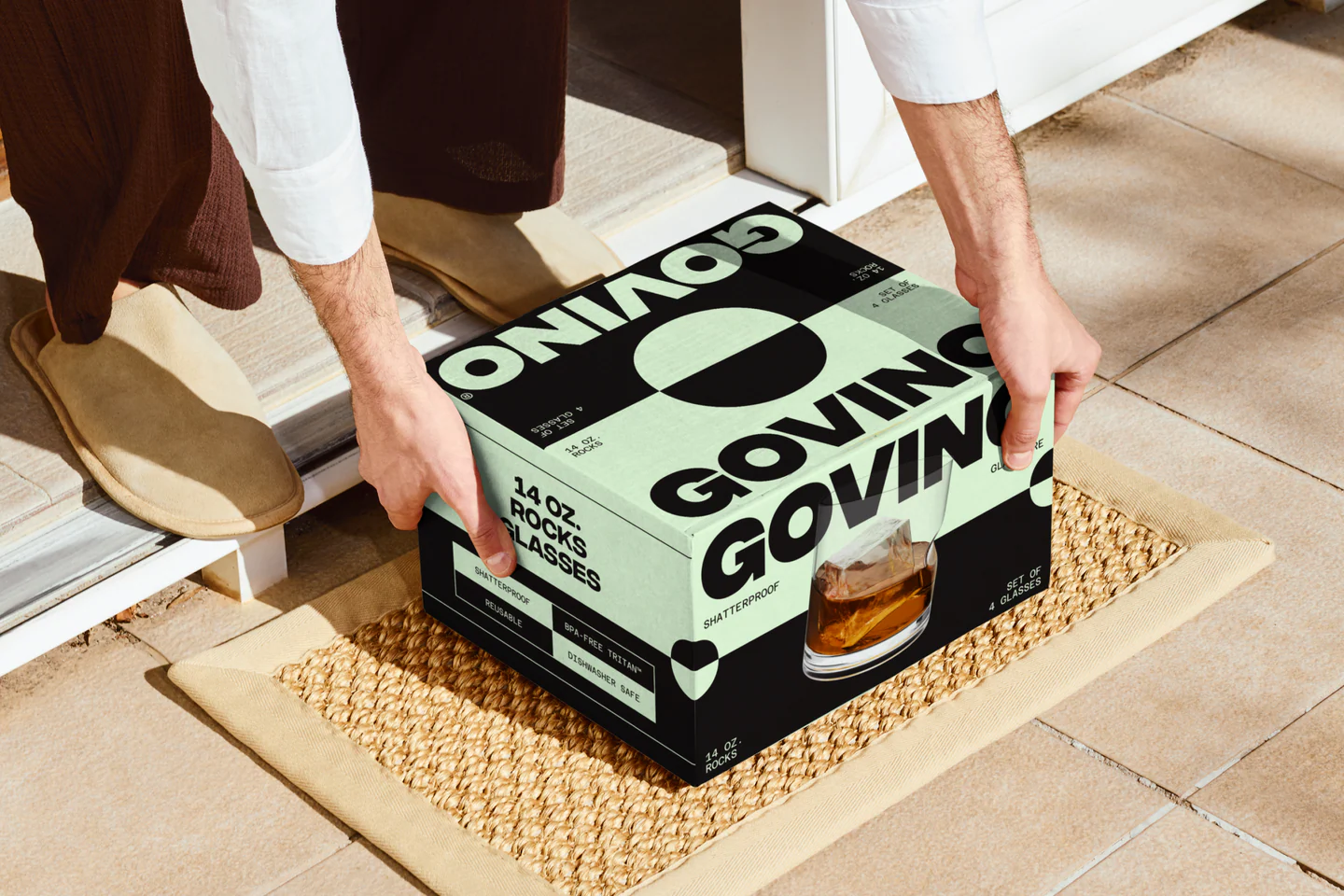
Govino’s packaging, brought to life by Redscout, treats glassware packaging like a design object. Oversized sans serif typography takes over the box while modular color blocking shifts by product type, creating instant shelf navigation.
The glass imagery feels almost architectural, and by leaning into bold structure, Govino has made a name for itself within the shatterproof glassware space, not to mention its signature ergonomic thumb notch.

Govino launched in 2008 with its signature shatterproof wine glass, featuring a distinctive thumb notch, and offering a more refined alternative to traditional plastic cups.
As the market became saturated with similar, lower-priced products, the brand faced challenges in standing out. Govino partnered with a creative team to refresh its brand and visual identity, repositioning the product as a stylish essential for modern entertaining rather than just a functional solution.
It quickly gained popularity in Napa Valley. The rebrand centered on the iconic thumb notch and extended across all brand touchpoints, creating a cohesive, elevated, and approachable brand experience.