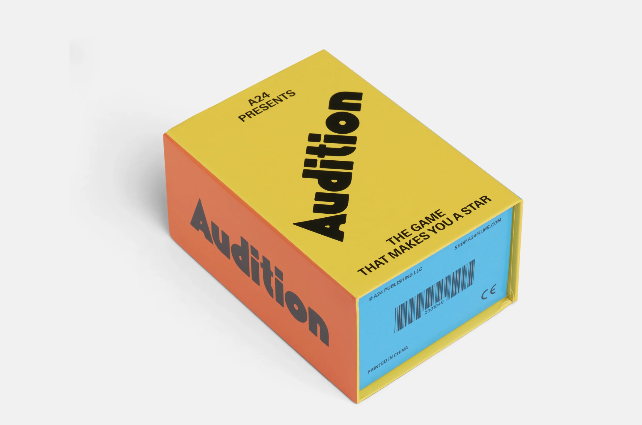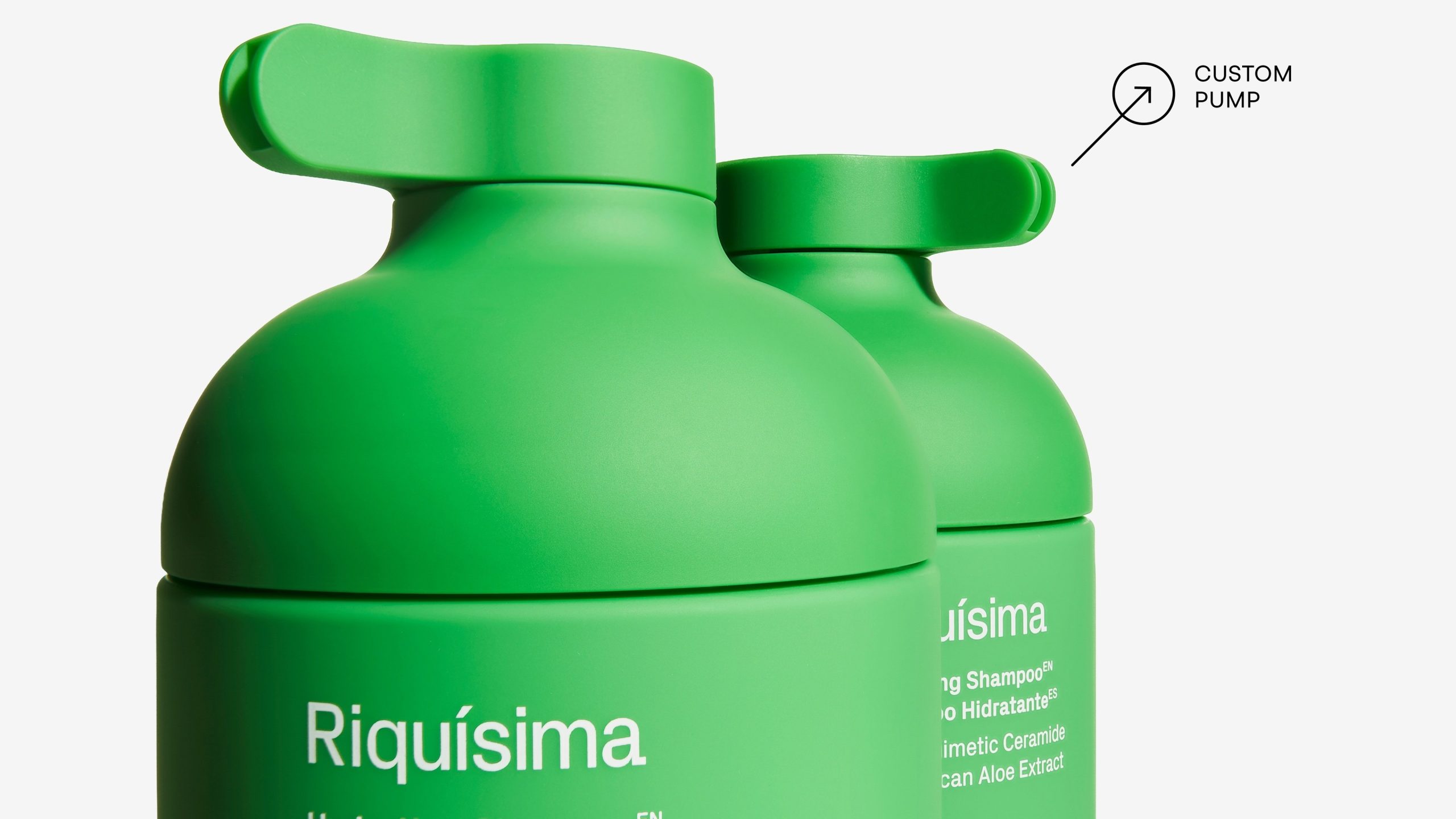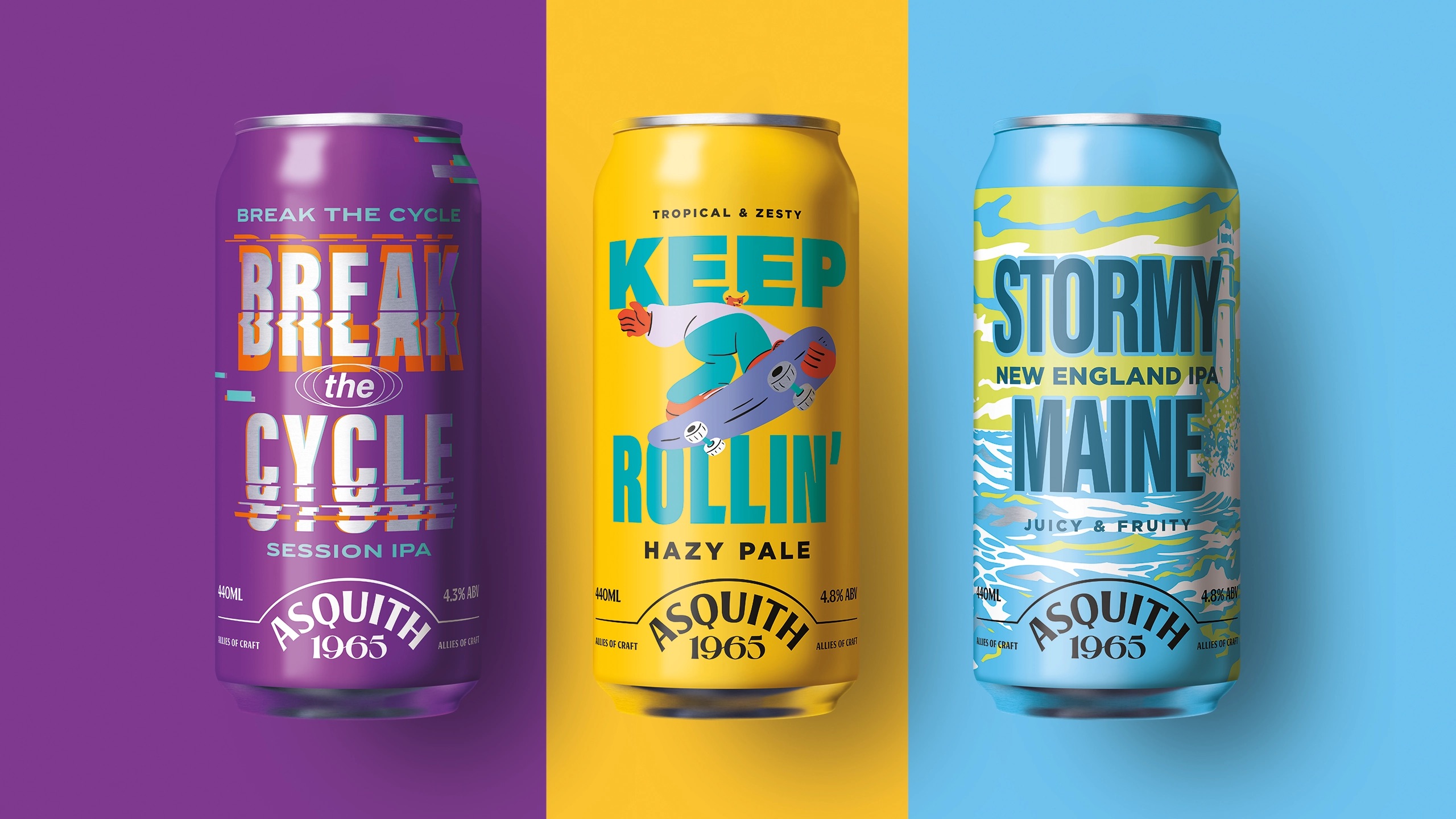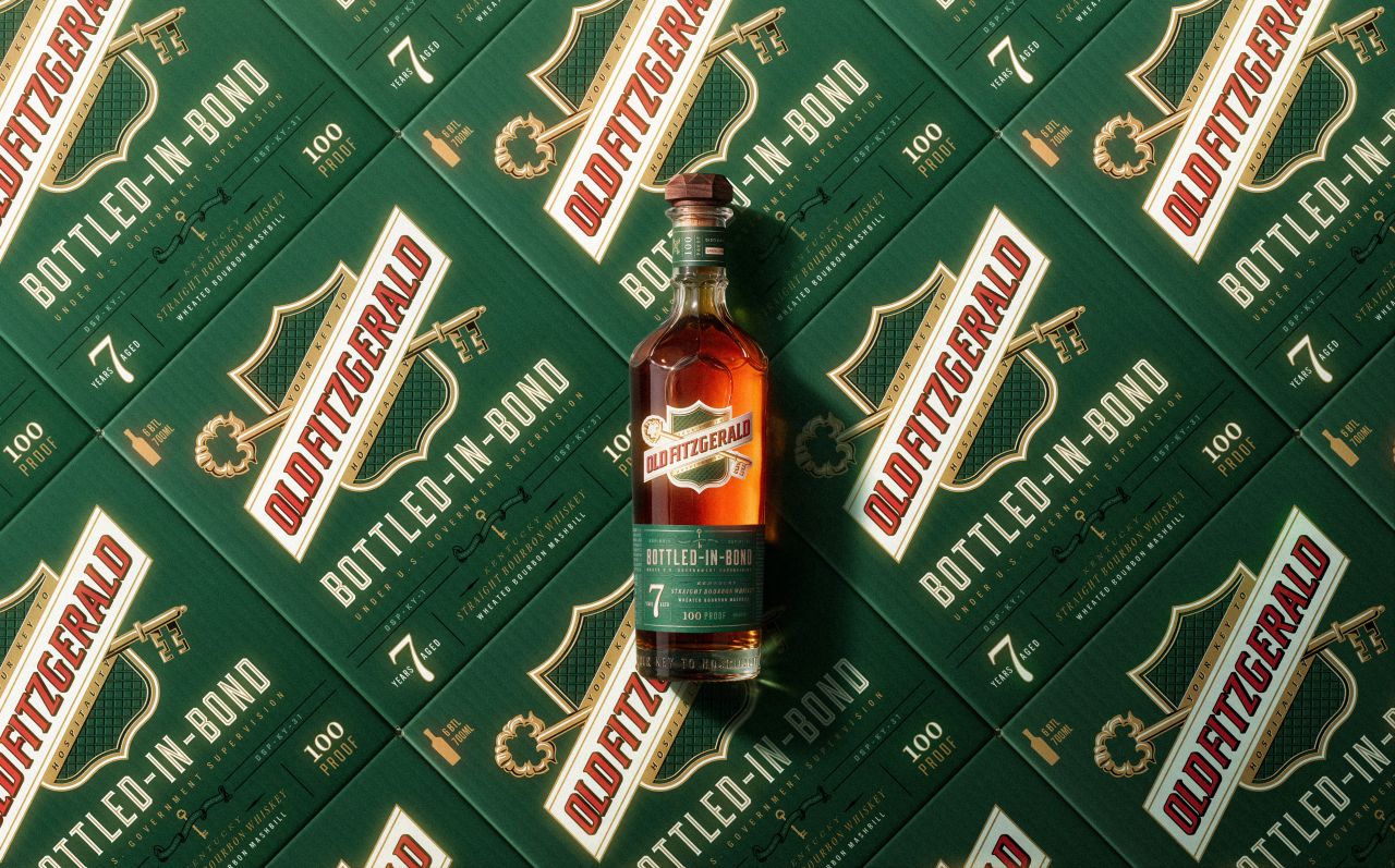
Minimalism and maximalism have been at odds for the past few years, and it’s been something of an aesthetic war. Design felt fairly aggressively quiet for a while, and in maybe something of a reactionary move, a lot of it gotten much louder. While each has its merits, we’re fans of a happy medium that finds just the right touches of quiet and loud.
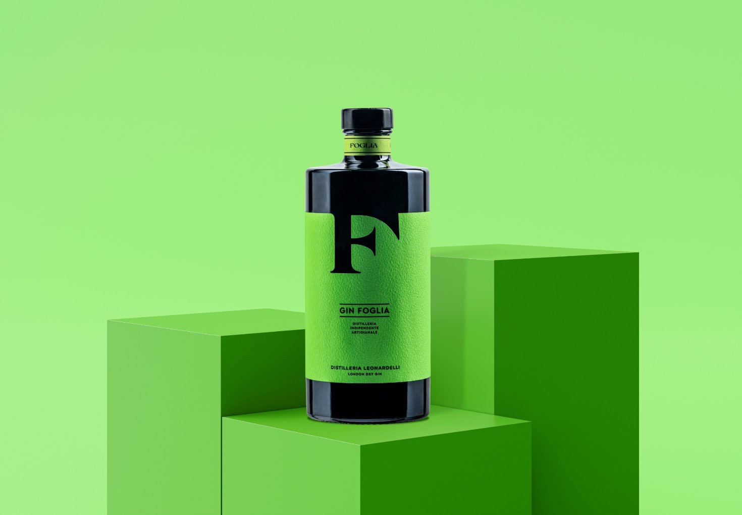
Italy’s Killeridea split the difference beautifully with their work for Distilleria Leonardelli gin, which comes in a sleek black bottle with poppy neon labels. While bright orange and green do the work of attracting attention, every other detail is softer and more sophisticated, with embossed sans serif text and a classic European serif for the wordmarks.
The two gins distinguish themselves immediately with their colors and monograms, the latter of which are carved beautifully into the label. The “F” stands for “foglia,” or “leaf,” fitting its bright green label. The “S” on the orange bottle stands for “scorza,” or “zest” for its zippy citrus flavor. We love when style has substance!