When I started Shelf Life over a year ago, the goal was to capture the tiny ripples, the weekly micro-trends, and cultural undercurrents influencing packaging in real time. Stepping back from that immediate cadence, this trend report widens the frame, weaving those fleeting signals into a clearer view of the macro forces shaping the year ahead.
Each week has been one of the most energizing parts of my work. There’s something grounding about pausing the daily (or hourly) algorithmic churn to see how aesthetics, politics, nostalgia, and technology keep intersecting in surprising ways. This report is where all of those threads come together to sketch what might unfold next.
For 2026, I’ve distilled ten emerging ideas. Some respond directly to AI’s acceleration, others evolve from post-pandemic consumer desires, and a few simply remind us that design and culture still know how to delight.
Glow in the Dark

Glow-in-the-dark packaging is no longer just a Halloween limited edition novelty. As brands scramble for visibility (pun very much intended) in our nonstop scroll economy, luminosity delivers a quick hit of childlike delight that doubles as an instant algorithm hack. With recent launches from Capri Sun’s eclipse-themed pouches and Marama’s glowing rum labels, there’s a growing desire for packaging that radiates.
So why now? Well, two forces are colliding. First, the pressure to make everything an “experience” has officially reached grocery shelves. Post-pandemic, consumers are hunting for micro-moments of small wonder anywhere they can find them, and CPG brands are responding with interactivity, making this the perfect moment for glow-in-the-dark theatrics. Second, Gen Z’s demand for shareable visual features, combined with their fixation on nostalgia, puts glow-in-the-dark packaging right at the center of their cultural Venn diagram.
Layer in a broader cultural drift toward nostalgia-meets-futurism, and glowing packaging becomes an obvious fit. And honestly, it makes me wonder if the 2027 evolution of all this is going to be scratch-and-sniff packaging. Time will tell.
Analogue Design

Analogue design isn’t necessarily a rejection of technology, but it is a reaction to a world drowning in algorithmic sameness. As AI-generated visuals flood feeds with everything from monotonous perfection to bizarre slop, brands are rediscovering the power of the human touch. In 2026, expect packaging with grit, think charcoal-smudged typography, pen-and-ink linework, typewriter-style labels, and limited-edition artist collaborations that feel collectible instead of mass-produced.
Consumer research continues to show rising skepticism toward AI-driven creativity, with trust and authenticity climbing to the top of purchase motivators across categories. You can see it in the comments section, too: brands that lean on AI get instant pushback, a clear signal that people aren’t ready to cede control to the robots.
Hand-crafted details signal intention, effort, and authorship, all qualities that resonate in a cultural moment increasingly concerned with human agency. And as conversations around data privacy, deepfakes, and creative ownership grow louder, analog cues offer reassurance that a real person shaped the work. Expect to see more packaging that doubles down on humanity and celebrates the beauty of tools other than prompts.
Caricatures

Hear me out: caricatures.
Think bold, hand-drawn character faces, or exaggerated personalities stamped on packaging front and center. It’s a departure from the now-overused 90s-inspired cartoon characters and anthropomorphic food buddies we’ve seen absolutely take over, a la Graza. Instead, it’s an interaction that’s expressive, a humanized graphic that acts as a personality anchor.
Brands are leaning into characters with faces and exaggerated expressions. Recent launches lean into this like Kavalero’s liquor, Dolcetti’s fruit pops, and Keya’s Snacks. These personalities act as a conduit for brand personality, flavor narrative, and irreverence.
It’s important to note that there’s a fine line in making these work. When done well, these illustrations feel fun, light, and harmless. However, when done poorly, they can tip into territory reminiscent of outdated and problematic mascots, think the controversies around Aunt Jemima or the former Land O’Lakes indigenous woman. The difference lies in intention, awareness, and avoiding tropes that stereotype rather than celebrate.
The caricature becomes the “brand spokesperson” on the shelf, and we’re seeing more and more founder-led social content. These caricatures serve as a graphic extension of that trend and an evolution of the ’90s cartoon style, and they are effective when a consumer is in the aisle rather than just scrolling on their phone.
The aesthetic is playful and hand-illustrated, but it also fits within premium or adult-oriented packaging due to its expressive nature. And it’s not just for kids.
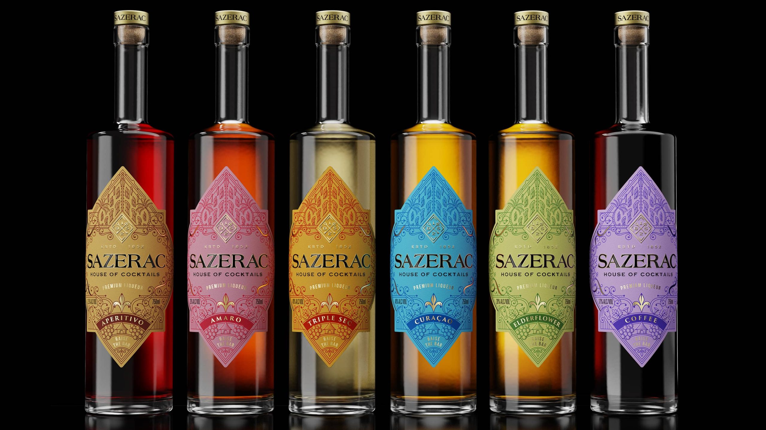
Rich, Not Snobby

In 2026, premium packaging is no longer elitist; it’s embracing what I’m calling “Rich, Not Snobby.” The goal is luxury without alienation, think high-end materials and elevated finishes, but with warmth and approachability baked in. Duzi Studio’s recent rebrand for Audrey’s Chocolates maintains its sophistication with beautiful papers, foil accents, meticulous detailing, but stripped away any feeling of exclusivity. It’s premium, but not out of reach. The packaging communicates care, craftsmanship, and indulgence, but without the iciness traditionally associated with luxury.
The global luxury packaging market is valued at around $17-18 billion and is forecast to grow at a rate of roughly ~4–6% annually, signaling sustained investment in elevated presentation. Yet today’s affluent buyer is purchasing for justified value, artisanship, and emotional relevance. A recent study in Asia found that 87% of wealthy consumers now prefer “timeless quality over trendiness.” There’s a clear shift from flash to substance.
But there’s another layer here that brands can’t ignore. The widening wealth gap and rising “eat the rich” sentiment, against the backdrop of an affordability crisis, can make ostentatious design read as out of touch. That’s why the future of luxury leans toward indulgence that invites, not intimidates, luxe textures paired with accessible typography, inclusive imagery, and a tone that doesn’t taunt superiority for performance.
Clinical With Soul

Clinical with Soul is a sleek, science-forward look, softened with just enough humanity to feel inviting rather than sterile. This trend is being propelled, in large part, by the continued global dominance of Korean beauty and wellness. K-beauty’s signature visual language features clean lines, functional claims, gentle colour accents, and ingredient-first storytelling, which has become shorthand for efficacy and credibility. As Korean beauty sales surge worldwide (with the global K-beauty market projected to surpass $28.1 billion by 2026), its design cues are bleeding into adjacent categories from beverages to supplements to mocktails.
Brands like The Mocktail Club and VUUM exemplify the shift. Their redesigns lean into minimal, almost medicinal layouts, metallic substrates, and ultra-clear functional messaging. Meanwhile, brands such as Seoul Tonic embody the blueprint, its clinical clarity paired with charm, character, and cultural specificity. Consumers now associate this aesthetic with innovation, precision, and “smart” wellness.
But it’s important to note that it’s not quite pharma branding. Sure, people will always want something a little more dependable and authoritative regarding their medicine, but Clinical with Soul branding is not going to be seen on your prescriptions, maybe just your GLP-1s.
The “soul” piece, of course, matters. A soft gradient, a friendly serif, a warm-toned accent? These are the signals that keep the science approachable. Because wellness is booming, Clinical with Soul hits the sweet spot because it’s trustworthy, modern, and globally fluent, with K-beauty definitely leading the way.
Soft Edges

Soft Edges is a move that’s as structural as it is stylistic. On one hand, it describes the physical vessel: cans, bottles, boxes, pouches with softened corners, or curved panels that feel more tactile, ergonomic, and approachable. On the other hand, it represents graphic and typographic design details with rounded corners on labels, buttons, or visual cues that are circular rather than sharply squared, and layouts that lean into curves rather than rigid grids.
Why is this happening? Research shows that our brains tend to favor rounded shapes due to their warmth and friendliness because they’re perceived as more organic, softer, and even safer. Even one of my local coffee shops just swapped its to-go cups for a plastic cup with organically rounded edges, and I was shocked to see so many Instagram posts featuring just these cups.
Interestingly, a recent study found that circular shapes on packaging graphics were associated with higher purchase intentions among consumers. And from a production side, curved or rounded-corner packaging formats are gaining traction. For example, in 2024, a new rounded-corner multipack format trialed by Carlsberg in Poland reduced CO₂ emissions by 224 tons annually compared to standard corrugated forms.
What does this mean in practice? Rounded vessels feel less industrial and more cozy. A growing wave of designs is moving toward pill-shaped bottles, softened-shoulder boxes, labels that reflect the form of the container, and typography shaped by curves rather than strict rectilinear grids.
Clingy

Cling Wrap is emerging as one of 2026’s most intentional design shifts. It’s packaging that literally conforms to the product within. We’re seeing vessels that closely contour their contents, secondary packaging that effectively vacuum-seals around multipacks, and formats designed to eliminate excess space and air. It’s both a visual design and a purposeful one, a signal that there’s nothing wasted or arbitrary about this aesthetic.
Hard numbers back the rise of this style. The global vacuum packaging market, valued at $31.16 billion in 2024, is projected to reach $50 billion by 2032, driven by growing demand for formats that protect freshness, reduce oxidation, improve logistics, and cut material waste. Flexible and vacuum-sealed systems are also gaining adoption because they support shape-optimized packaging and more sustainable, efficient supply chains. It’s partly an aesthetic shift, but it’s also destined to grow because cling-style wrapping cuts costs, lowers carbon impact, and boosts perceived product quality, a win-win-win.
Visually, form-fitting packaging has a premium, almost engineered look. By removing any void space, brands can communicate intention and craft their packaging that feels literally custom-tailored and ditches decorative excess.
Hyper Max

Hyper Max is a wave of brands that are fully committing to their concept, not only visually, but also verbally and structurally. This trend isn’t hyperbolic design for the sake of being loud; it’s brands that are pushing their narratives to the edge of exaggeration in a way that feels deliberate, humorous, theatrical, and culturally fluent.
You see it in projects like the Gigantic rebrand, where everything, from the graffiti typography to the cigarette-inspired packaging, all leans into the name. The shift was dramatic, flipping the brand’s former identity on its head and rebuilding it with an entirely new visual language. Vampons is a tampon brand so literal in its vampire-coded aesthetic that the packaging becomes almost a parody of itself. Then there’s Sandboy’s leisure drink that leans so fully into its lazy-day, sun-drenched identity. These brands are world-building, yes, but they also have a campy appeal.
These maximal theme immersion cuts through the algorithm by being fully unmistakable across every touch point, especially among Gen Z, who gravitate toward humor and brands that “commit to the bit.” It’s calculated and, honestly, just plain ol’ fun.
Dopeymine

After years of earnest minimalism and hyper-polished sincerity, this emerging direction breaks the fourth wall instead. Brands are starting to lean into humor and deliberate self-commentary. It’s now all about packaging as narration, visual tropes exaggerated on purpose, and design choices that are intentionally too literal, too loud, or too on-the-nose. Think Burn Rate hot sauce wrapped in a $100 bill; it’s not subtle, but it is a gleeful way to poke fun of consumerism and marketing, and honestly, life?
Younger consumers, especially Gen Z, are increasingly fluent in the mechanics of marketing. They adore brands that openly acknowledge the nature of branding itself. This aesthetic taps into that appetite for honesty through exaggeration, using kitschiness and intentional overstatement.
Take David’s Cod, the protein brand’s deadpan twist on a hyper-masculine, protein-packed snack. It’s cod, just cod, but it’s branded and packaged like anything but a joke. It’s four plain filets for $69, framed with the kind of self-seriousness usually reserved for luxury goods. Or look at Swim Club, a male-fertility supplement that turns “swimming” into its entire visual universe, stretching the metaphor until it becomes both clever and absurd.
By Hand

Handwritten typography is a subtle yet powerful way for brands to humanize their visuals without going fully analog. Unlike the broader handmade movement, which leans into a completely crafted-from-scratch aesthetic, this direction is more precise. The overall packaging may remain crisp, polished, and highly produced, but it’s the typography that adds a raw, personal touch. Think ink-bleed loops, jittery baselines, and letterforms that feel torn from a notebook and dropped into a pristine layout.
The Man Cereal launch tease is precisely what I mean. Even though it wasn’t the final packaging, it shows how effective this approach can be: simple, tactile, and emotionally resonant in a way a digital type isn’t.
Same with the London-based bakery Jolene. The logo was actually drawn by the six-year-old son of graphic designer Frith Kerr, whose studio, Studio Frith, created the brand’s packaging.
This micro-dose of human touch is gaining traction for a reason. As brand visuals become more streamlined and uniform, teams are looking for small, intentional gestures that signal authorship. Handwritten typography creates a sense of warmth, trust, and emotional closeness, offering a quick hit of authenticity without requiring an entirely handcrafted identity.
It’s not the full chaos of imperfection, but a strategic wink. Handwritten type suggests that a human was very much here, while maintaining the glossy finish consumers tend to favor.