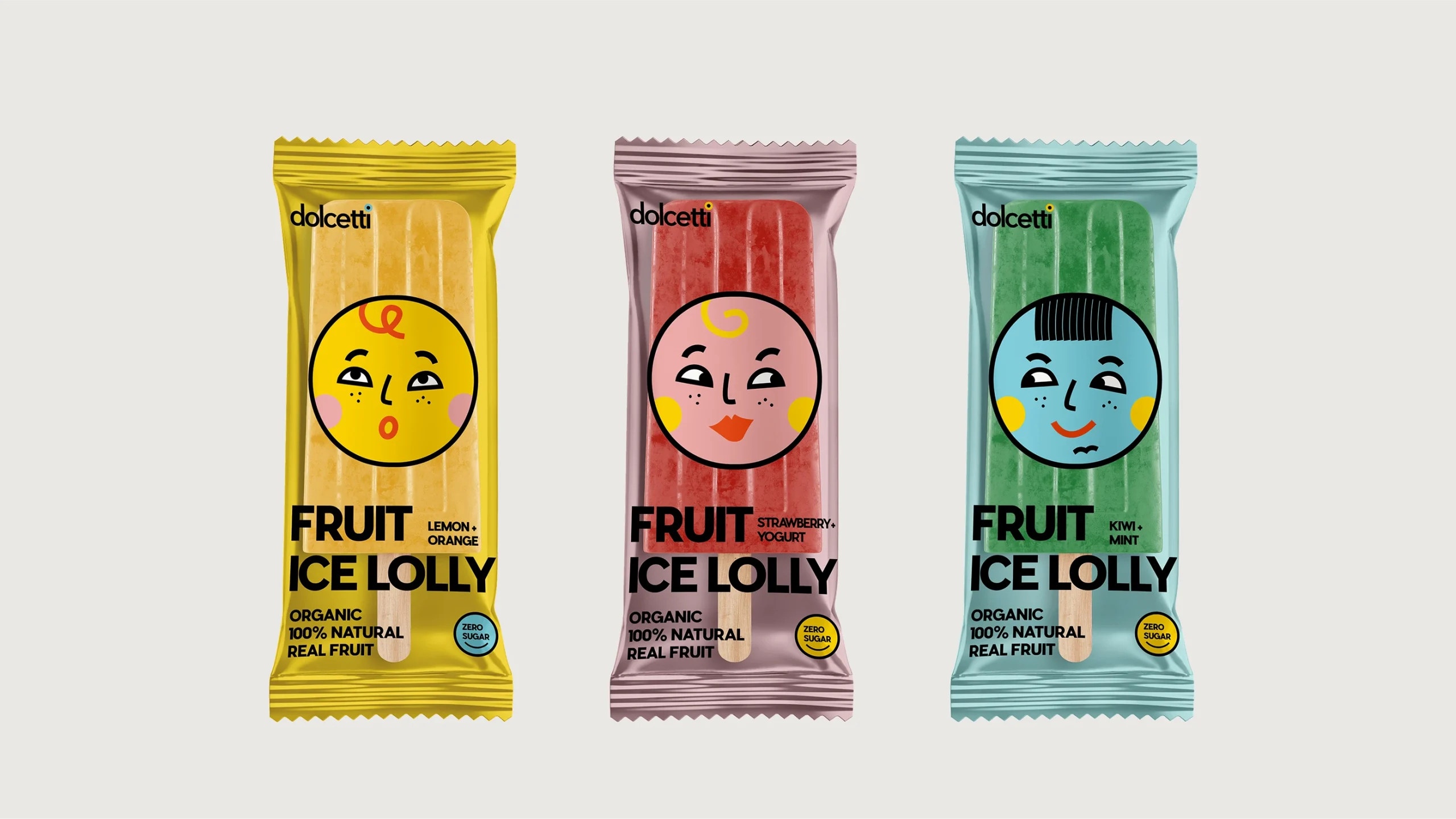
Dolcetti Puts a Face on Flavor with Character-Driven Packaging
By
Published
Filed under
By
Published
Filed under
Dolcetti’s packaging, designed by Iryna Kram, is built around a series of expressive faces that are anything but background noise. Bright color-blocked wrappers serve as individual canvases for each character, while the bold sans-serif typography anchors the layout in a clean visual hierarchy.
The brand relies heavily on illustration, turning popsicles, boxes, cups, and even merch into collectible, personality-driven touch points. It’s cohesive without being repetitive, and playful without trying too hard.
Get unlimited access to latest industry news, 27,000+ articles and case studies.
Have an account? Sign in