The Mocktail Club Serves Sleek Simplicity with Bold New Look
By
Published
Filed under

By
Published
Filed under
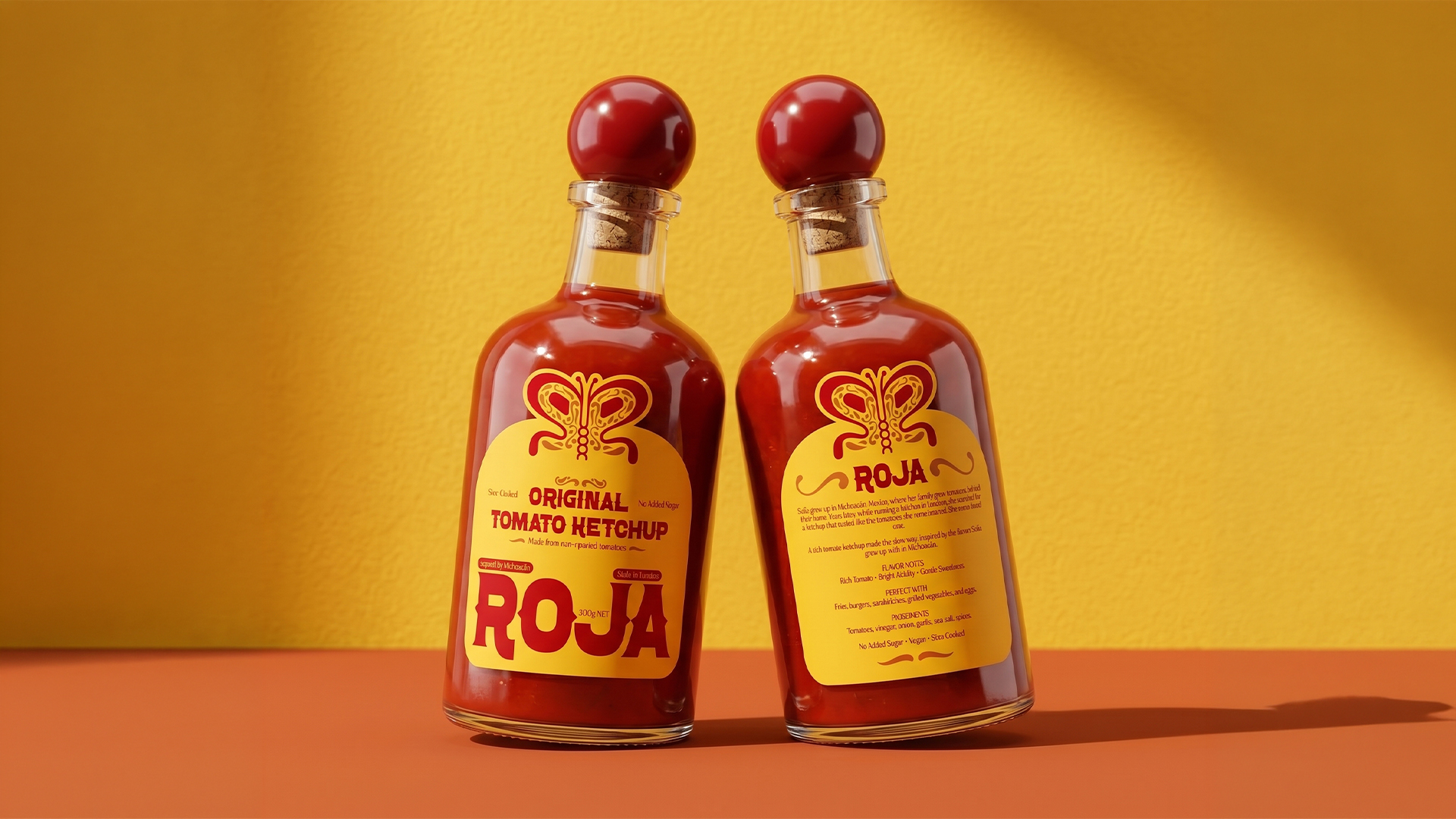
The Mocktail Club’s rebrand by Skinn Agency leans hard into minimalism with a bold silver label that mirrors the refined nature of its zero-proof cocktails. The fluid blob-like shapes nod to fruit slices or poured liquid, each one distinct per flavor.
The type is clean and confidently spaced, letting the product speak without distraction. A monochrome system, extending across bottles, shippers, and merchandise (including the embroidered cap), reinforces the identity. It’s cocktail hour, without the clutter.
Get unlimited access to latest industry news, 27,000+ articles and case studies.
Have an account? Sign in