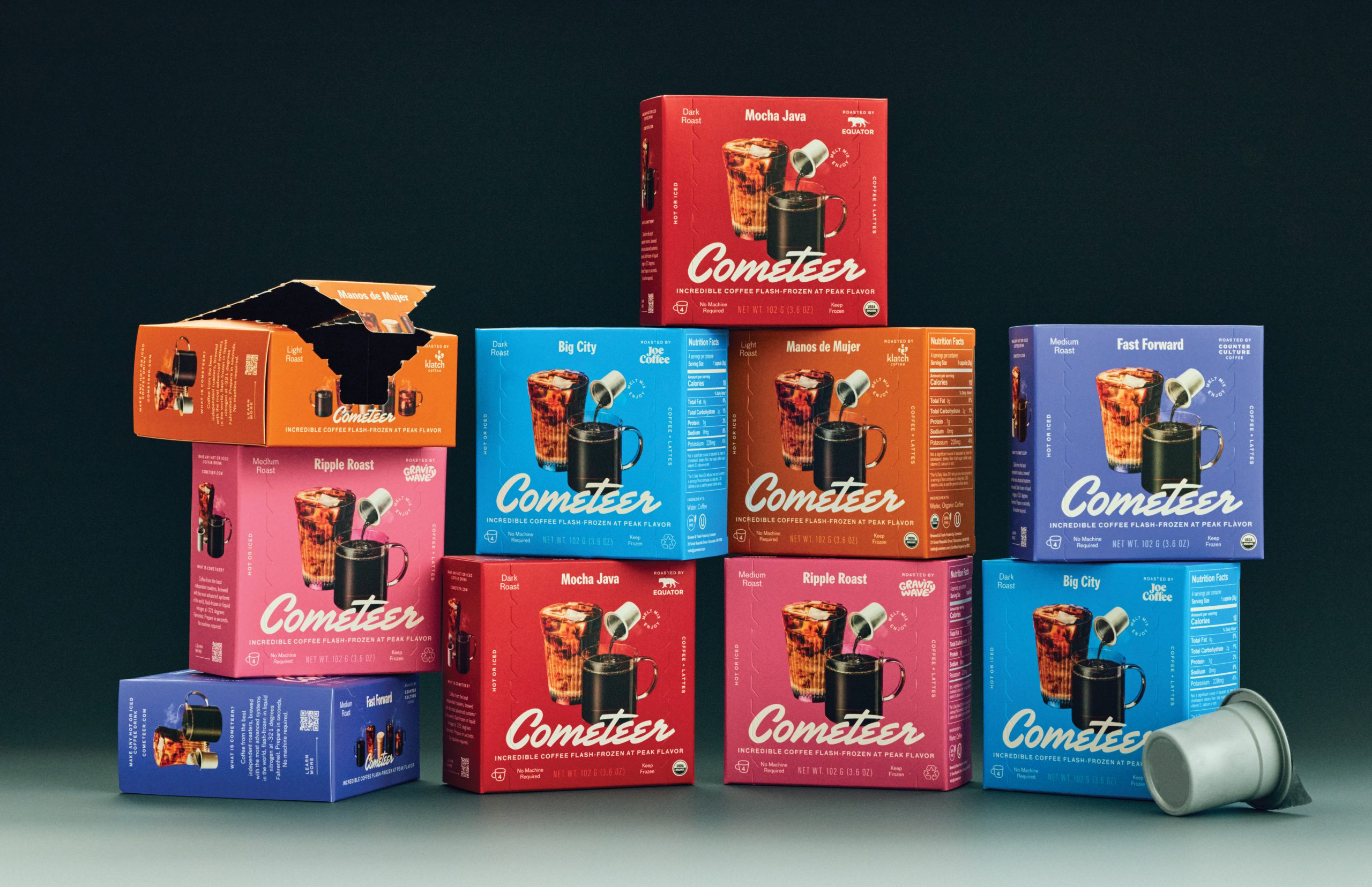
Cometeer’s retail packaging, designed by Creech, leans into a bold, coffee-first visual language. The angled product shot on the front shows coffee poured straight from capsule to cup, both in iced and hot forms, which immediately explains what sets Cometeer apart.
The logotype has a retro snap, softened by the clean structure of the supporting typography. Each roast gets its own color-coded box, helping with shelf differentiation and quick navigation. The side flap opens cleanly, turning the freezer aisle into a streamlined at-home ritual.