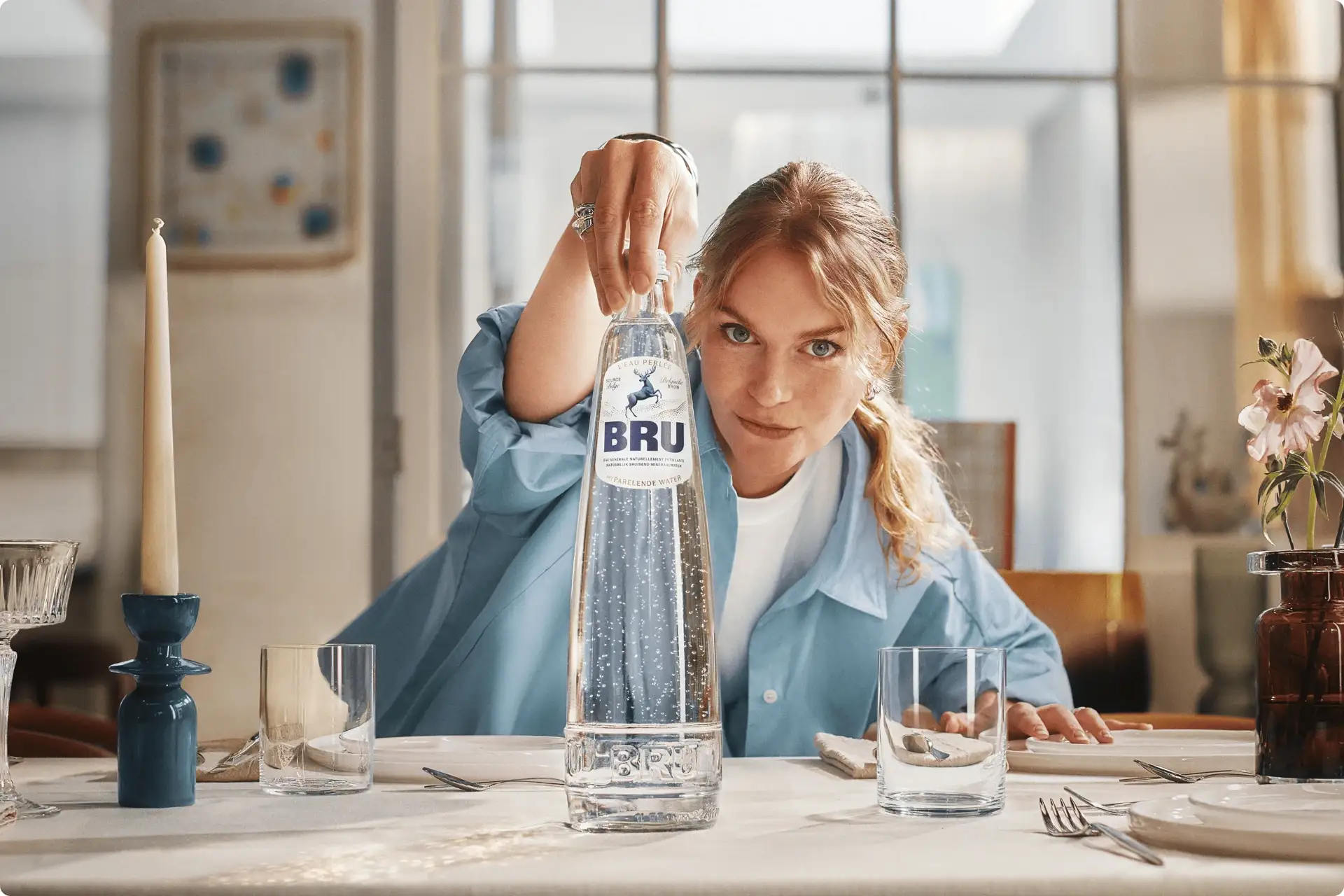
WeWantMore takes BRU in the direction of borrowing from hospitality and the rituals of a beautifully set table, combining them in a way that’s reminiscent of classic European dining while keeping the bottle fresh and inviting.
The rearing stag has been redrawn with more character and dimension, while dotted pearl forms ripple across the label as a playful reference to BRU’s signature bubbles. The typography pairs the familiar oversized BRU name with elegant script and finer details that could easily live on a restaurant menu. It is a smart shift from the icy minimalism that often surrounds premium water, making BRU look like part of the table itself.