OOP Brings You Back To Simpler, Easier Times
by Chloe Gordon on 03/07/2022 | 2 Minute Read
We all very well know that ice cream is more than something sweet to eat after a meal. Instead, ice cream is a nostalgic solace, and OOP is a Qatar-based ice cream shop delivering this association through the packaging alone, designed aptly by Futura. The melting logo and playful color combinations make this brand feel more like an escape than a once-in-a-while treat. When branding is so good, it can bring you back to simpler times; you know you've done something right.
"What does ice cream mean to people?” Is the first question we had when we started working on this project. “Dessert,” said someone quickly... “Wrong!” Replied a voice from the other side of the room. “It’s comfort. It’s a reward... it’s childhood.” And this is where this branding story begins.
OOP is an ice cream shop based in Qatar. The concept is friend- ly and familiar, so we wanted to dig deep on the experience that this cool edible has offered since our childhood: comfort with a nostalgic wink.
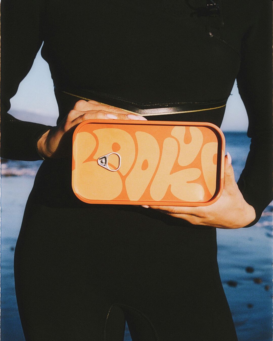
For the logotype, we went with the flow (literally) and played with the melting sensation of one letter into the other, person- alizing the typography and avoiding edges for a round, wavy finish. Through repetition we achieved a staple look that feels fun and lively.
The editorial system uses a more structured, monospaced sans, that contrasts with the constant loop of the logotype.We complemented the identity with illustrations of a vintage cartoon-inspired character, which tells a story of how living on the run can turn very hard... while melting. Diagonal text com- positions reflect a spontaneous nature, just like the whim for ice cream.
The color palette is inspired by the pastel tones of vintage ice- cream shops, only disrupted by bright tones to make it inter- esting and contemporary.
OOP, don’t let them melt..
- Design By: Futura