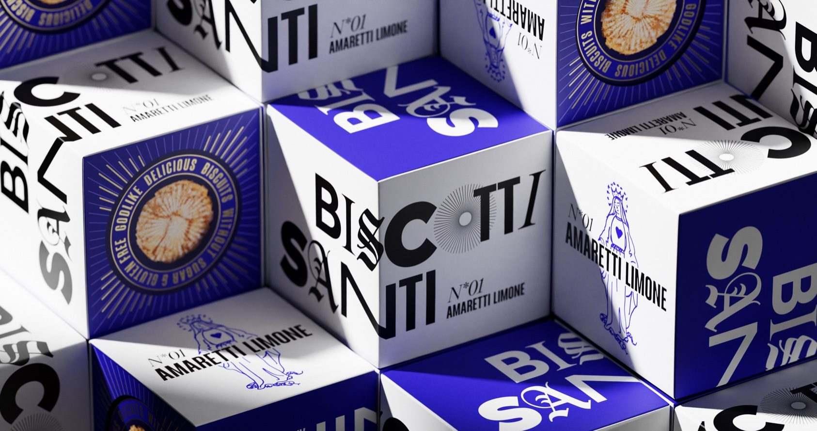
Designed by WIN Creating Images, conceptual brand The Biscotti Santi’s packaging system is a fusion of many aesthetics. Encouraged by a creative paradox, WIN Creating Images blends church-inspired aesthetics with street style. The result is a system that feels grounded but playful and divine but solemn. In addition, the unusual typography system feels eclectic but not overbearing, pushing packaging to become more daring.
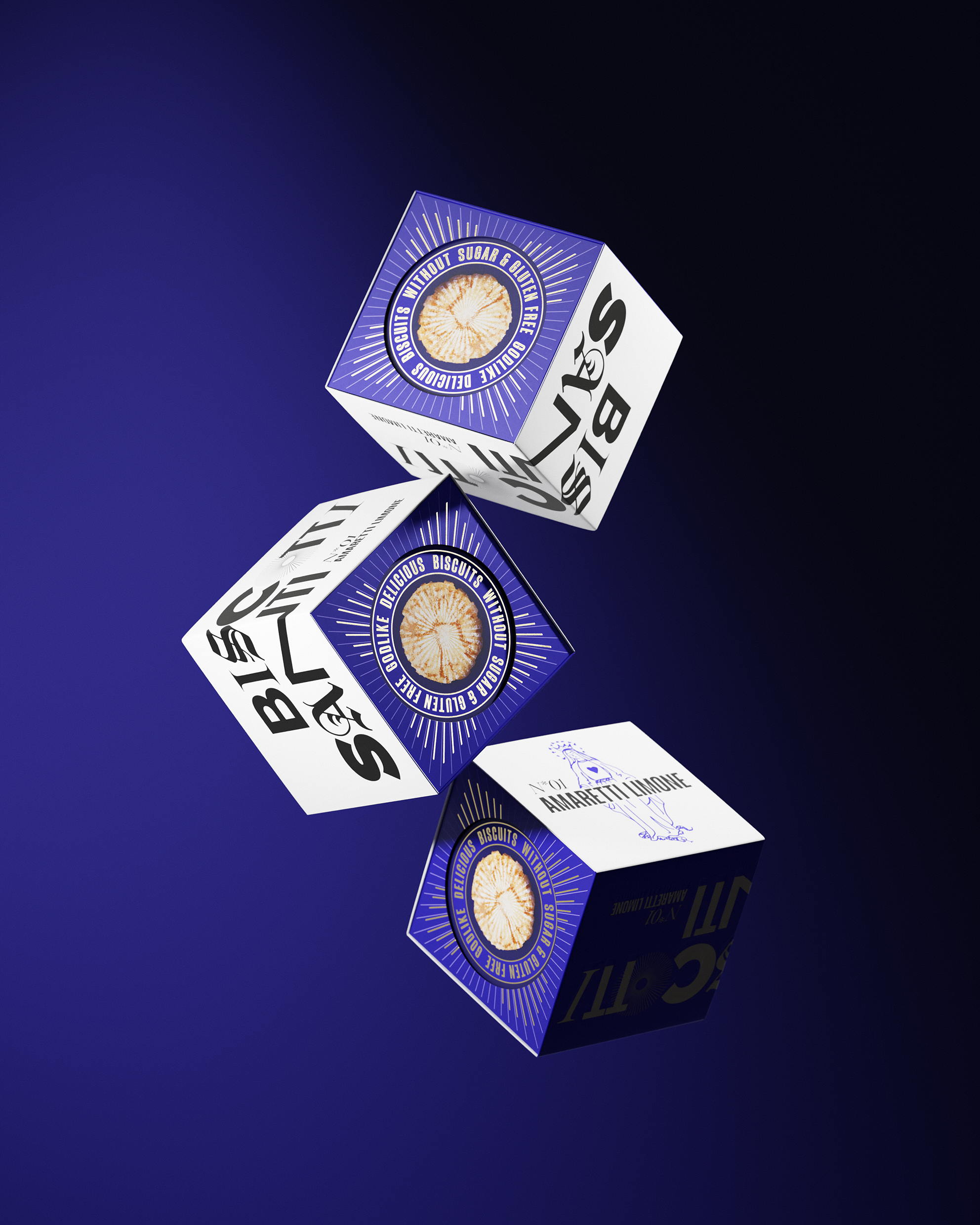
The Biscotti Santi – the holy cookies – are the visual exaggeration of an “innocent” sweet. The design completely breaks with candy category codes and plays with the taboo breaking of snacking sweets thanks to monstrance-inspired design elements with halo references. The “church meets street” vibe of the design puts aesthetics and fun at the center of the slightly ironic concept of this guilt-free, yet visually fun snack option.