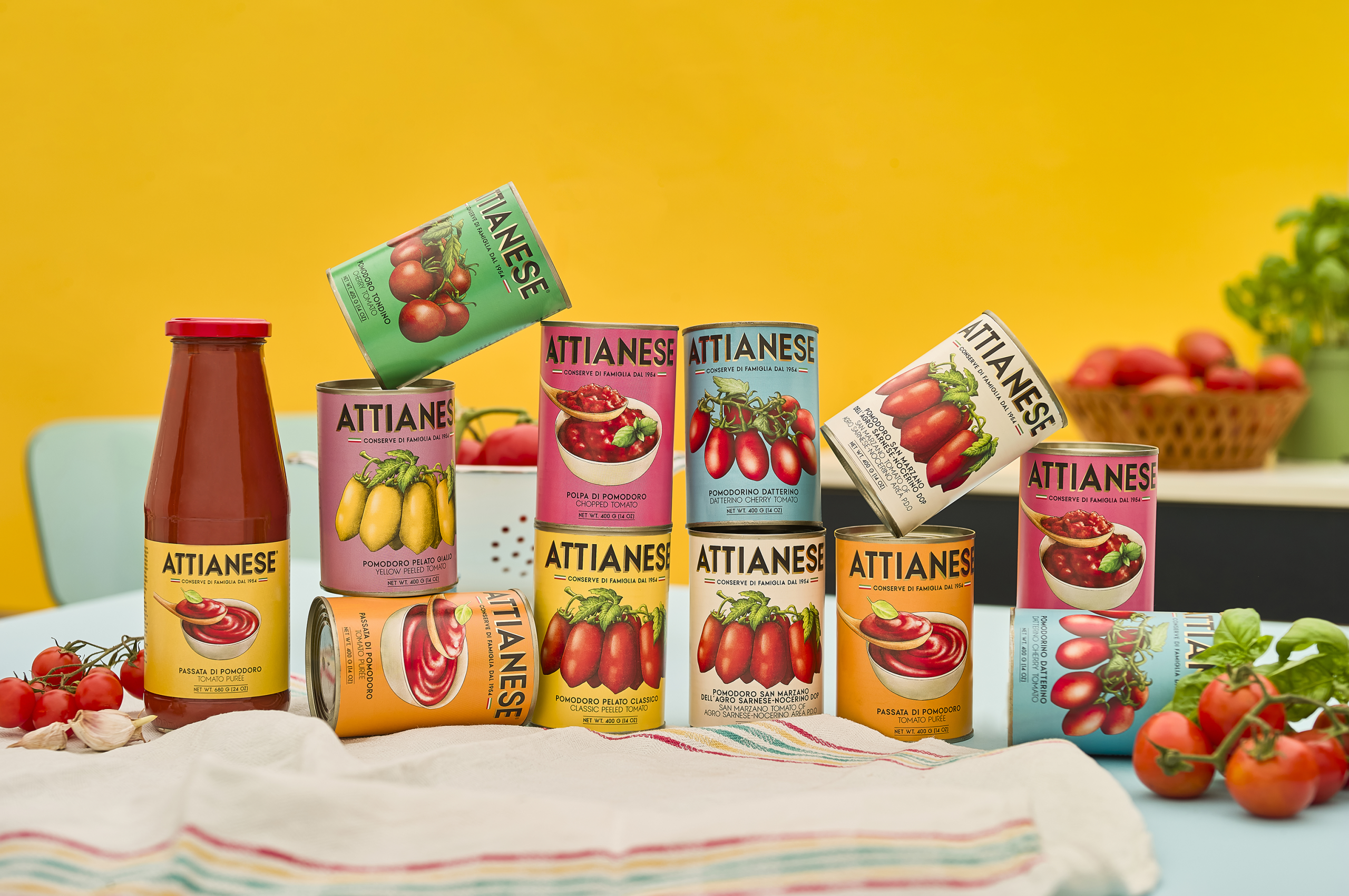
- Italian agency nju:design has created a suite of packaging based on a vintage illustration style for Attianese Conserve’s line of canned tomato products
- The label designs are inspired by those used by Campania canning companies in the 1950s, updated for the modern era
In a modern-age dominated by trend chasing, there’s something to be said for timelessness. Italian agency nju:design has nailed it with the design for Attianese Conserve, inspired by vintage labels from 1950s Italy. They studied old labels from Campania canning companies that exported tomatoes all over the world, which featured a delicate illustration style. The result is an authentic, artisanal, and homey feel for Attianese Conserve, while a bright pastel color palette subverts the aesthetic with distinctly modern flair and pizzazz.
The system is all about the illustrations, which were drawn by Claudia Bartoli in a detailed style reminiscent of the sort used before photography. With this illustration style at its center, the product line comes together with a wholesomeness rooted in what we know but enhanced for the 2026 shelf.

The packaging design project for “Attianese Conserve” is inspired by the historic labels of Campanian canning companies that exported their products abroad. The design evokes the elegance of a traditional aesthetic that made Campanian tomatoes famous worldwide.


The project brings back the cultural and artisanal richness of labels designed from the 1950s, reviving that visual language. We have redrawn the tomatoes as was done at the time, opting for illustrations over photographs.
For the labels, we used vivid colors and a minimalist composition. The final result is a packaging design that maintains a strong connection to the past while being contemporary.



















